About
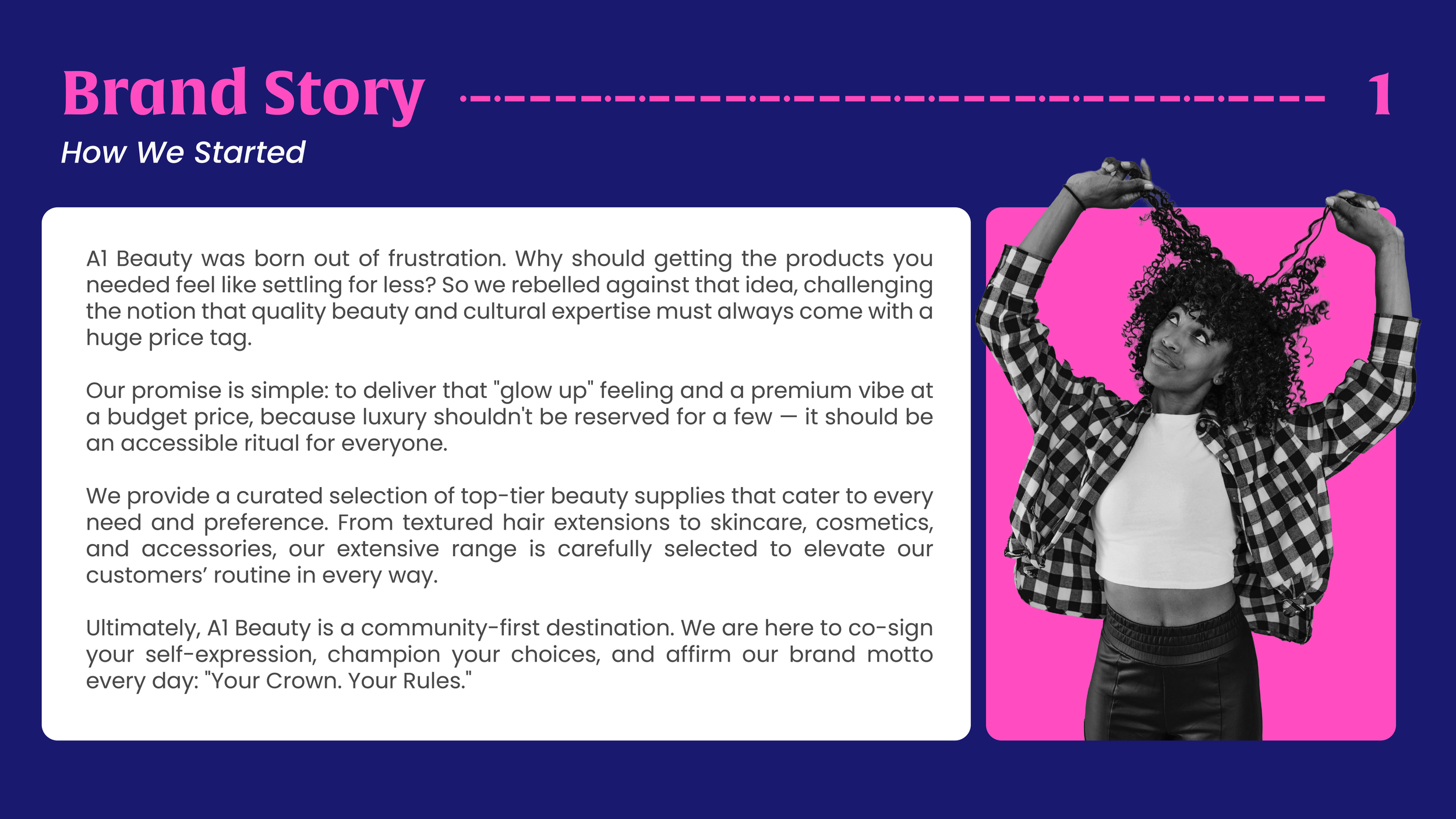
Kuwento (Brand Story)
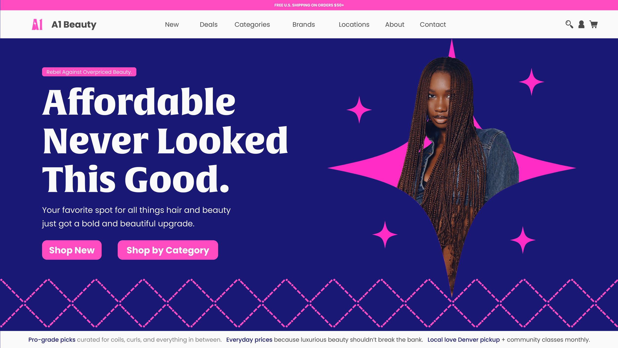
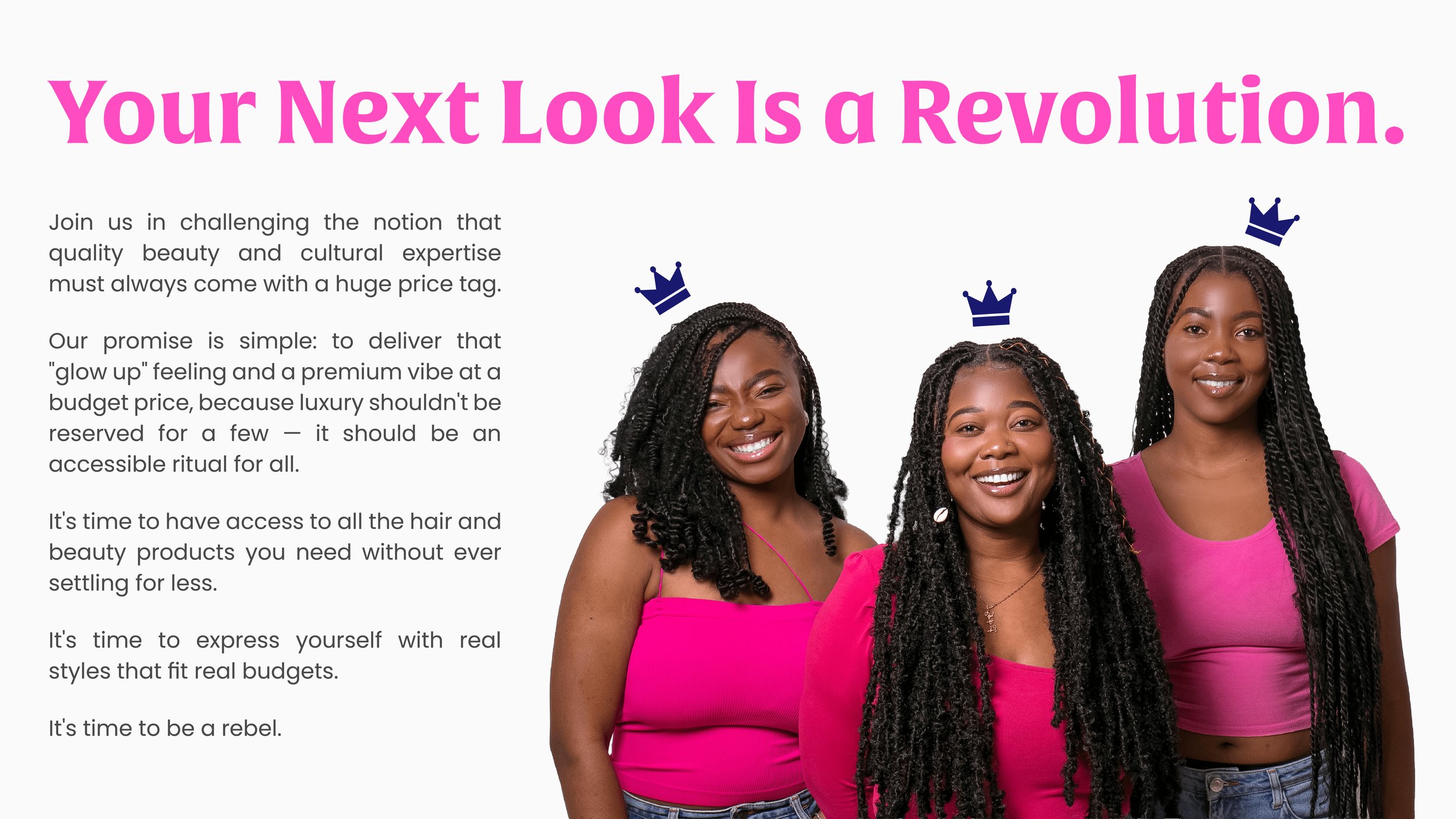
A Denver-based retailer, A1 Beauty is a hair brand for everyday confidence.
The brand aims to offer a “premium experience without the premium price tag,” blending the excitement of a beauty retail shop with the practicality and cultural relevance of a specialty hair supply store.
Find more of their story in the Brand Story section of the Brand Guidelines below!
The Challenge
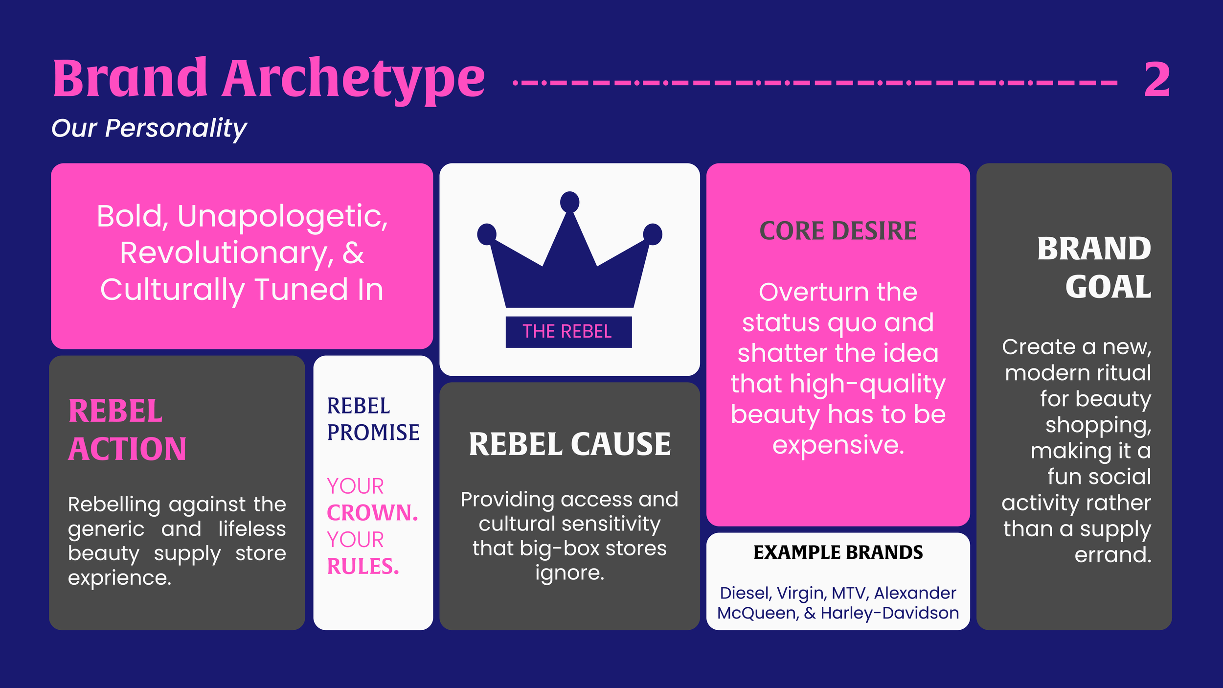
A1 Beauty is meant to feel like a destination: inclusive, social, and empowering, where women — especially Black and Latin communities — can find the products they want, share tips, and feel seen.
The original brand looked like any generic supply store. It was functional but needing more energy, so the rebrand had to:
Modernize the identity to feel sleek, fun, and social.
Maintain cultural authenticity for Black and Latin communities.
Stand out in a crowded, price-sensitive hair market while staying accessible and aspirational.
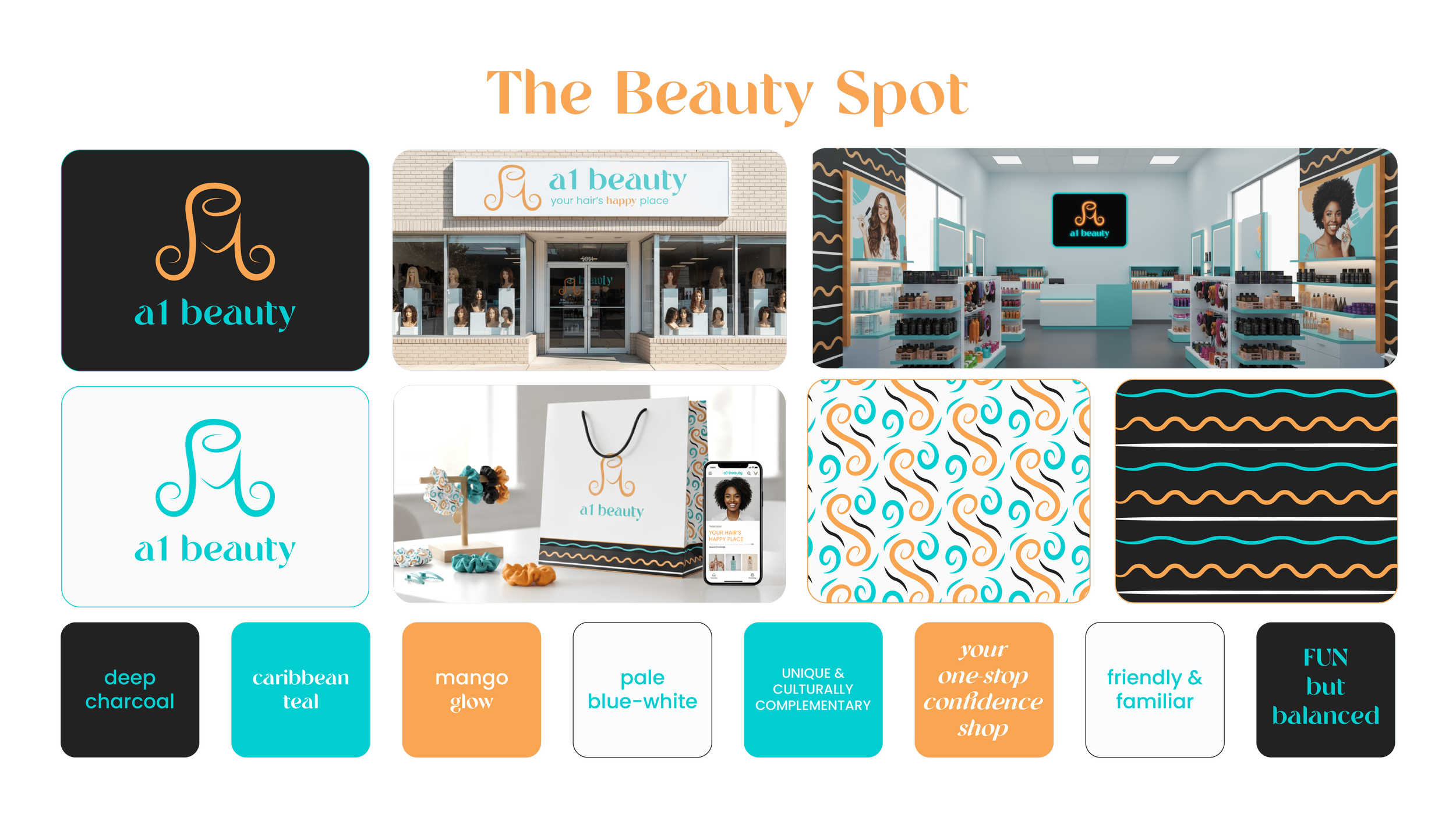
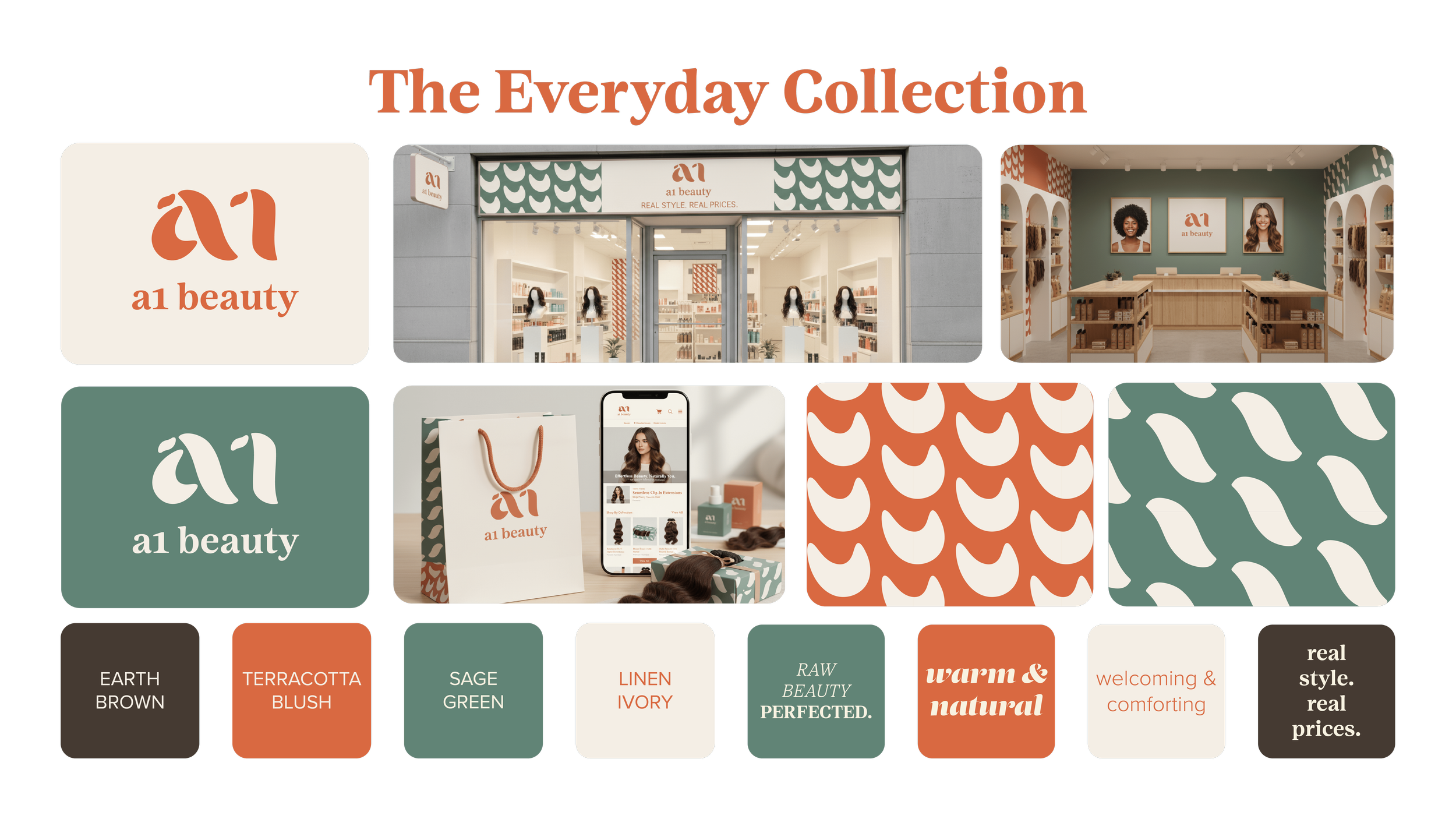
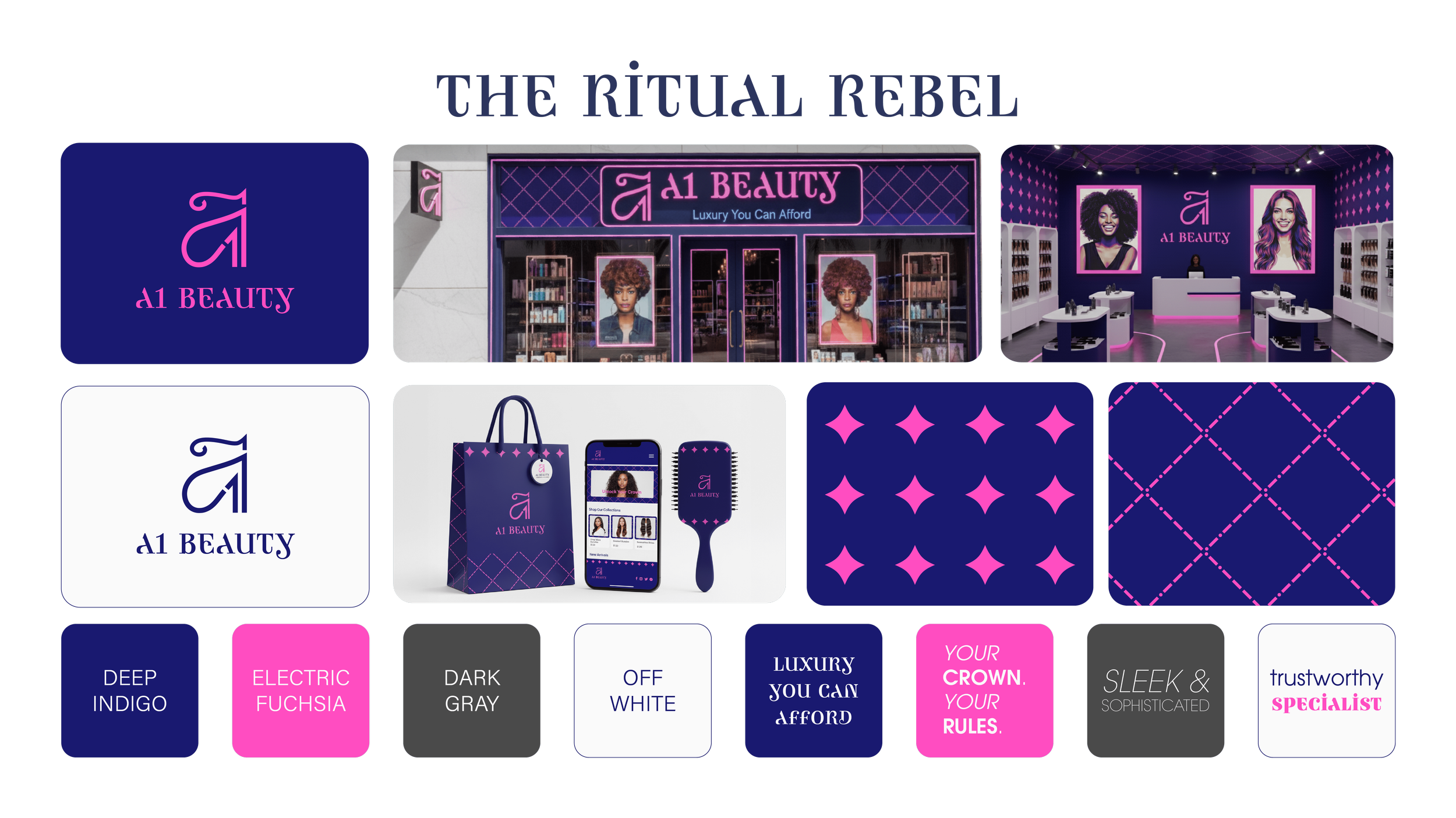
⋆˚。 Mood Boards
⋆˚。 Mood Boards
₊⊹ Brand Guidelines
₊⊹ Brand Guidelines
As seen on the rest of this page, Mood Board 3 became the winner for our creative direction.
The final A1 Beauty guidelines actually have 40 pages, but I’ve included only 10 slides here for a quick overview.
Here’s a peek at my design thinking and approach:
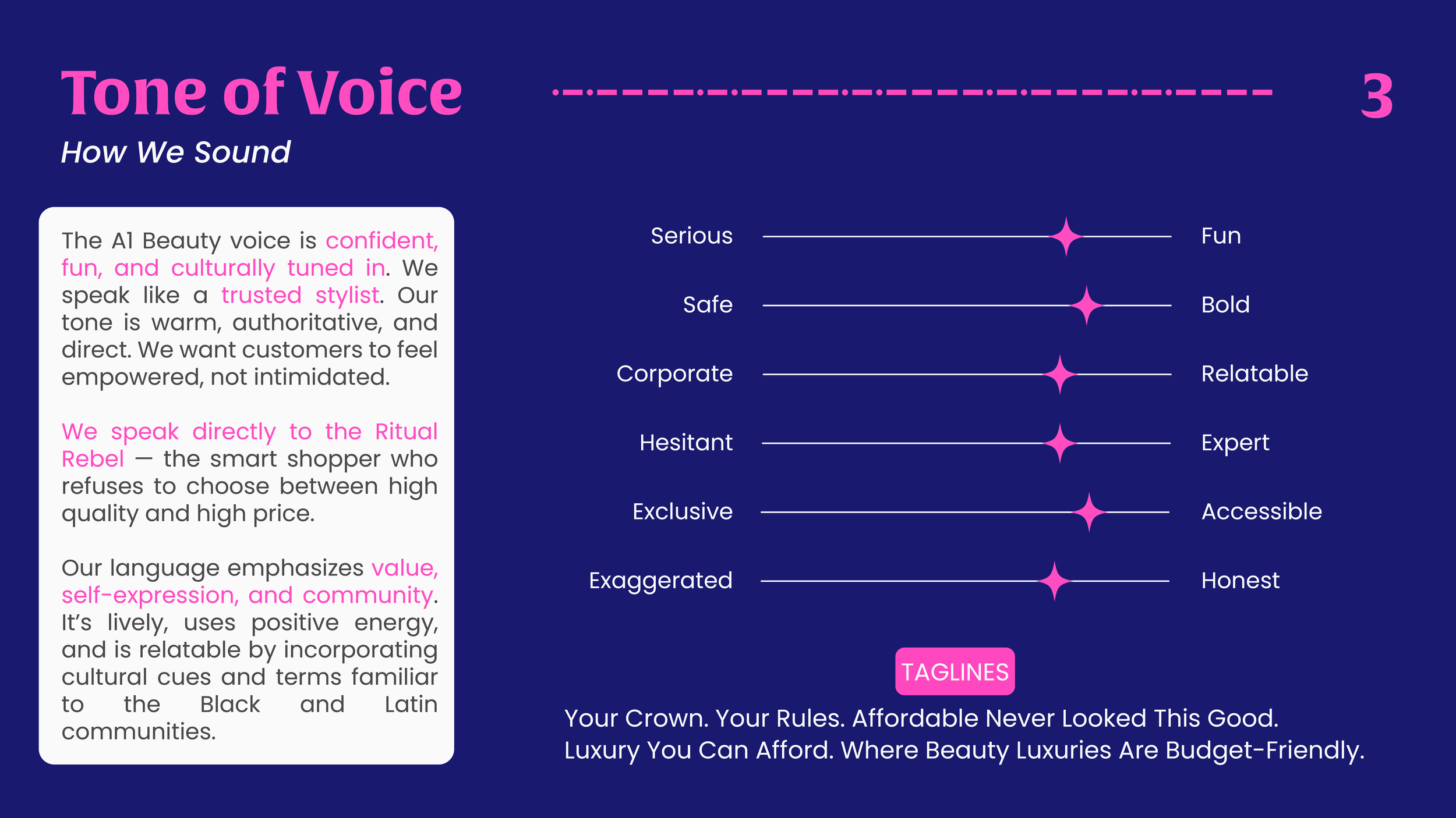
Every design choice was meant to solve the main challenge: turning A1 Beauty from a generic supply store into a confident, culturally authentic destination.
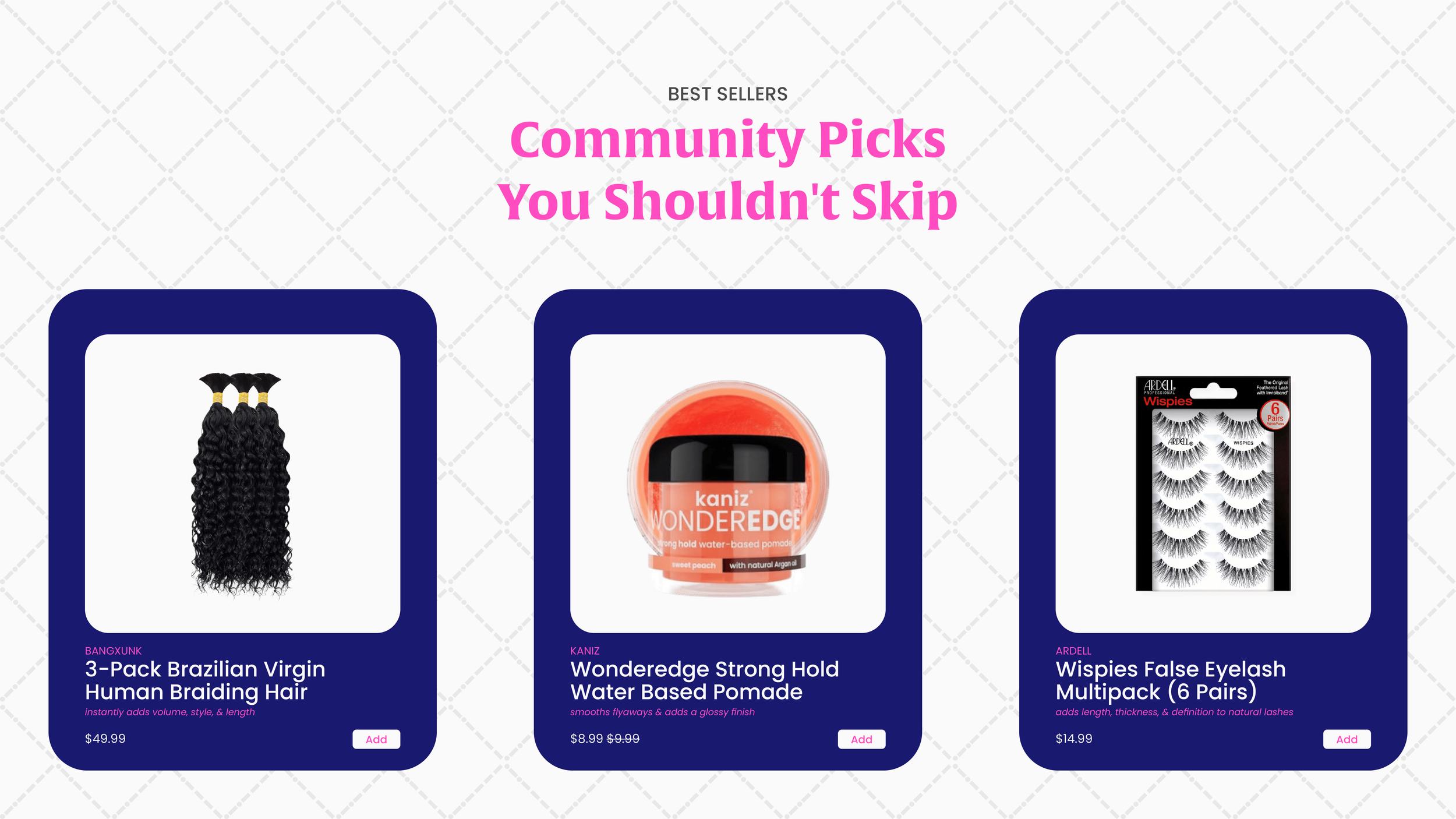
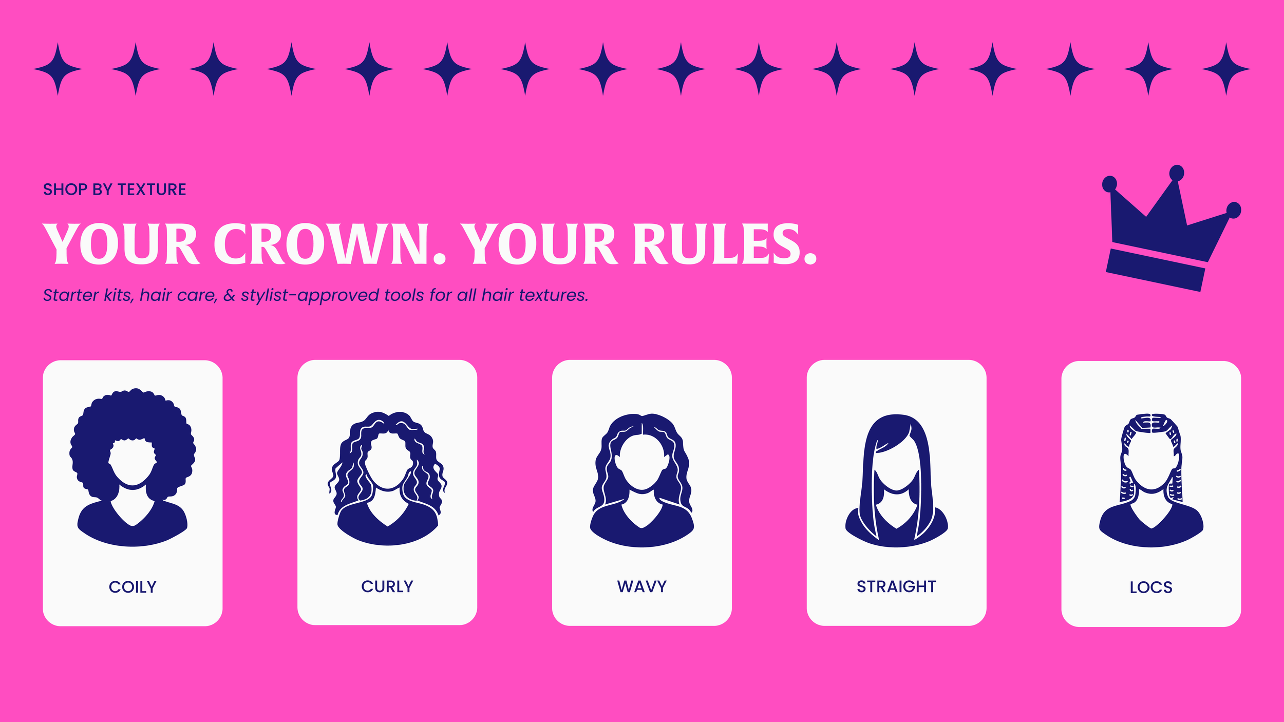
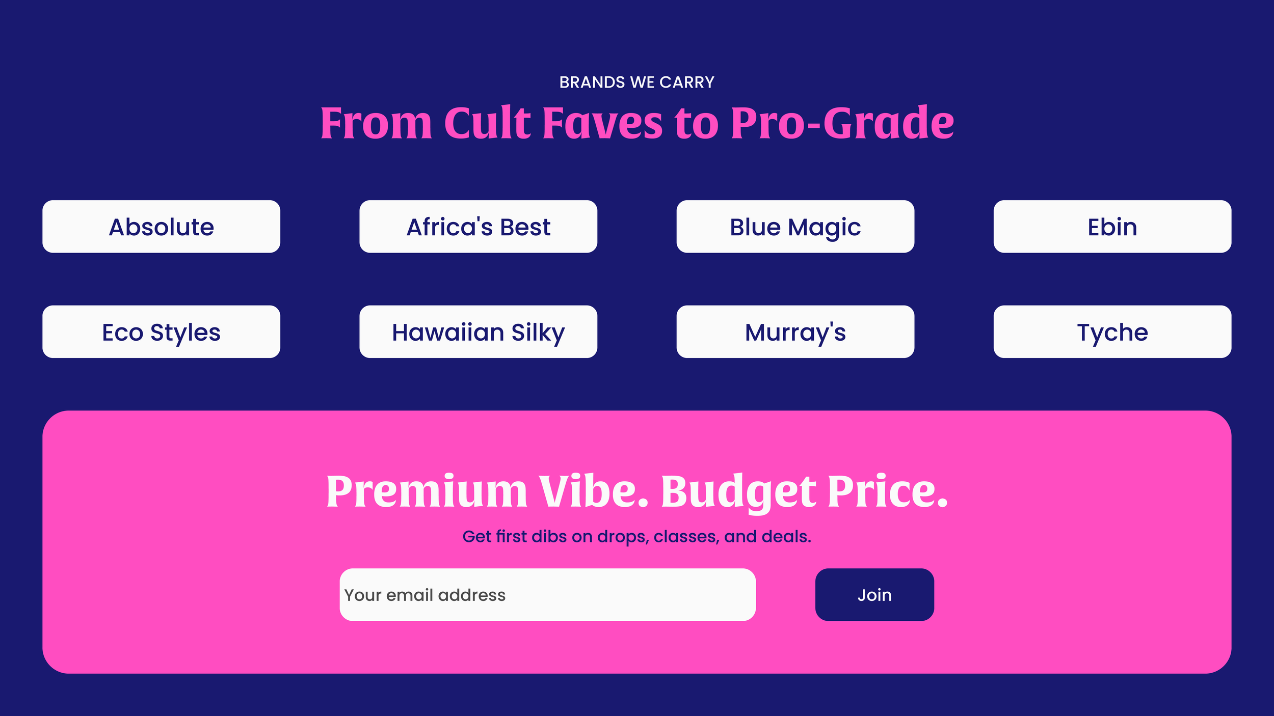
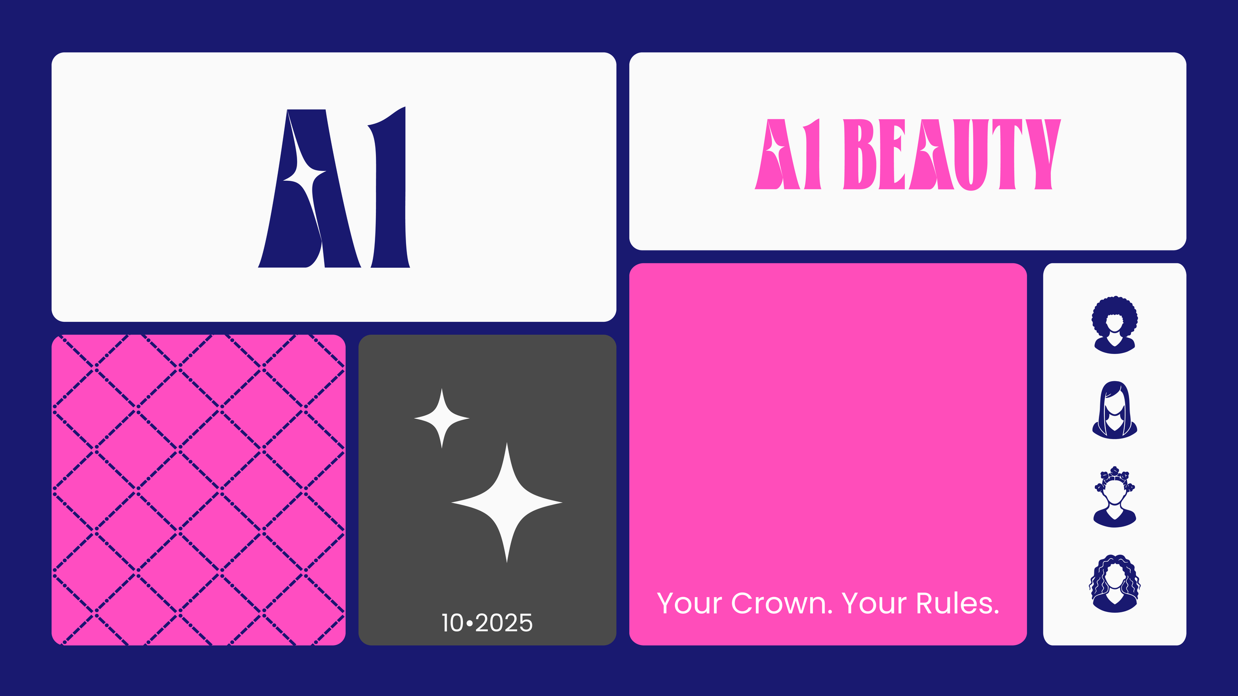
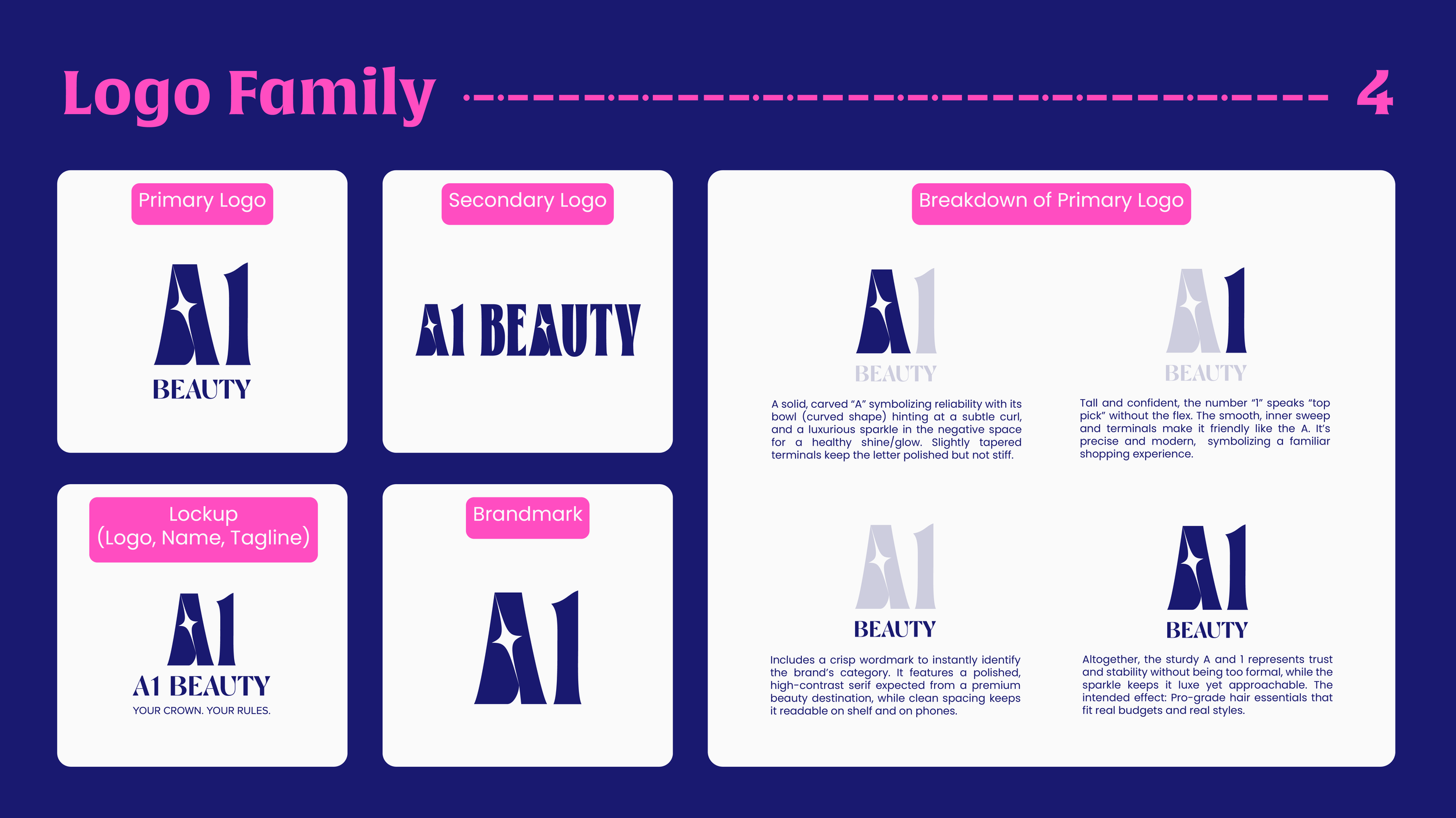
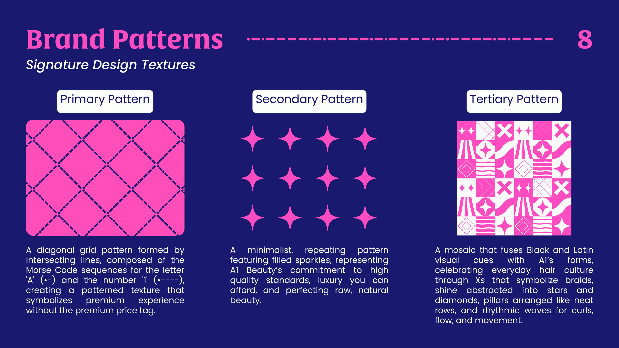
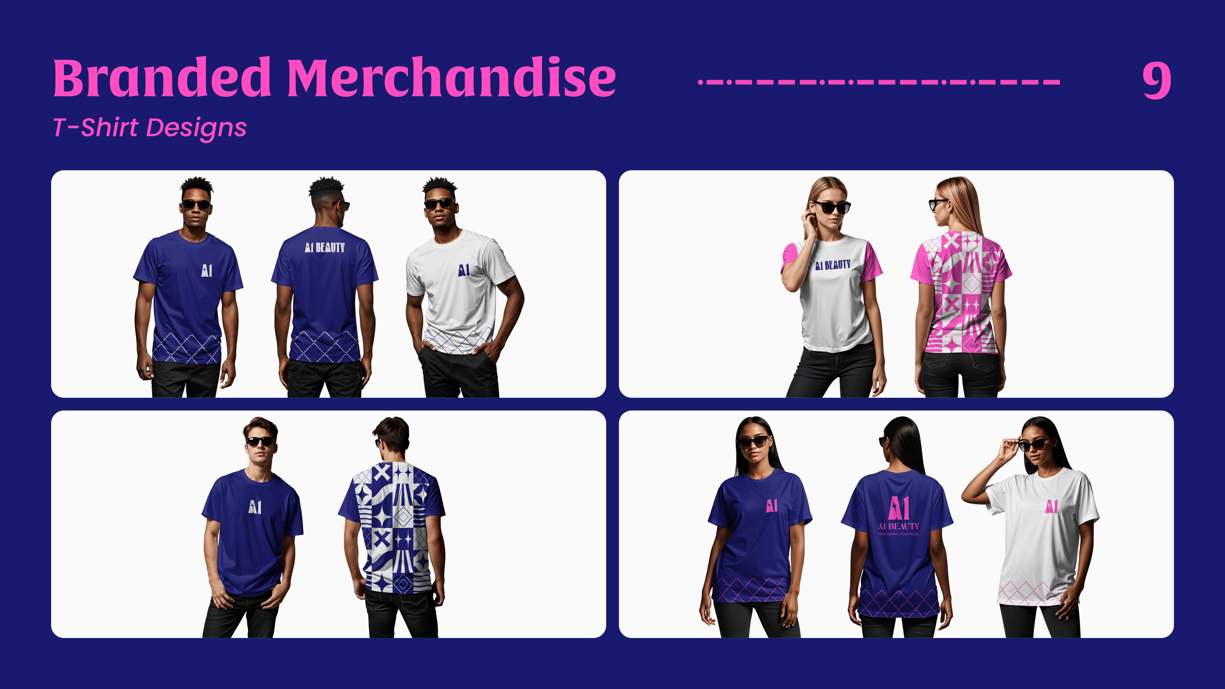
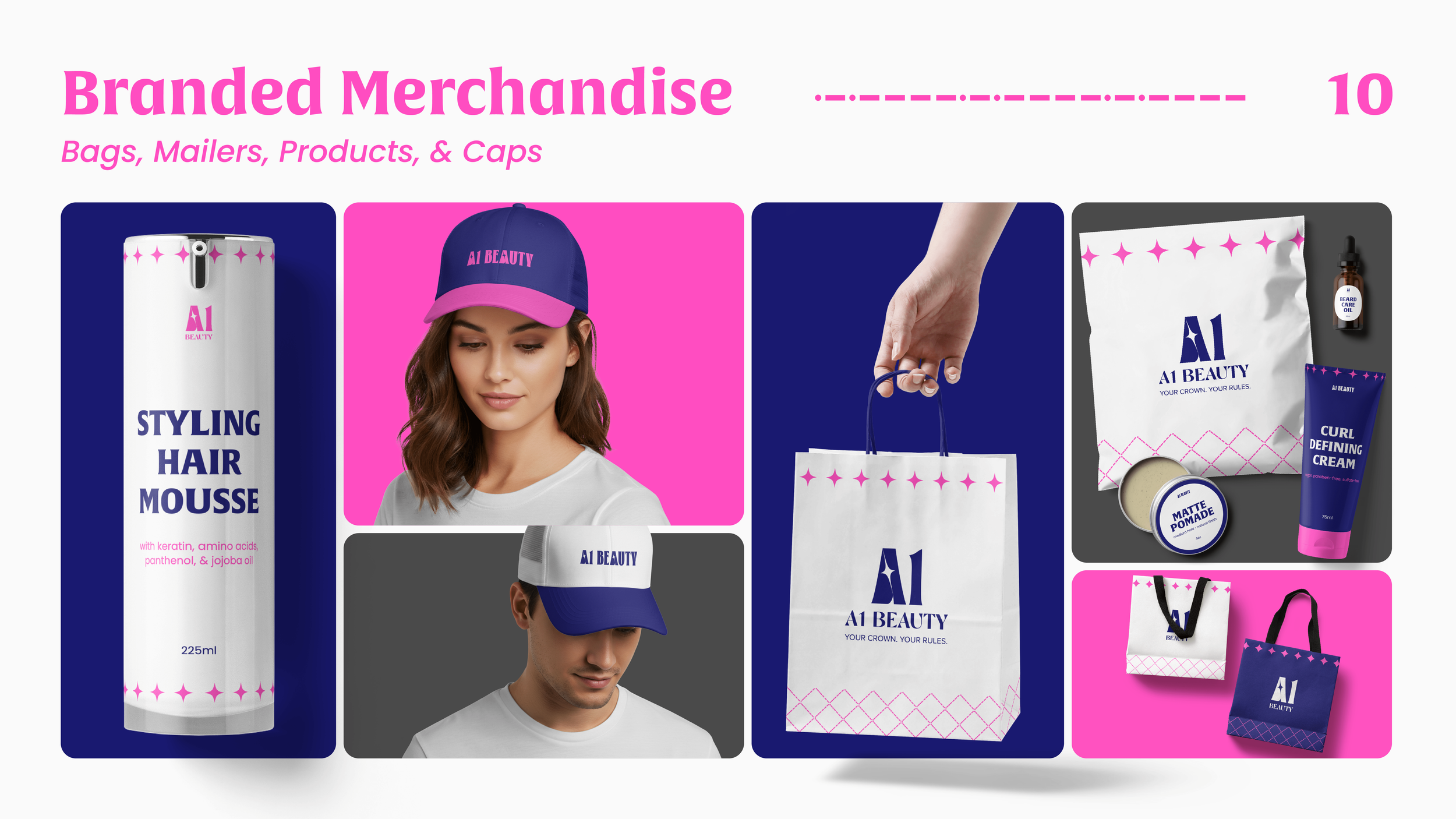
I went with a chunky, bold logo to give the brand presence and make it easy to spot online and in crowded marketplaces. It helps the brand stand out while still feeling approachable with the luxurious sparkle that says “we’re premium but not expensive.”
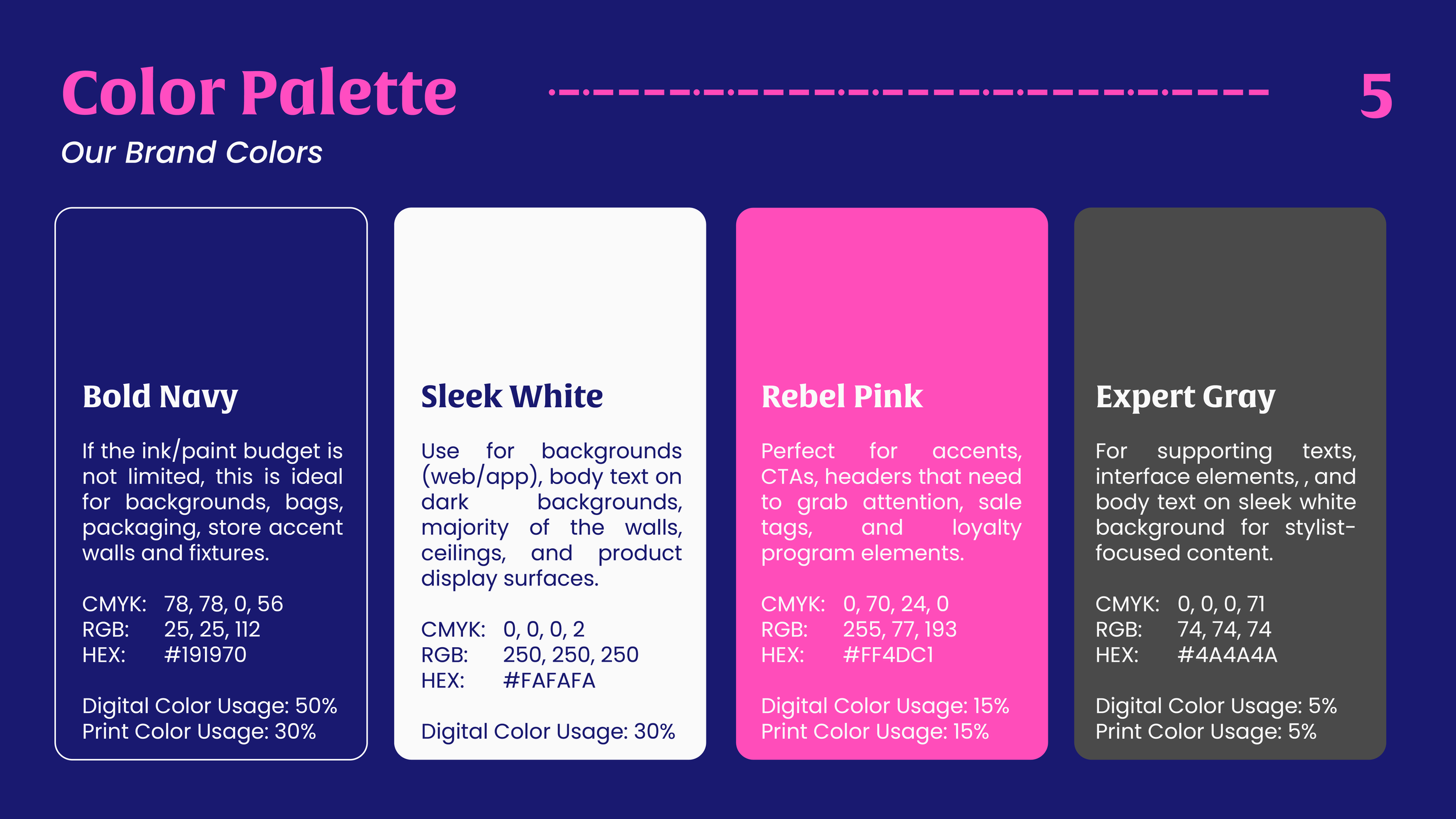
The color palette leans into the brand’s Rebel archetype. They’re lively enough to feel fun and modern. Also, Indigo, like teal, is great for most skin tones so it’s perfect for both their primary audience (Black and Latin communities) and secondary audience.
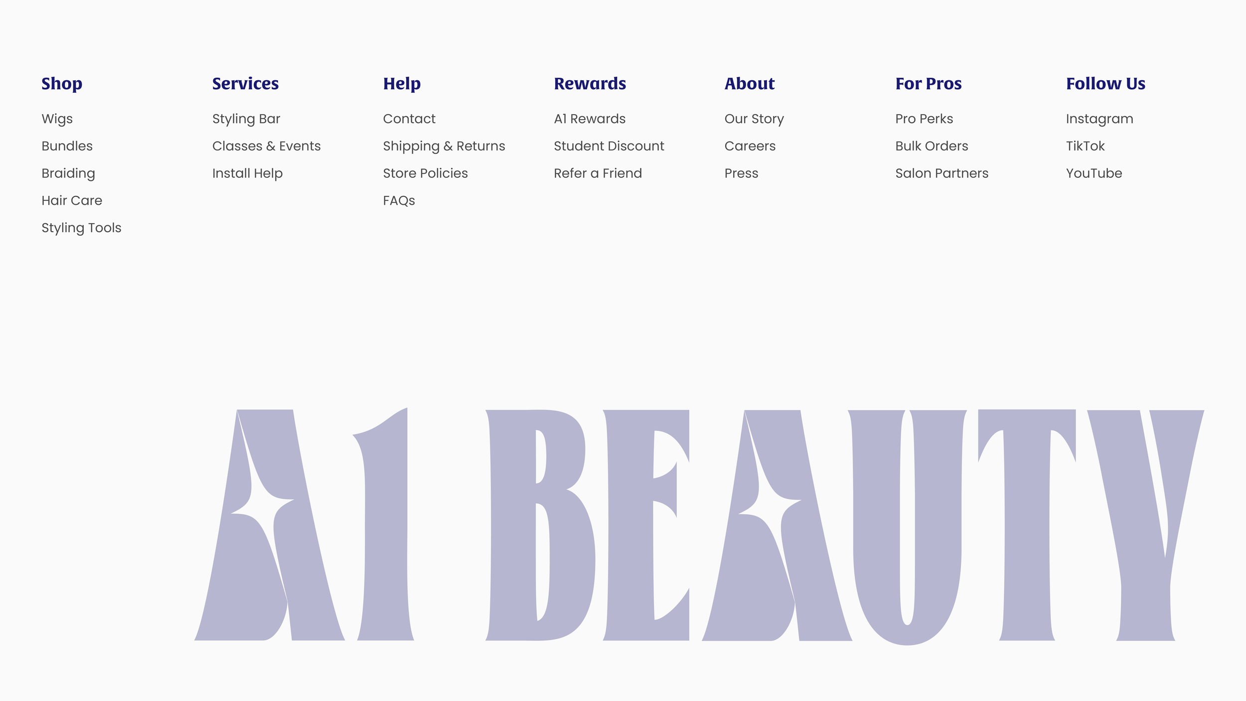
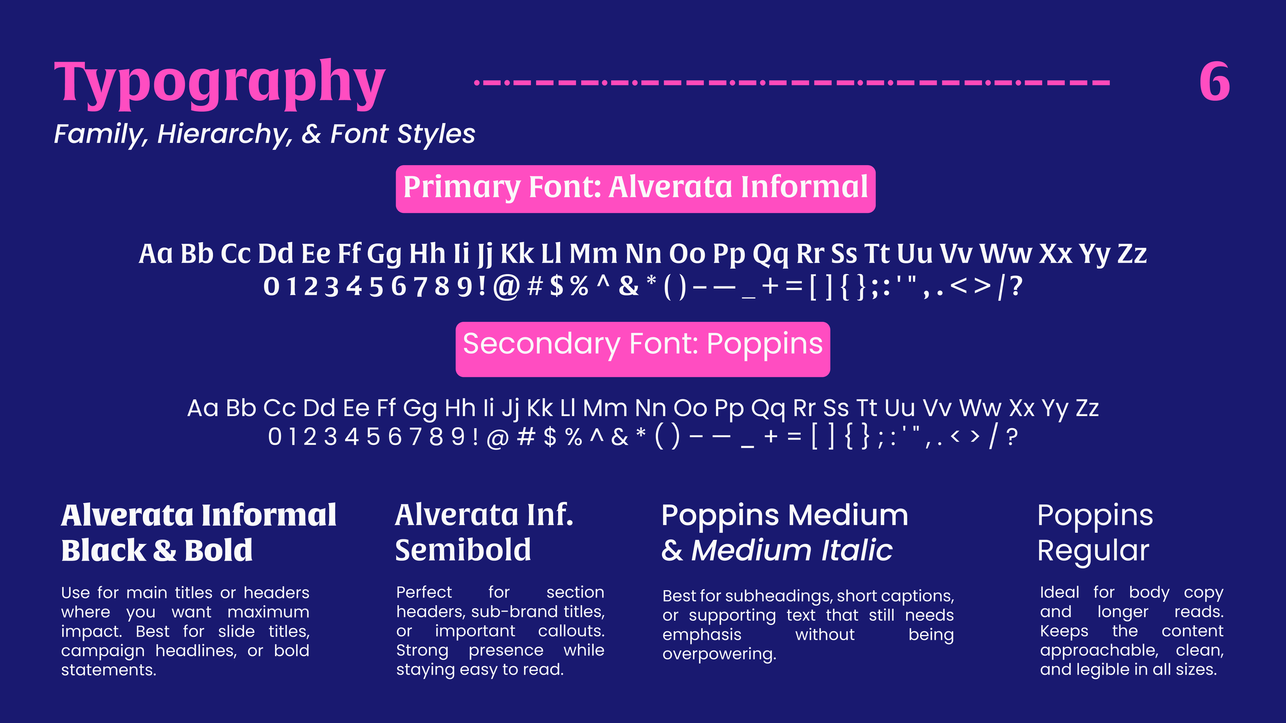
Clean, strong typography with clear hierarchy makes everything easy to read and feel modern.
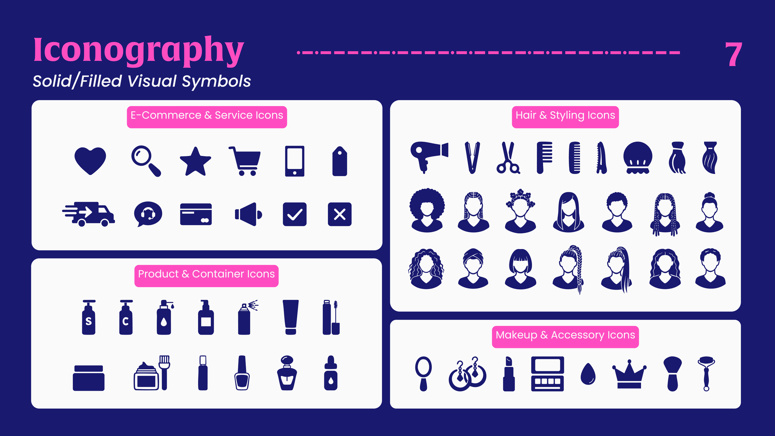
Icons, patterns, and layouts were designed to make shopping feel fun and social, like visiting a store you actually want to spend time in, not just scrolling a catalog.
If you’ve got 2 minutes, I encourage you to watch the video to know more about this project. Enjoy!
— Liz
~ Website Homepage
~ Website Homepage