

Starting up or starting over? Kuwento builds brand essentials you'll actually use, without draining your wallet (or your spirit).
Chapter 1: Meet the Storyteller

Hi, I’m Liz!
I’m a 30-something introvert from General Santos City. I’m also a perfectionist, so yes, I will notice if your logo is two pixels off. (You’re welcome.)
For over a decade, I’ve worn just about every hat in the creative closet, from copywriter and graphic designer to content manager and creative director. Along the way, I’ve helped 250+ brands worldwide, mostly in the US, UK, and Canada.
In 2025, I finally stopped saying “someday,” got myself certified as a brand manager by AIPMM, and built Kuwento (with a lot of cheering from my hubby and family). I believe every business, no matter how small, has a story worth telling, and that’s why it’s called Kuwento, the Filipino word for “story.”
Here, we won’t just hand you a pretty logo and then ghost you. We walk you through the why behind every choice — like why a logo isn’t enough — so you can run your brand with confidence long after we’ve wrapped up.
Expert branding can be clear, personal, and doable without costing a kidney. Kuwento is here to prove just that.
Chapter 2: The Conflict (What We Solve)

Money: One flat rate for the essentials.
₱30,000 flat for the 10 Brand Essentials, made for startups and small businesses in the Philippines. You'll know exactly what you’re paying before we even start. Need a little extra? Add-ons are on the menu, and you can split the payment into 2 or 3 installments.
Time: Brand-ready in 5–6 weeks.
Your essentials are ready to roll out in 5–6 weeks. No more projects dragging on for mooonths while your launch date creeps closer.

Effort: You bring the story. We do the heavy lifting.
Tell us your kuwento, and we’ll take it from there: market research, brand strategy, creative direction, and brand design. Your part: Review, approve, and maybe cry happy tears with us after everything’s done.
Chapter 3: The Plot Twist (Low Price ≠ Low Quality)
Affordable, but not cheap.
At Kuwento, low price doesn’t mean low effort. We keep the price down by keeping the process tight, not by skipping steps.
Every project goes through all four stages of our 4D process: Discover, Define, Design, and Deliver. Every logo, icon, and illustration still starts as a hand-drawn sketch. And every detail gets the same eye I brought to 250+ global brands.
Sulit, hindi tinipid.
Chapter 4: The Happy Endings
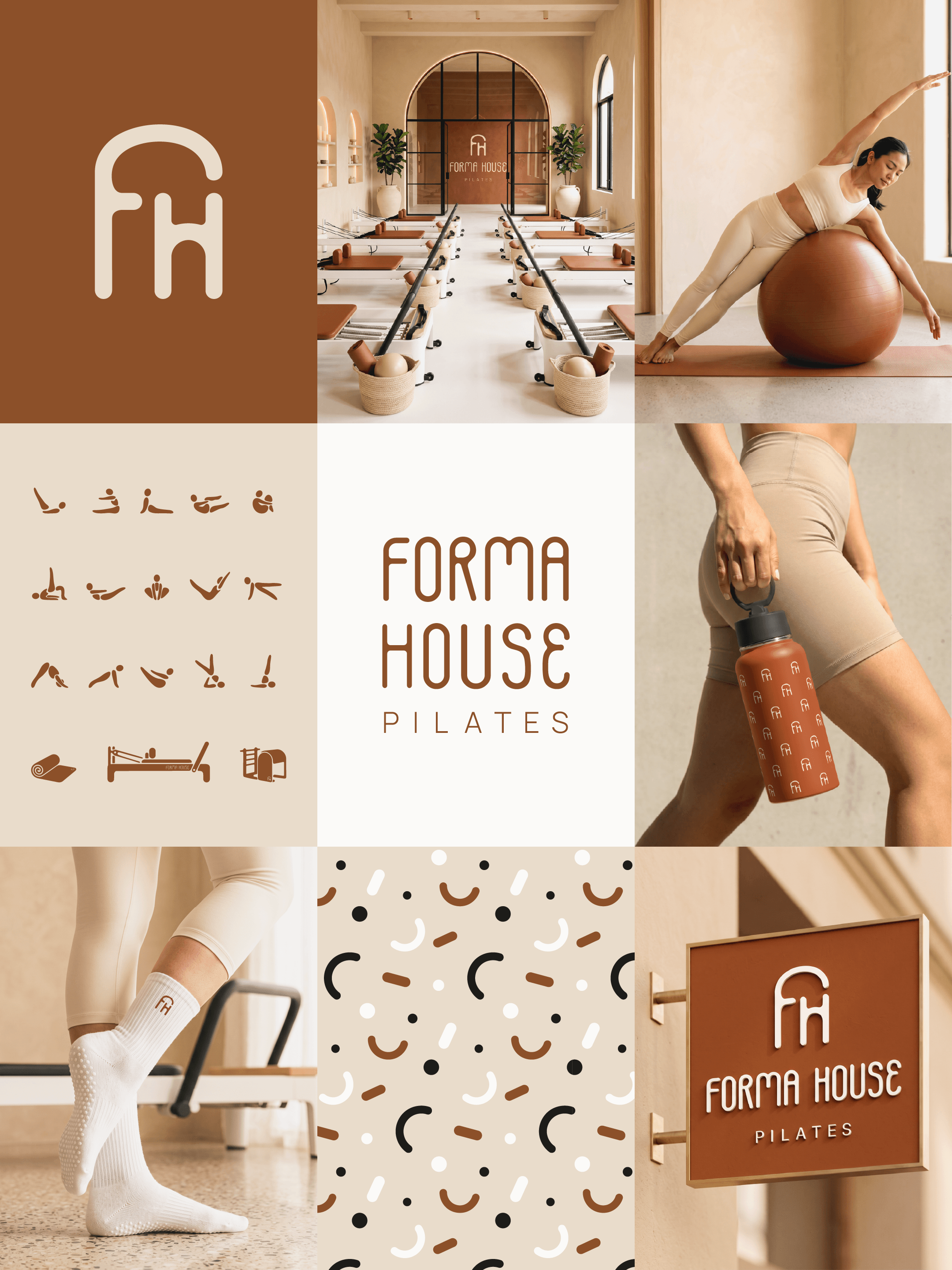
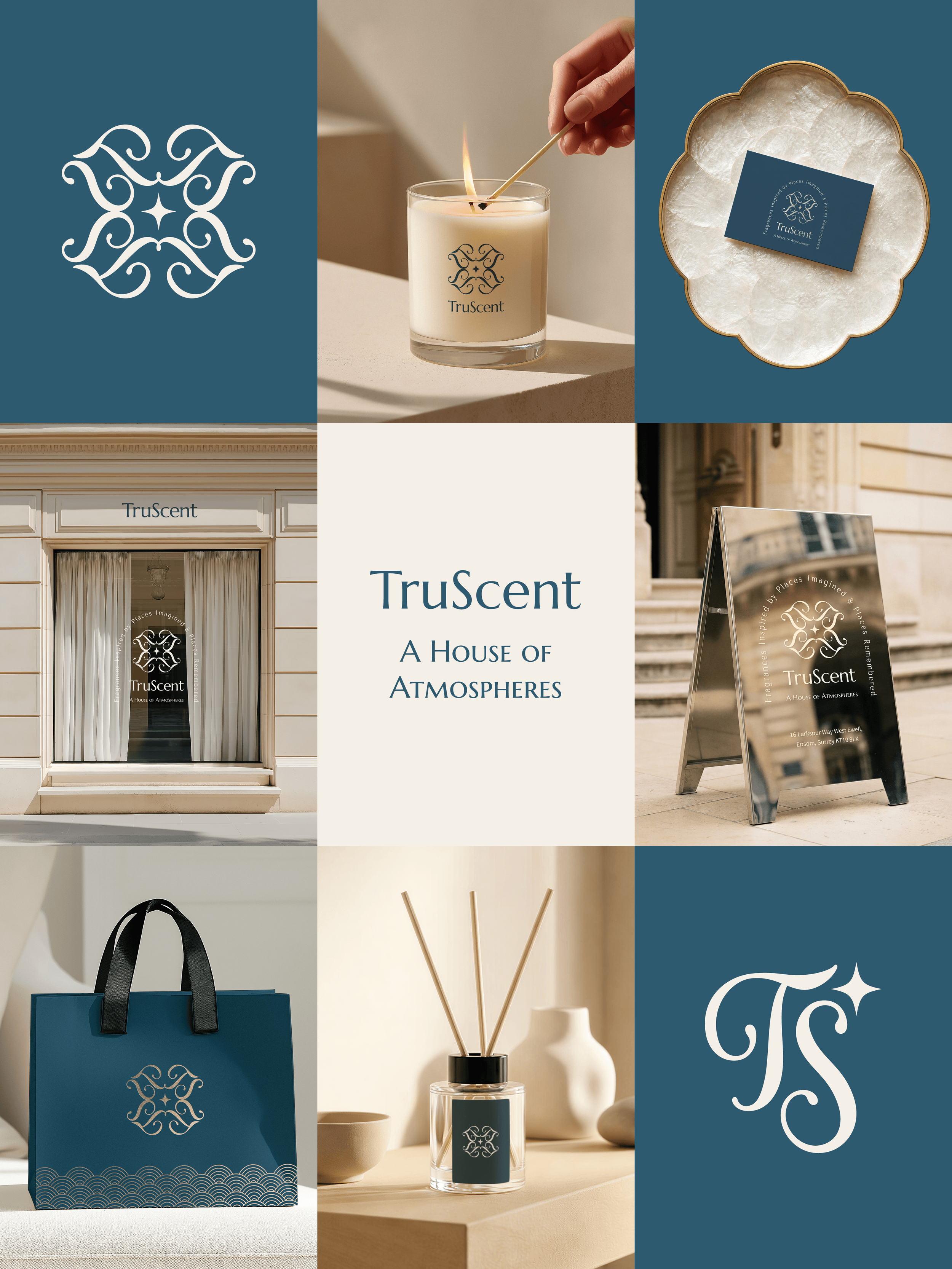
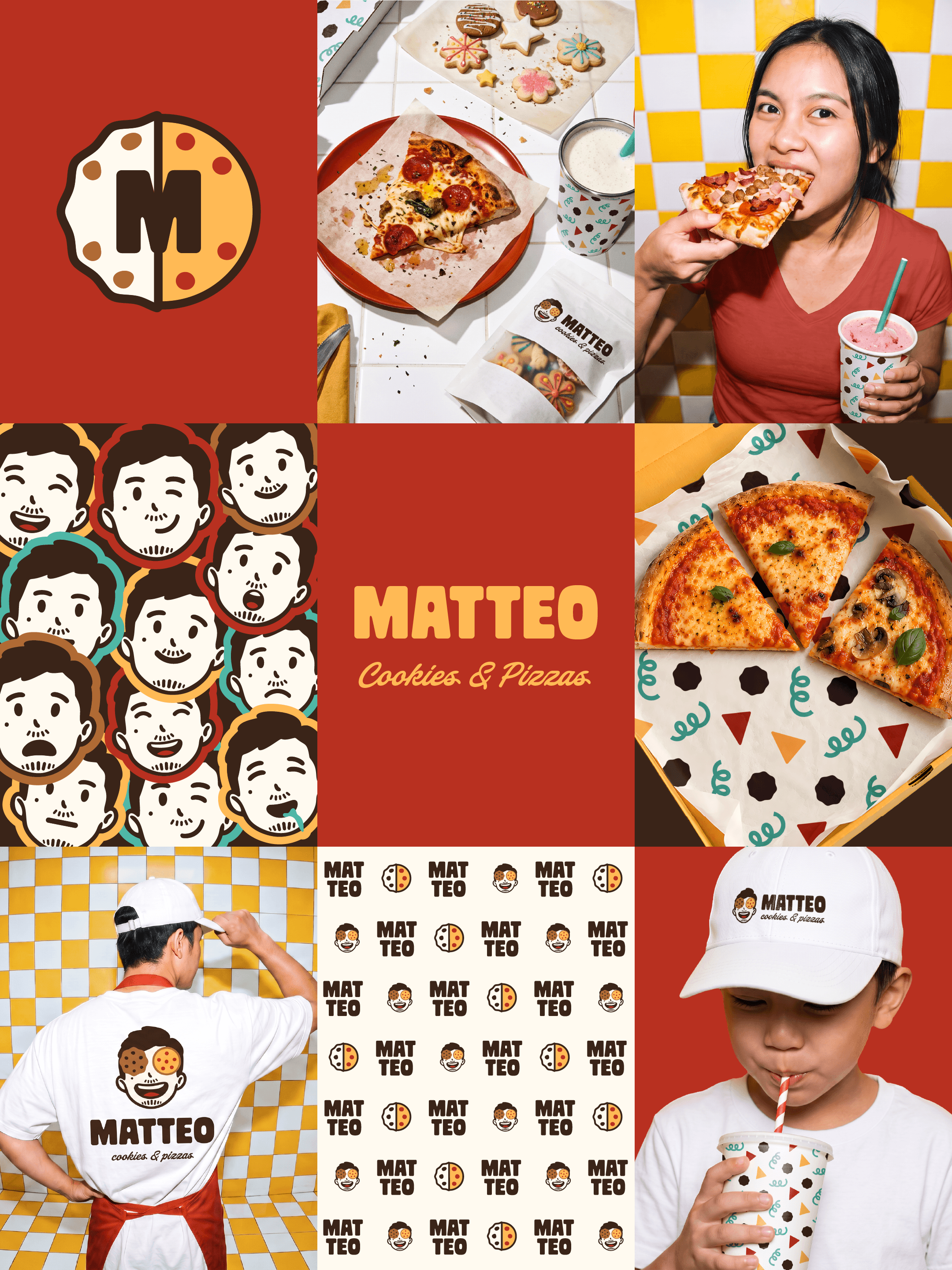
These are the most recent stories we’ve told — the real businesses with real stories we’ve had the honor of collaborating with.
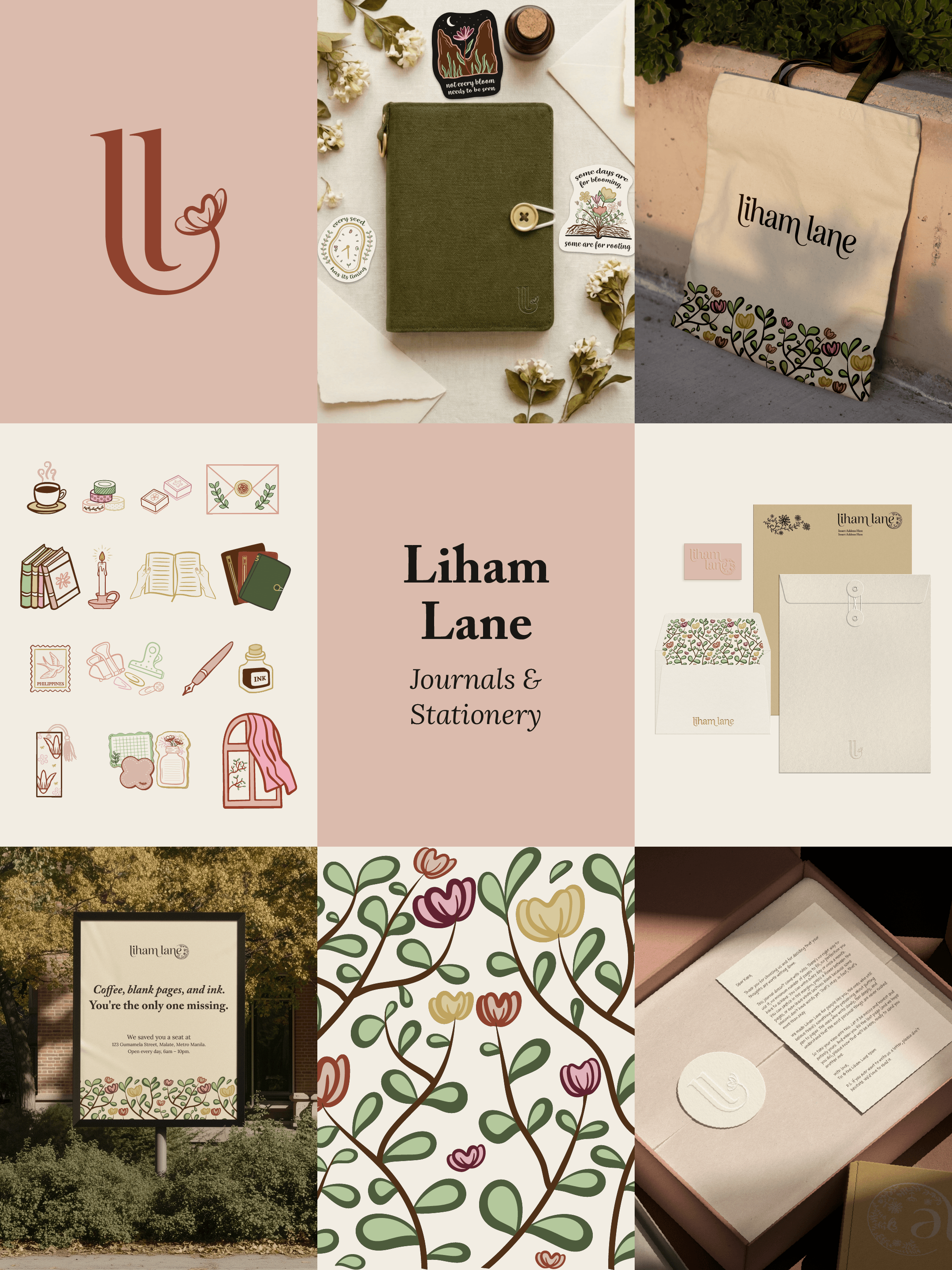
Hear it straight from our clients…
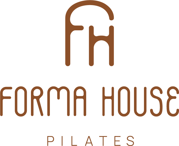
When I first reached out to Kuwento, I honestly had no clear idea of how I wanted my branding to look or feel. As a new business owner, I was still figuring things out and trying to understand how i wanted my brand to be presented.
I simply shared my story with Liz, on what my business was about, why I started it, and how I envisioned it growing. She took my story and turned it into a brand that was even better than I could have imagined. She understood what I wanted, even when I couldn't fully put it into words myself.
As someone getting started with a new business, having Kuwento guide me through the branding process was incredibly helpful. They made something that initially felt overwhelming and unfamiliar feel clear, intentional and achievable.
Liz truly lived up to Kuwento's mission and vision of helping business owners build world-class brands and strategies yet affordable , especially for small and new business owners like me. Kuwento didn't just create a beautiful brand for me, but also helped me understand the value of building a strong brand form the very beginning.
I'm so grateful I trusted Kuwento with my business. What started with me not knowing exactly what I wanted turned into a brand that feels authentically me and represents the story behind my business. Highly recommended!
— Clara, Founder of Forma House Pilates
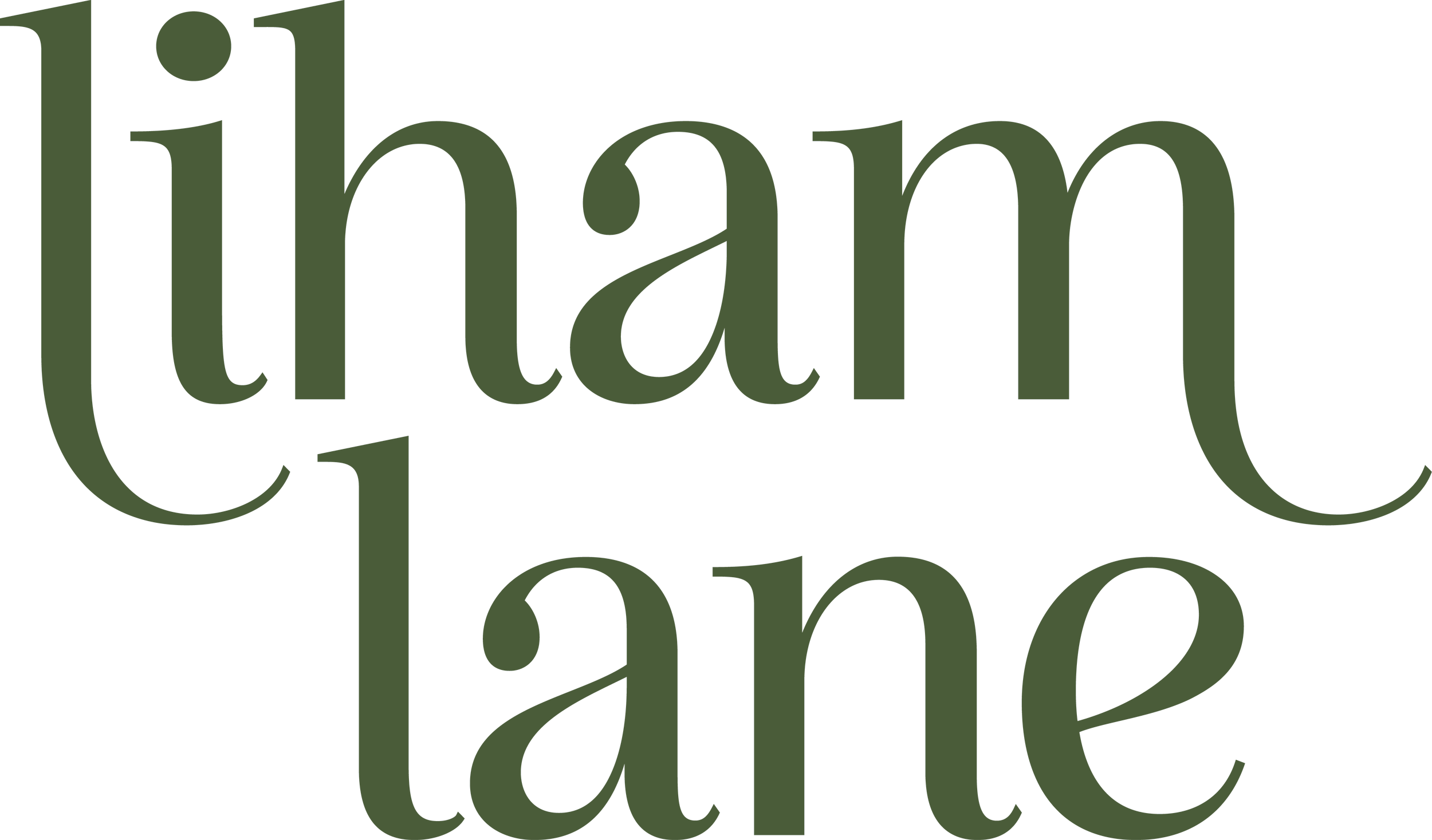
Choosing to work with Kuwento was one of the best business decisions I've made. Liz takes the time to understand the business objective, target market, and competitor to come up with a brand that's uniquely yours. She's detail-oriented, organized, and professional. I thoroughly enjoyed our partnership. ❤️
— Christine, Founder of Liham Lane
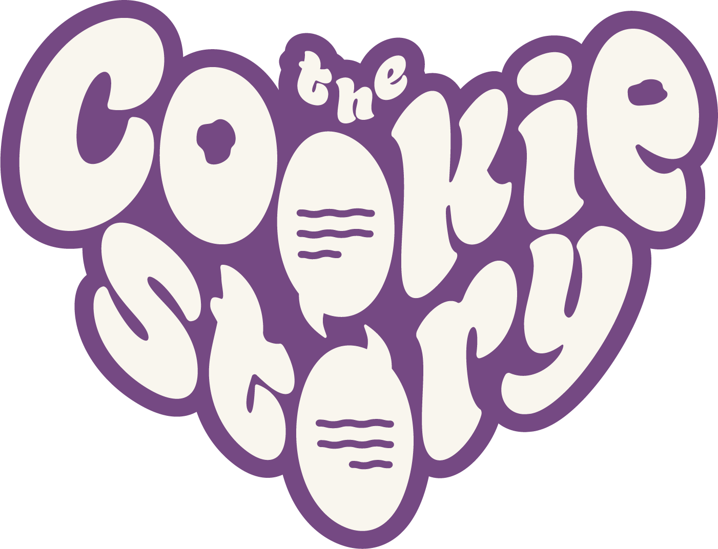
As the owner of The Cookie Story, having a strong and purposeful brand identity is very important to me. Working with Kuwento was a great experience. It helped me strengthen an identity that I already had when I was beginning to form the image of my business, while also highlighting my brand’s story in a way that felt intentional and authentic.
Seeing the final rebrand made me connect with my brand even more; it truly felt like an extension of myself and my vision, not something forced or generic. It gave The Cookie Story a clearer direction and a more cohesive presence.
What made the collaboration even more special was how aligned our goals were—both Kuwento and The Cookie Story aim to connect people through storytelling and create a sense of familiarity and meaning through shared stories. Because of this, the rebrand felt natural and true to what my business stands for.
— Ashe, Founder of The Cookie Story
Liz, this look[s] REALLY good! You absolutely nail the logo and I think the fonts match very well... Really impressed with your vision and commitment to detail, thanks for helping us bring color and life to the brand.
— Arin, CEO of A1 Beauty
Chapter 5: The Moral of the Story
People don’t just buy products. They buy from brands they remember, trust, and feel something for. Branding is how you earn all three. It’s why someone picks your café over the one next door, or happily pays extra because the packaging made them smile.
Without it, you’re one more option in a sea of lookalikes. And thanks to artificial intelligence (AI), that very sea is getting crowded. Nowadays, anyone can type a prompt and get a “logo” in 10 seconds, which is exactly the problem. Same prompts, same trending fonts, same Pinterest boards, and even the same beige — everyone ends up looking like everyone else. How can you stand out, then?
Your story is the one thing no algorithm can fake. No one else started your business for your reasons, in your town, with your side hustle and your 2 a.m. “what if.” That’s what we build your brand on. Every logo here starts as a sketch by an actual human (hi, it’s me), and the AI we mainly use is the original one: Adobe Illustrator.
All so your brand looks like you, sounds like you, and sticks with the people you want to reach.