About
Kuwento (Brand Story)
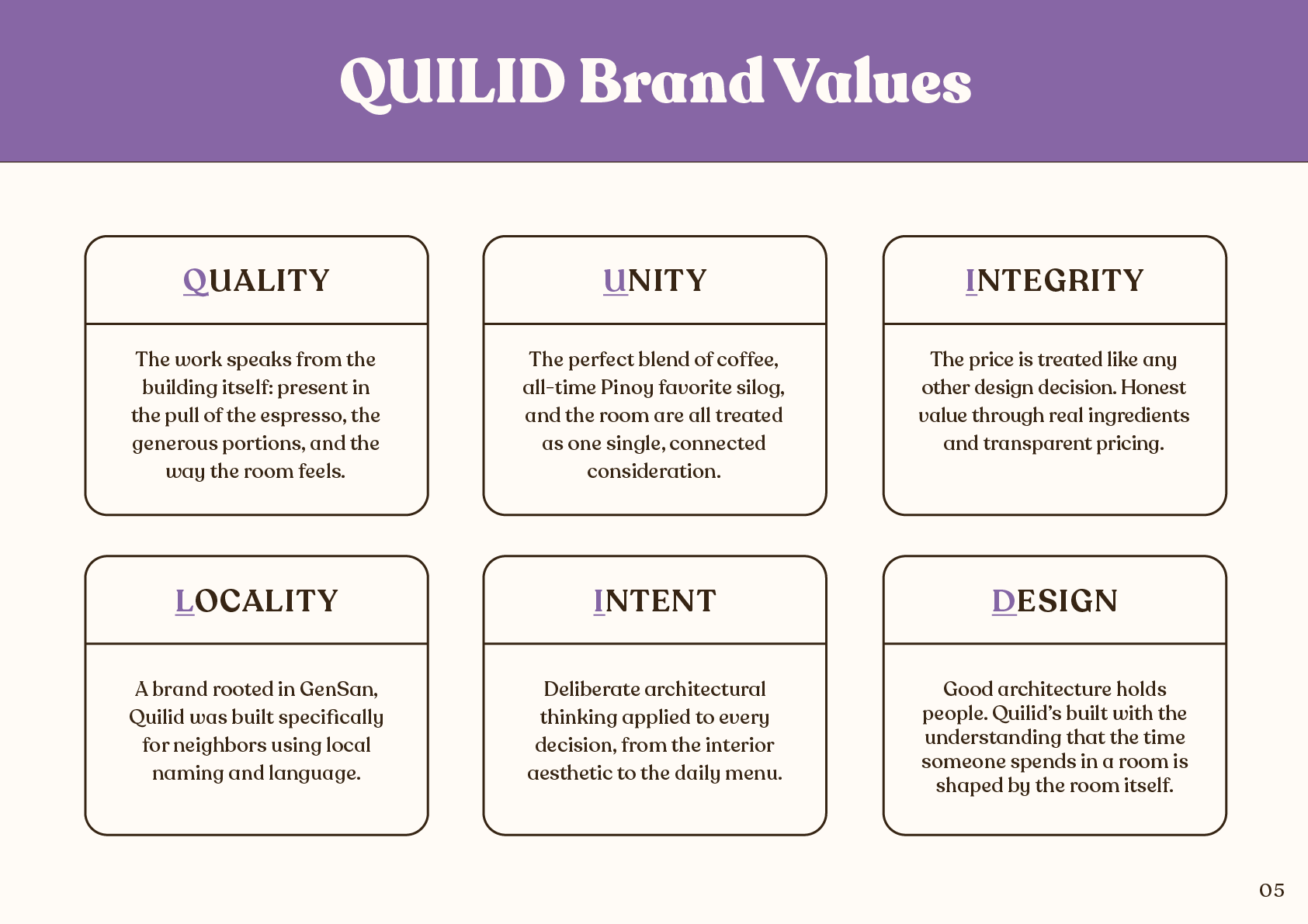
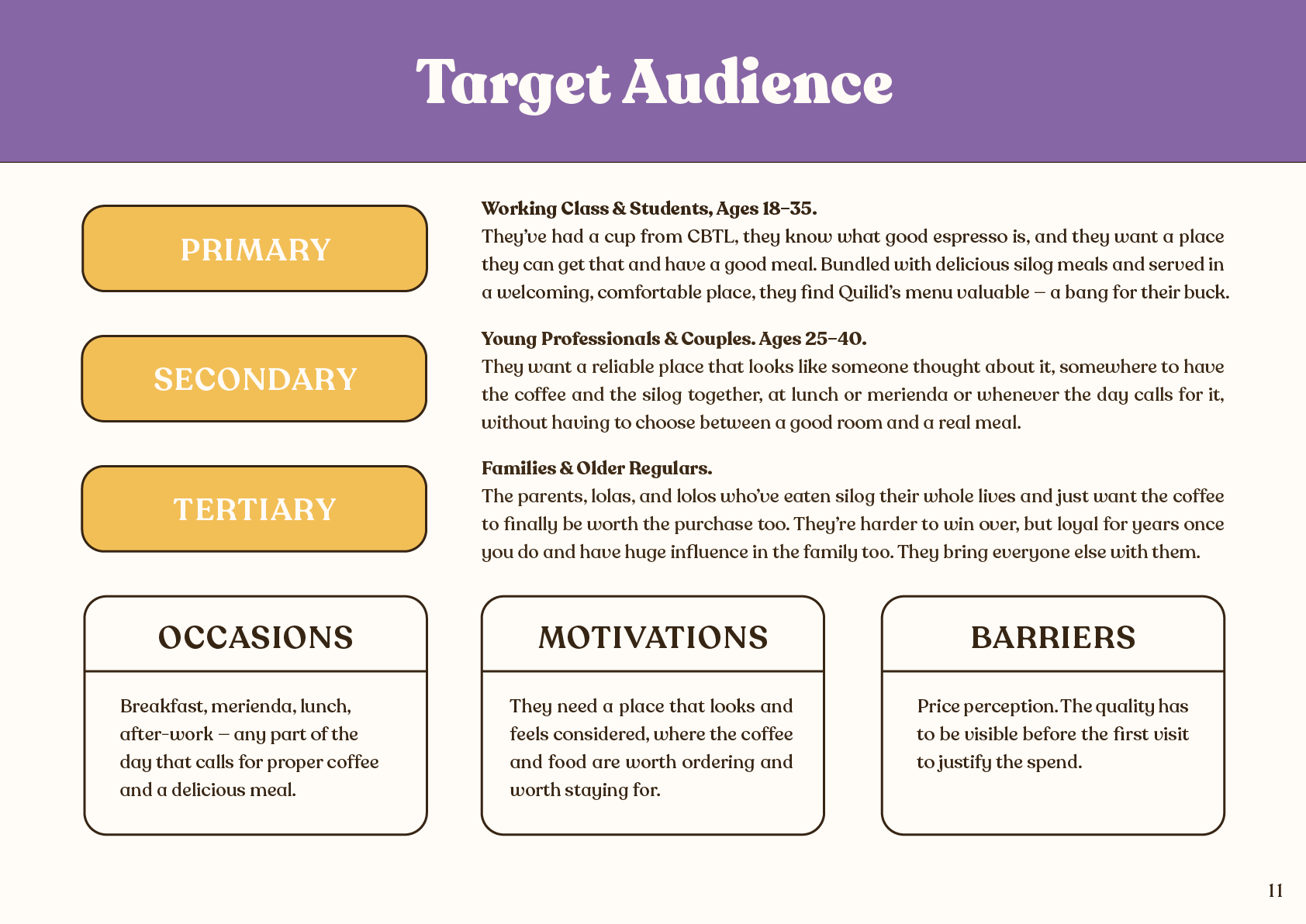
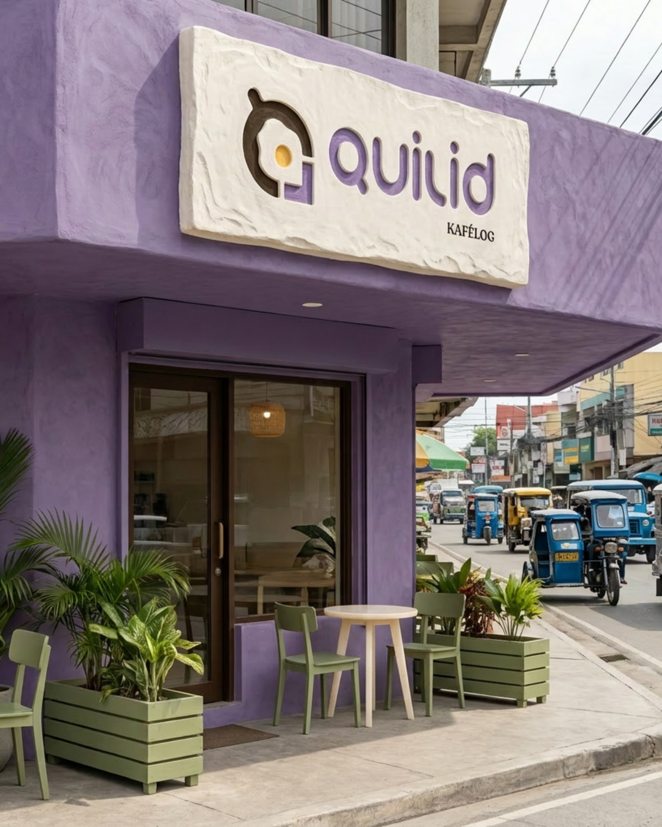
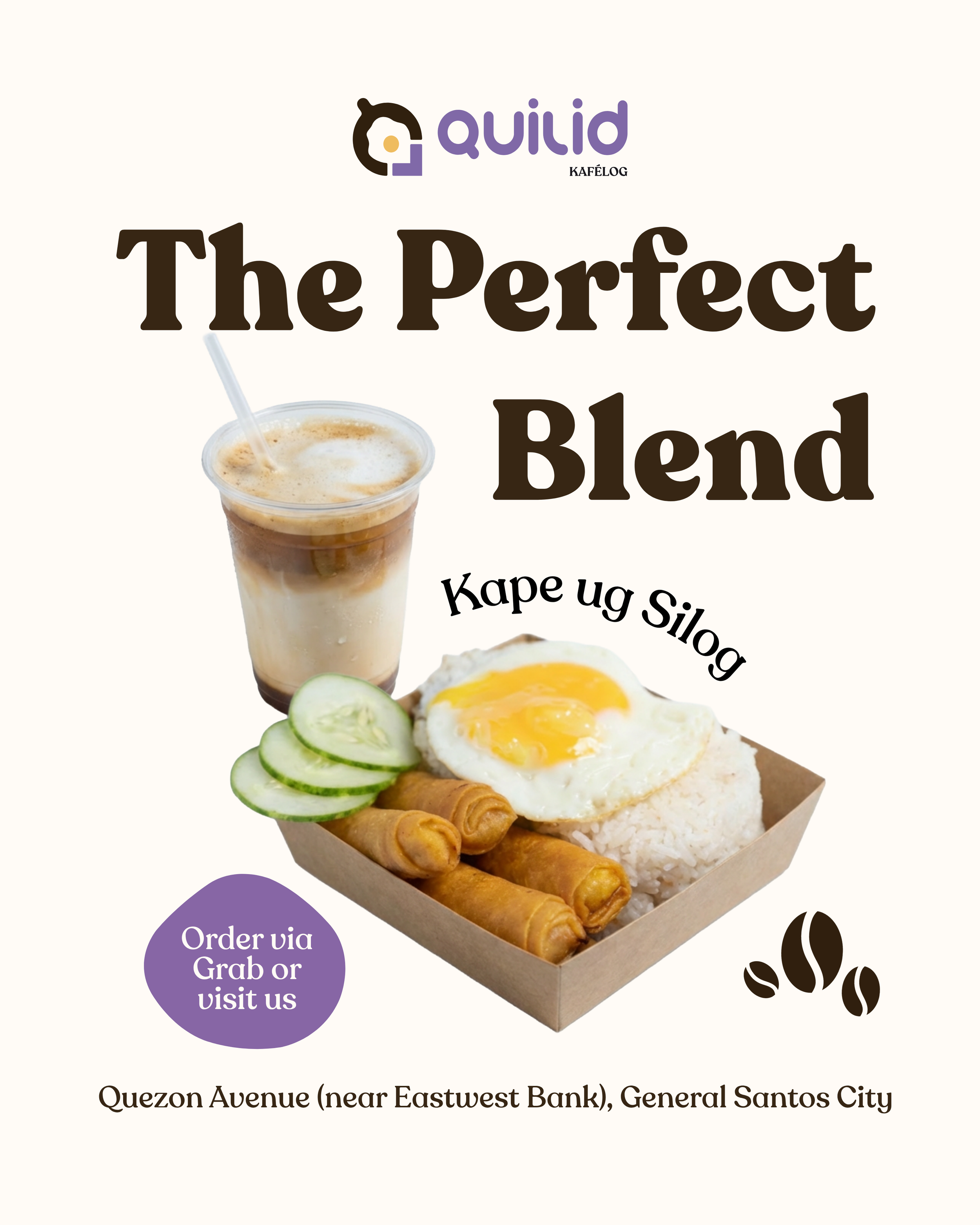
Made for the city’s working class, students, and daily regulars who want proper drinks and meals without the chain markup, Quilid Kafélog started with a couple from General Santos City, Philippines. The Kafélog was a brilliant portmanteau courtesy of the clients, from the words café and silog, the latter itself another portmanteau for a Filipino staple — sinangag (fried rice) and itlog (egg, usually sunny side up egg).
They'd been obsessing over coffee long before they opened a café, dialing in shots at home and even building a whole station just to get every cup right. And they loved silog just as much. But in GenSan, the two never seemed to exist in the same place, at least not well.
So they decided to built that place themselves. As architects, it's the same instinct they bring to a floor plan: find what's missing, then fill it properly.
The Challenge
GenSan already had cafés. It already had silog spots. What it didn't have was a place that took both… seriously.
The goal wasn't to split the difference, it was to build something relatively new — a kafélog: a café and a silog spot in one comfortable place.
On top of that, Quilid needed to stand apart visually in a city where food spaces default to the same “safe” color palette. Purple wasn't chosen for novelty. It was chosen because no one else in GenSan had claimed it yet, and a brand built around a new concept deserved a presence that looked like nothing else in the city.
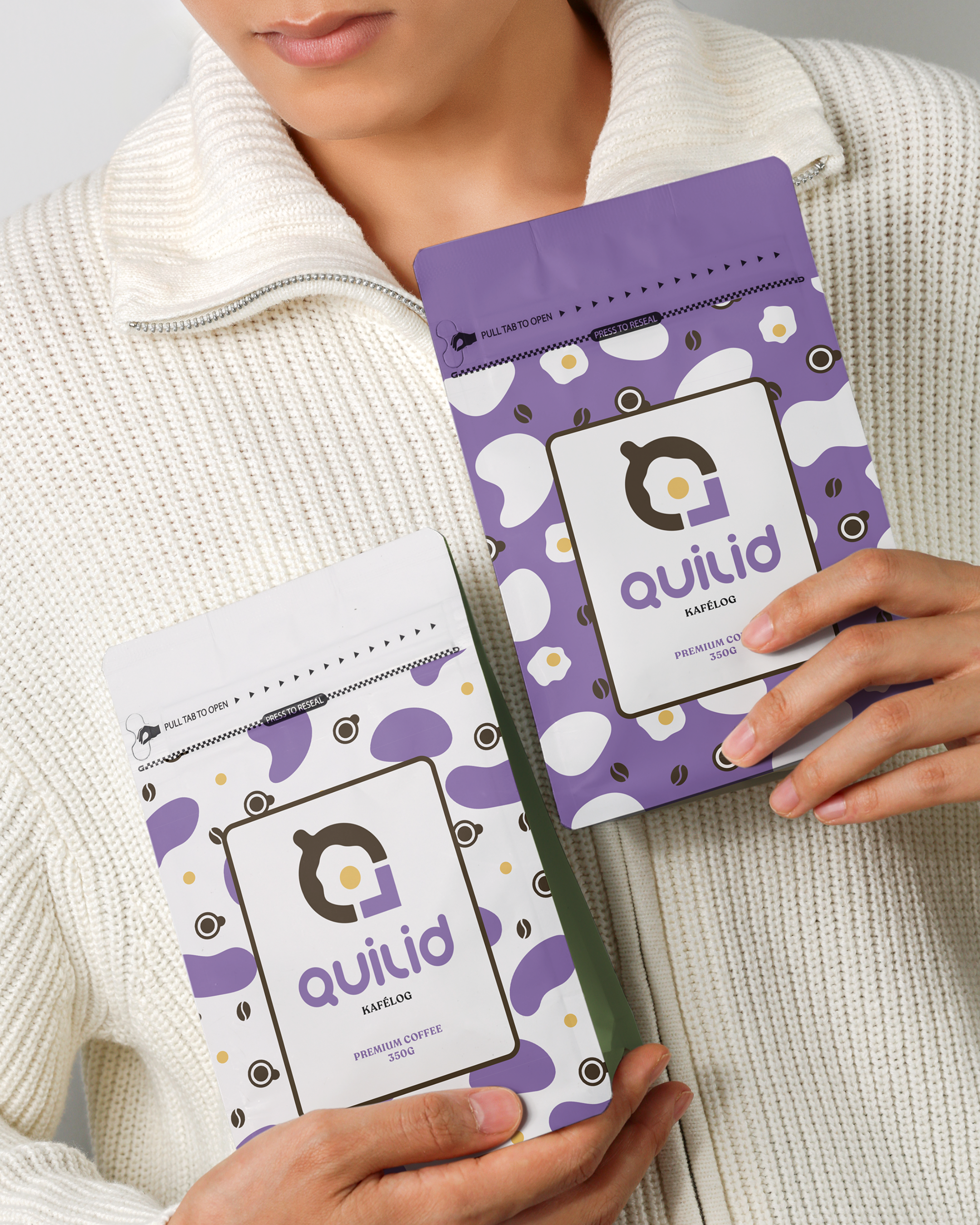
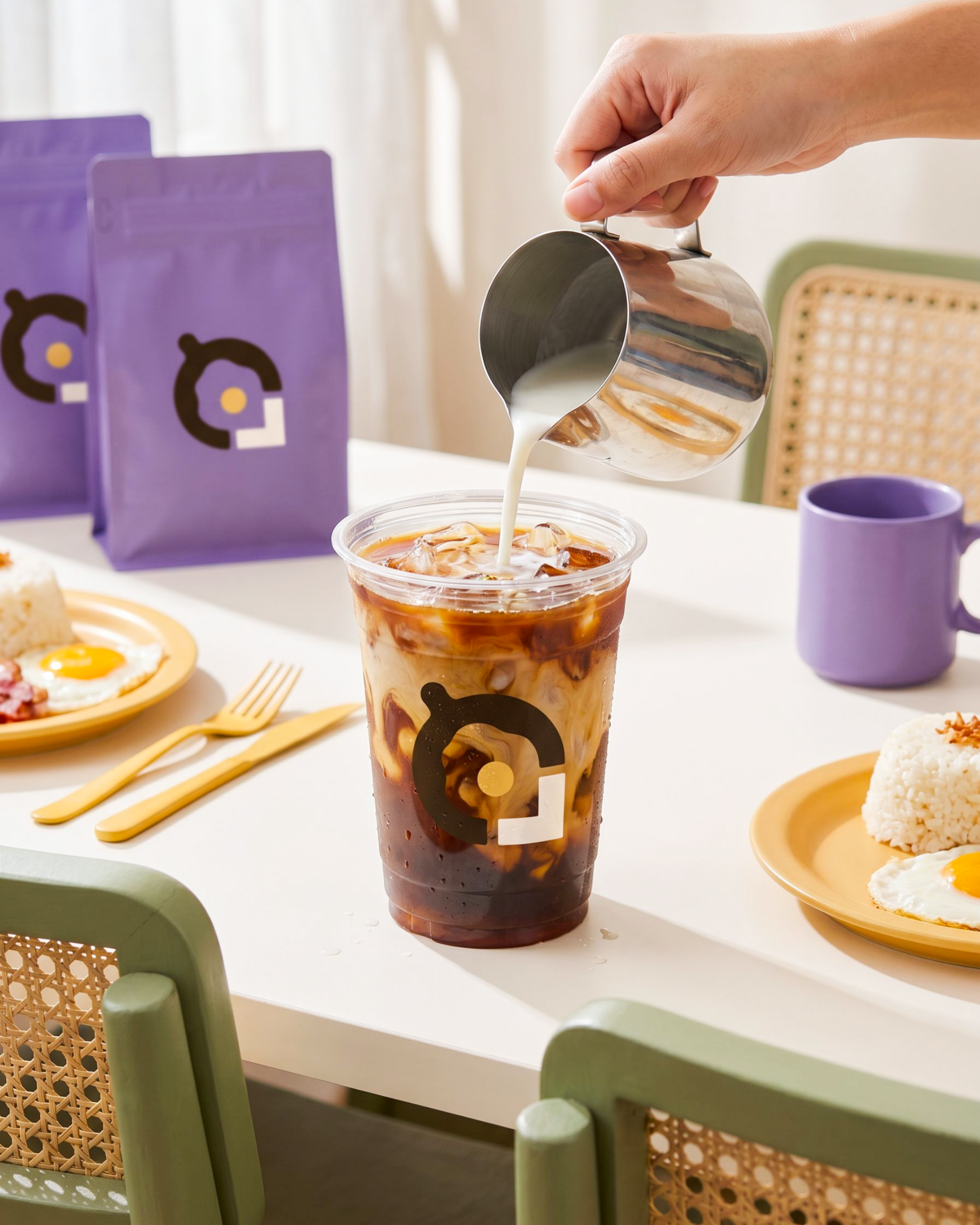
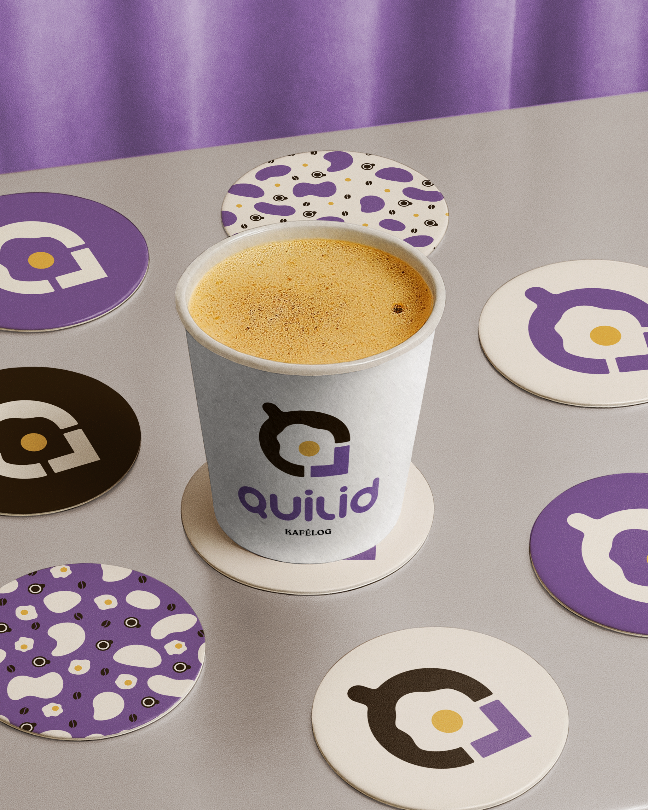
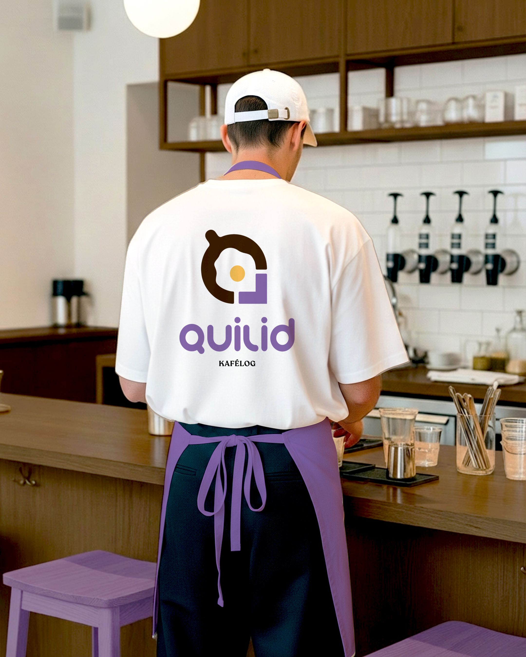
⋆⋅☆⋅⋆ Mockups
⋆⋅☆⋅⋆ Mockups
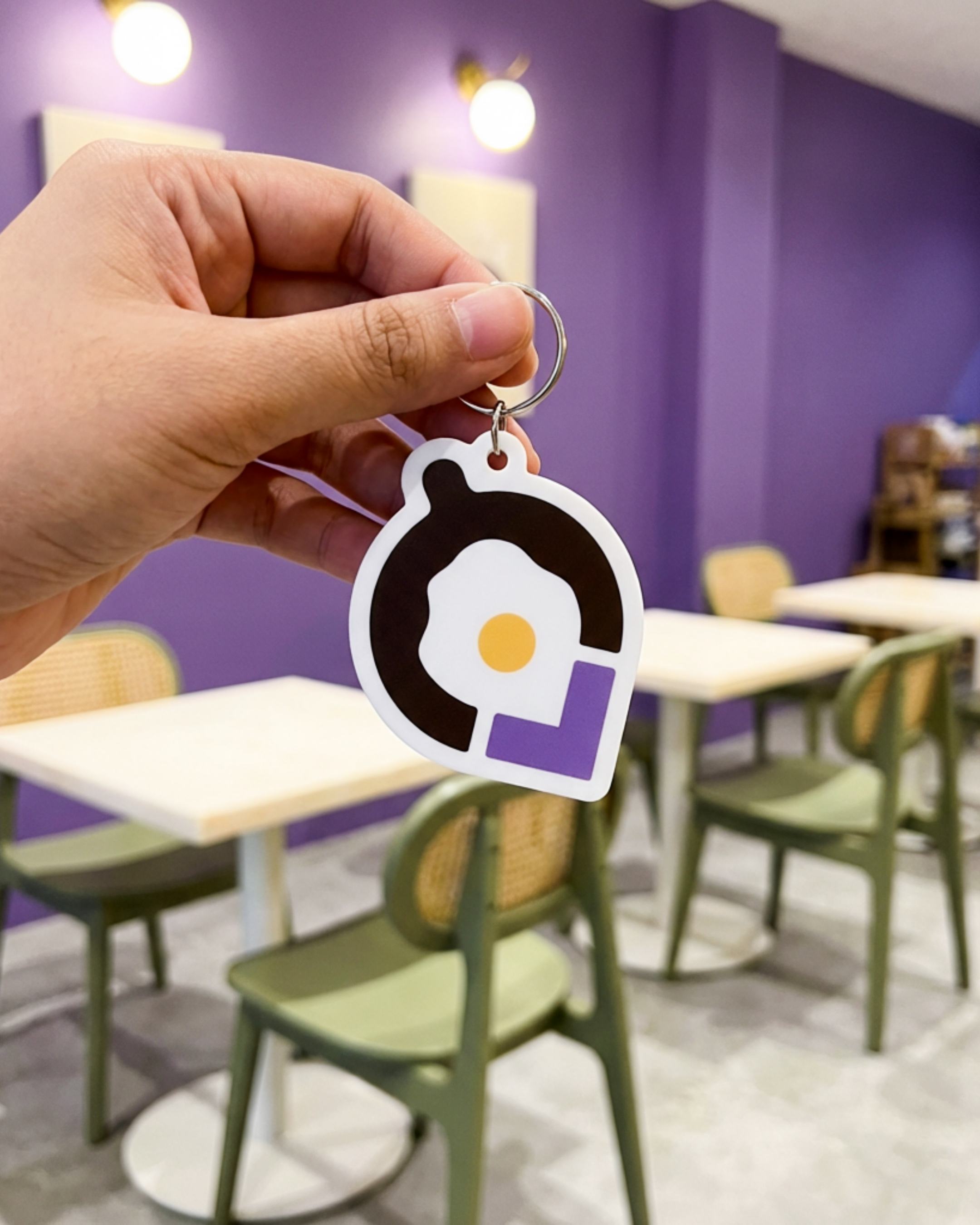
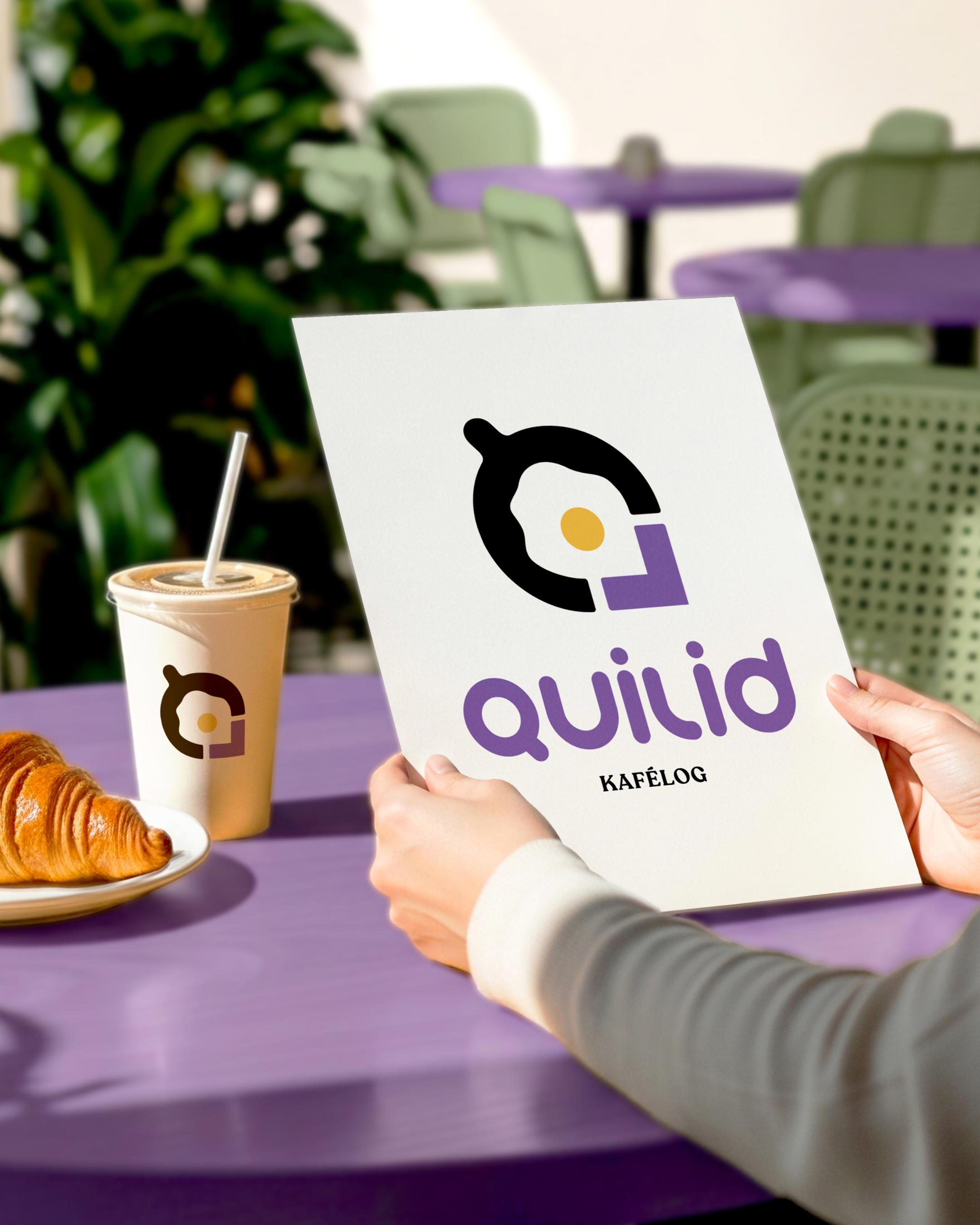
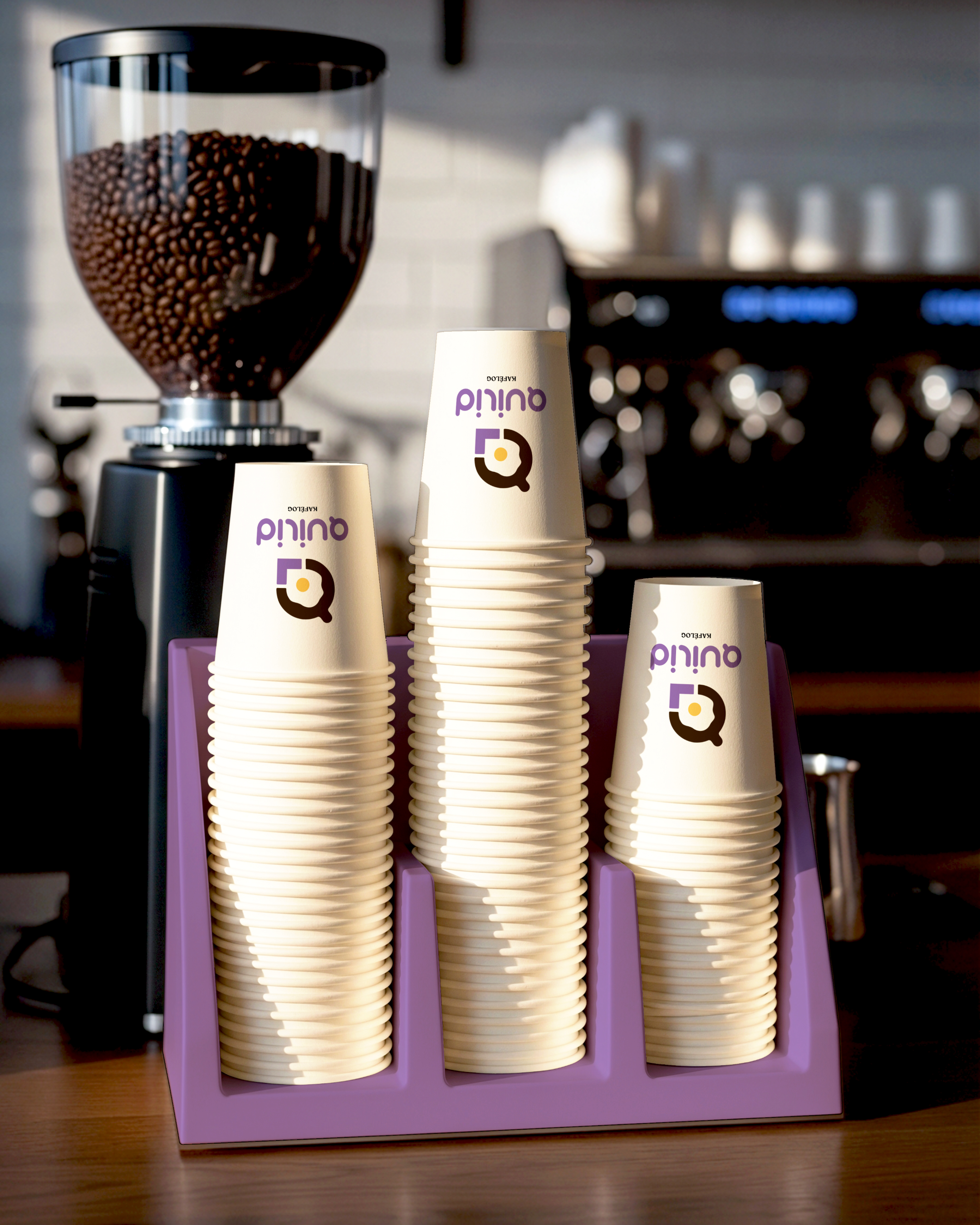
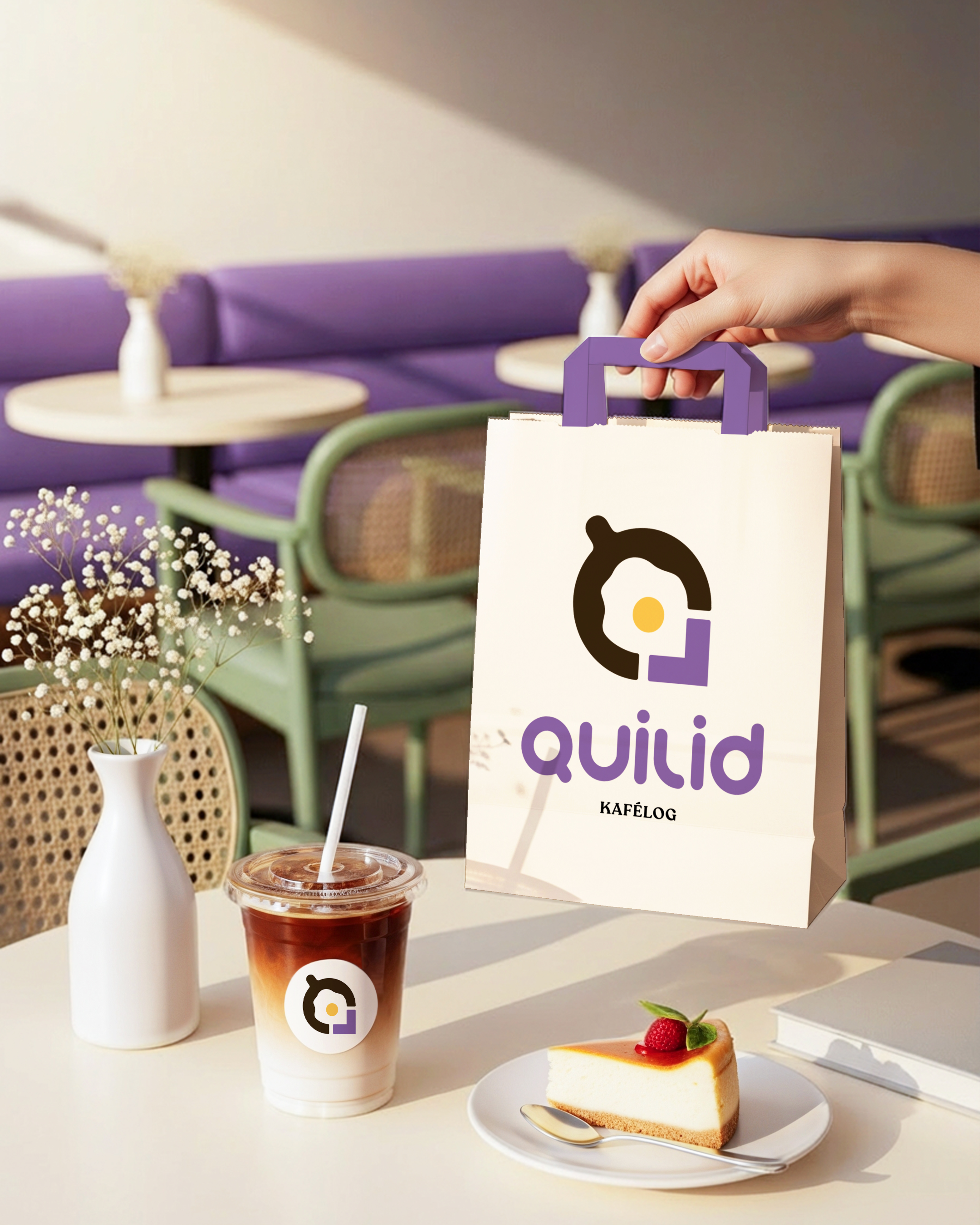
✎﹏ Design Approach
✎﹏ Design Approach
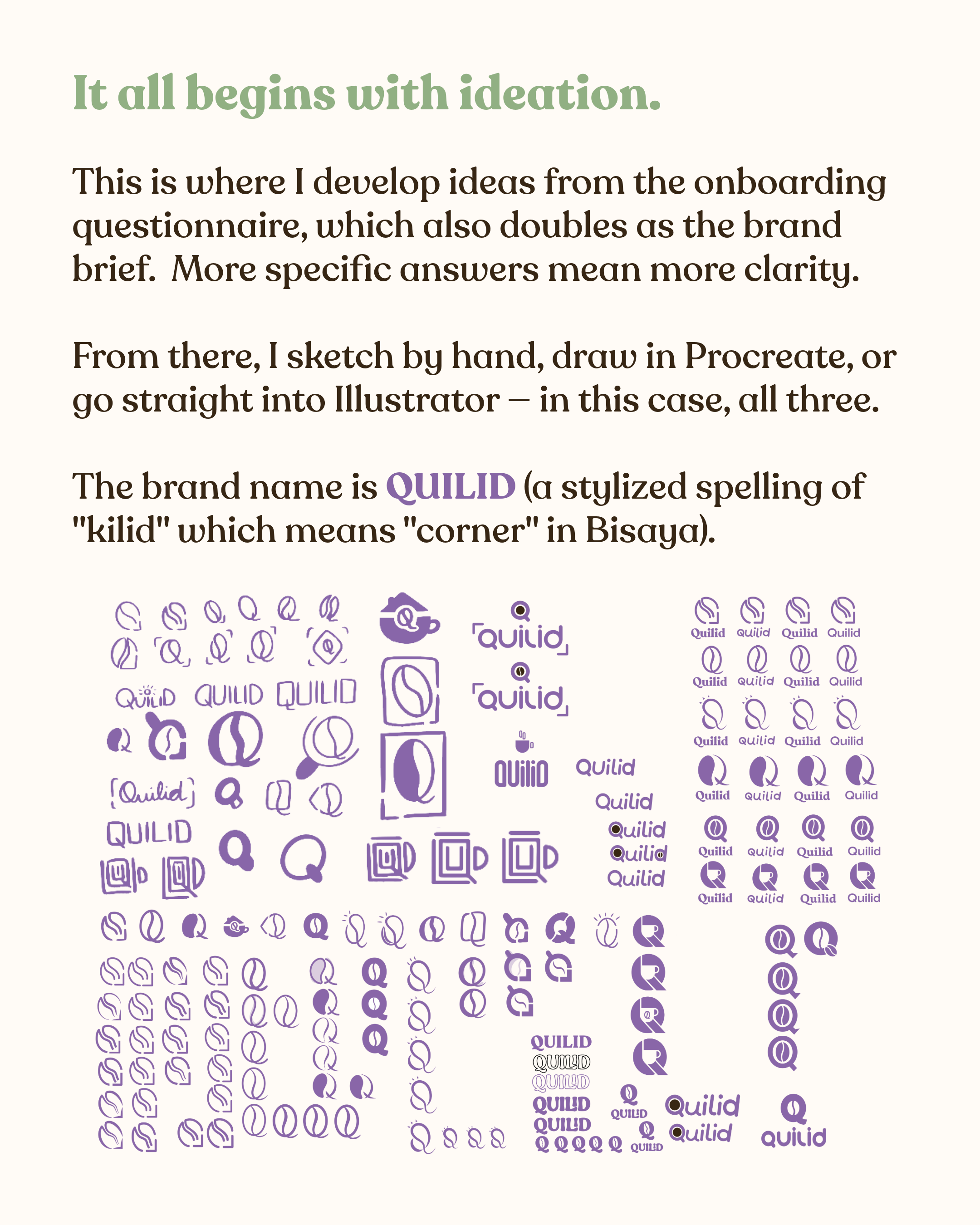
The concept: One question drove everything: How can you build a brand that differentiates it from existing competitors, in a saturated market? I found that the answer was: keep it true to the story and make it stand out with every move — logo, colors, font, even the menu copy.
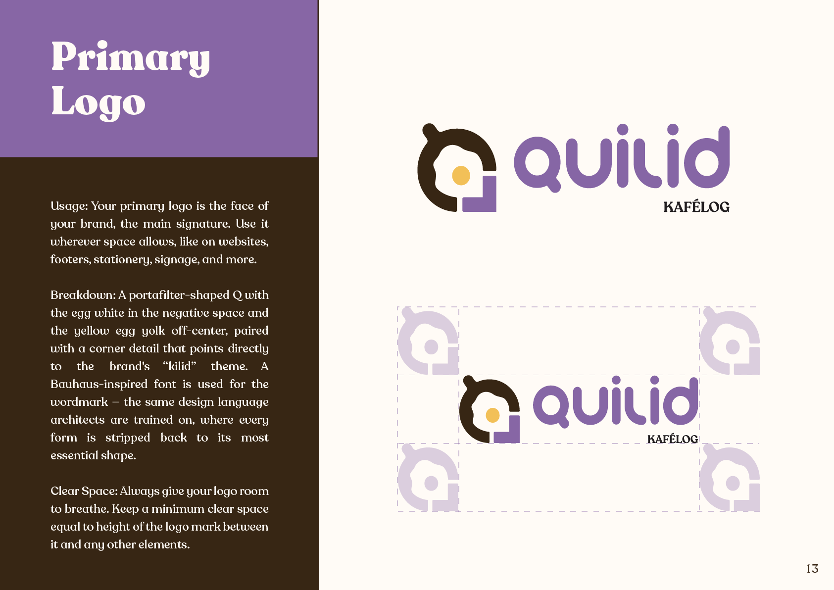
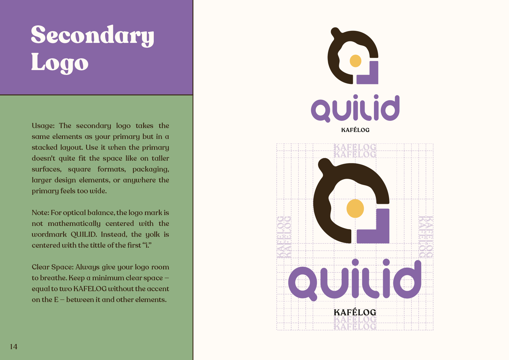
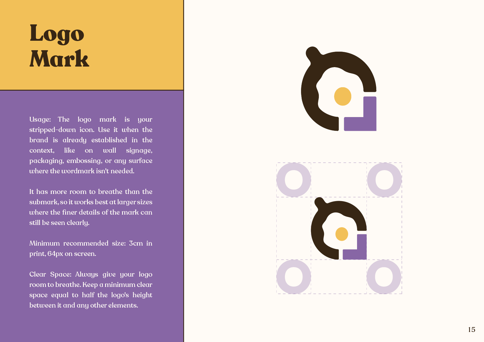
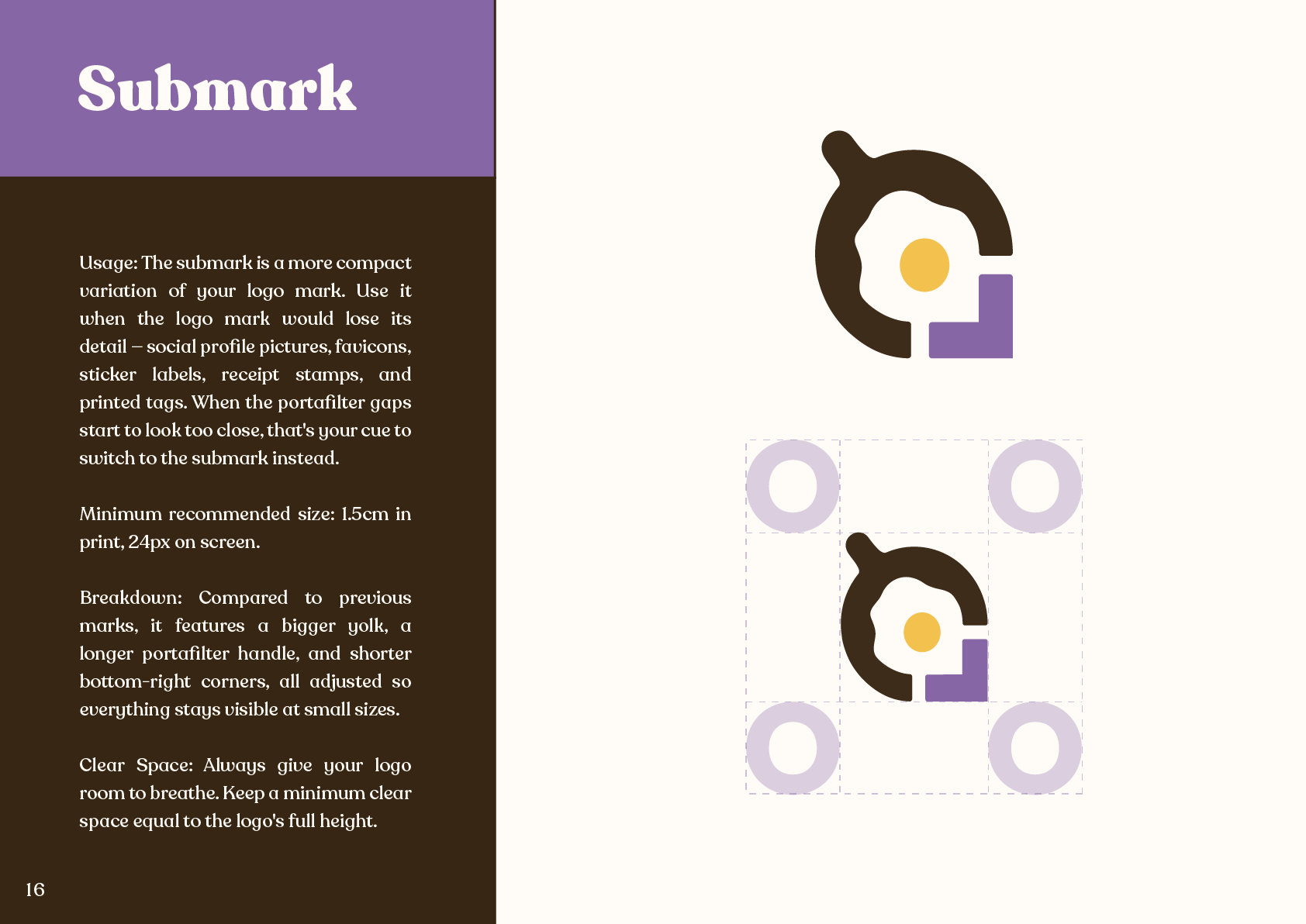
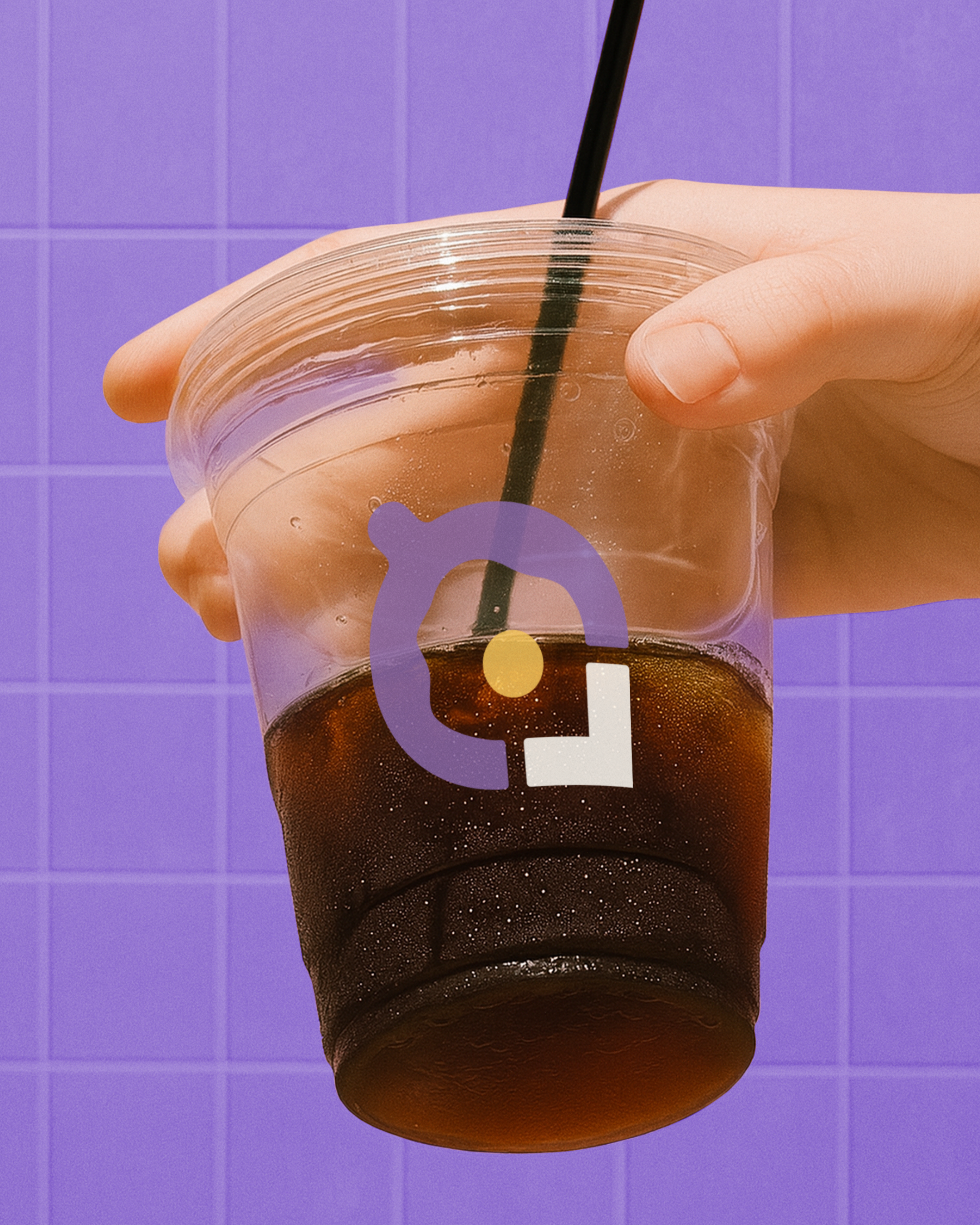
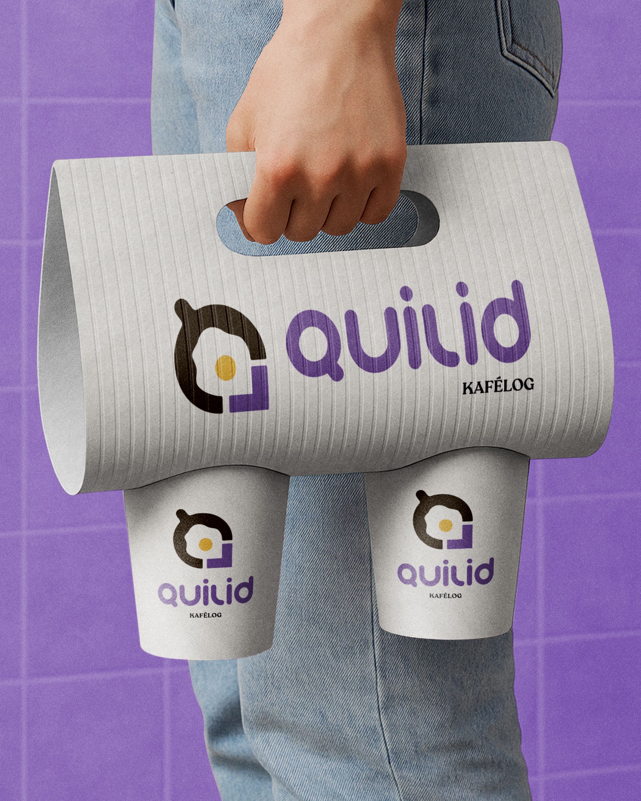
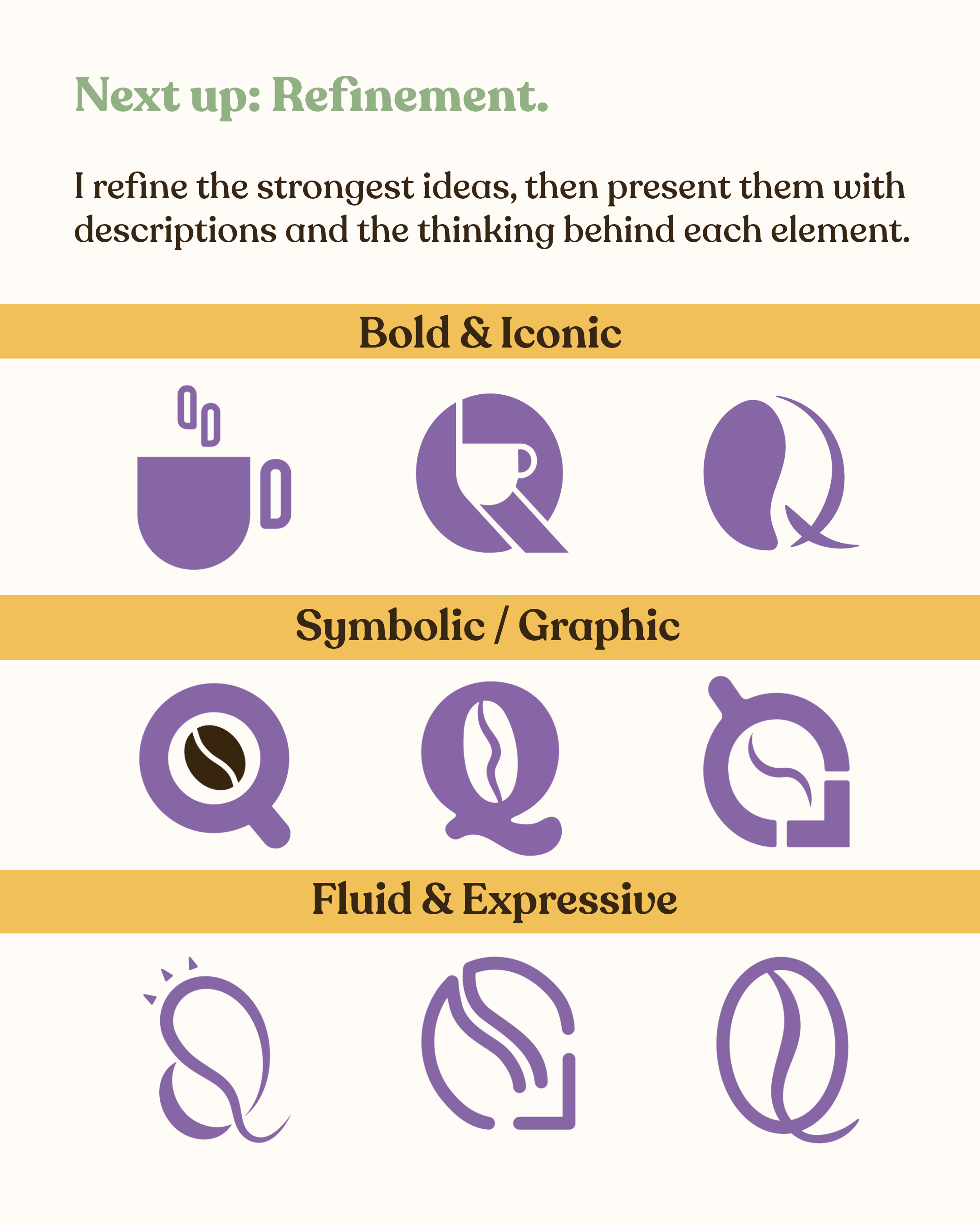
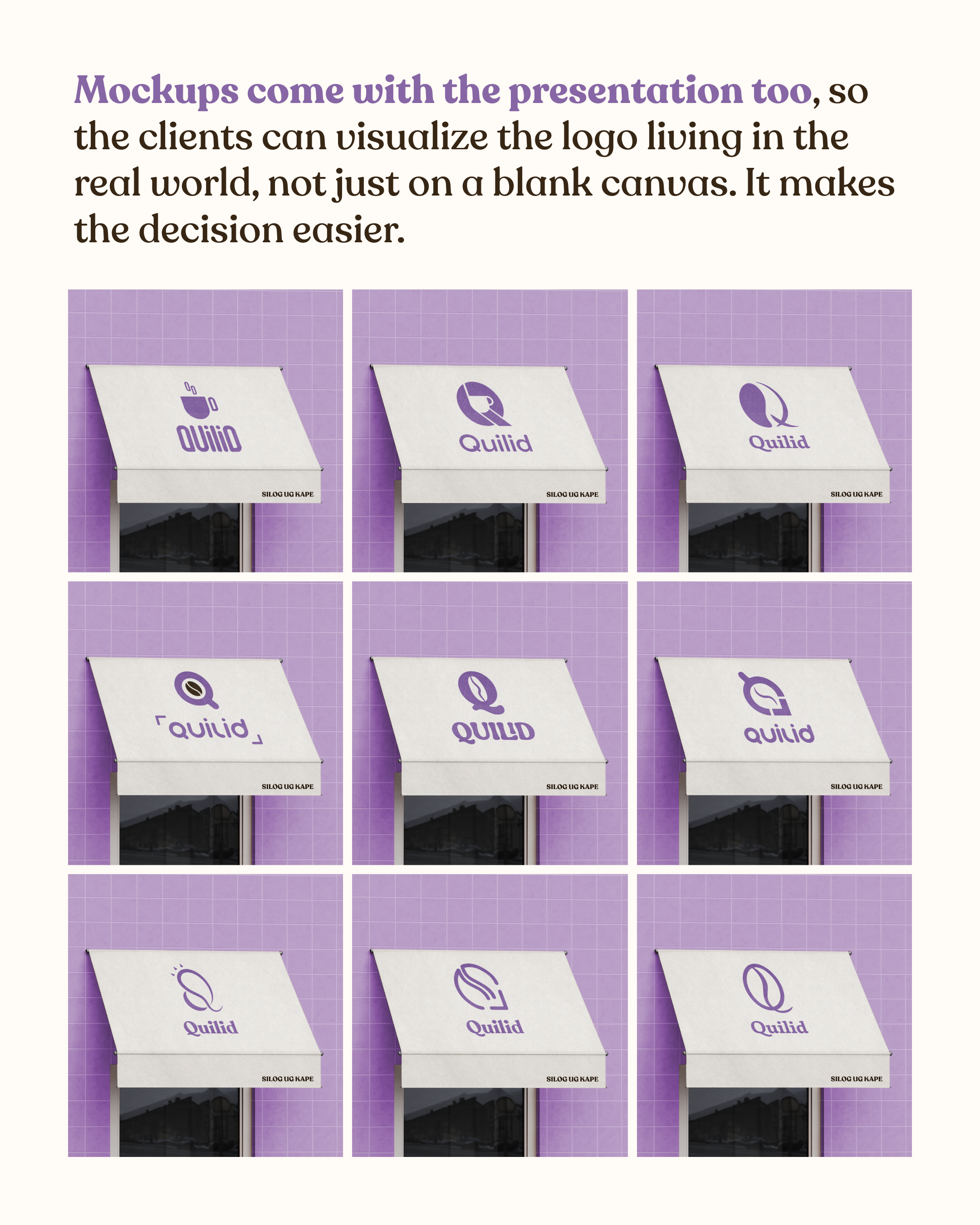
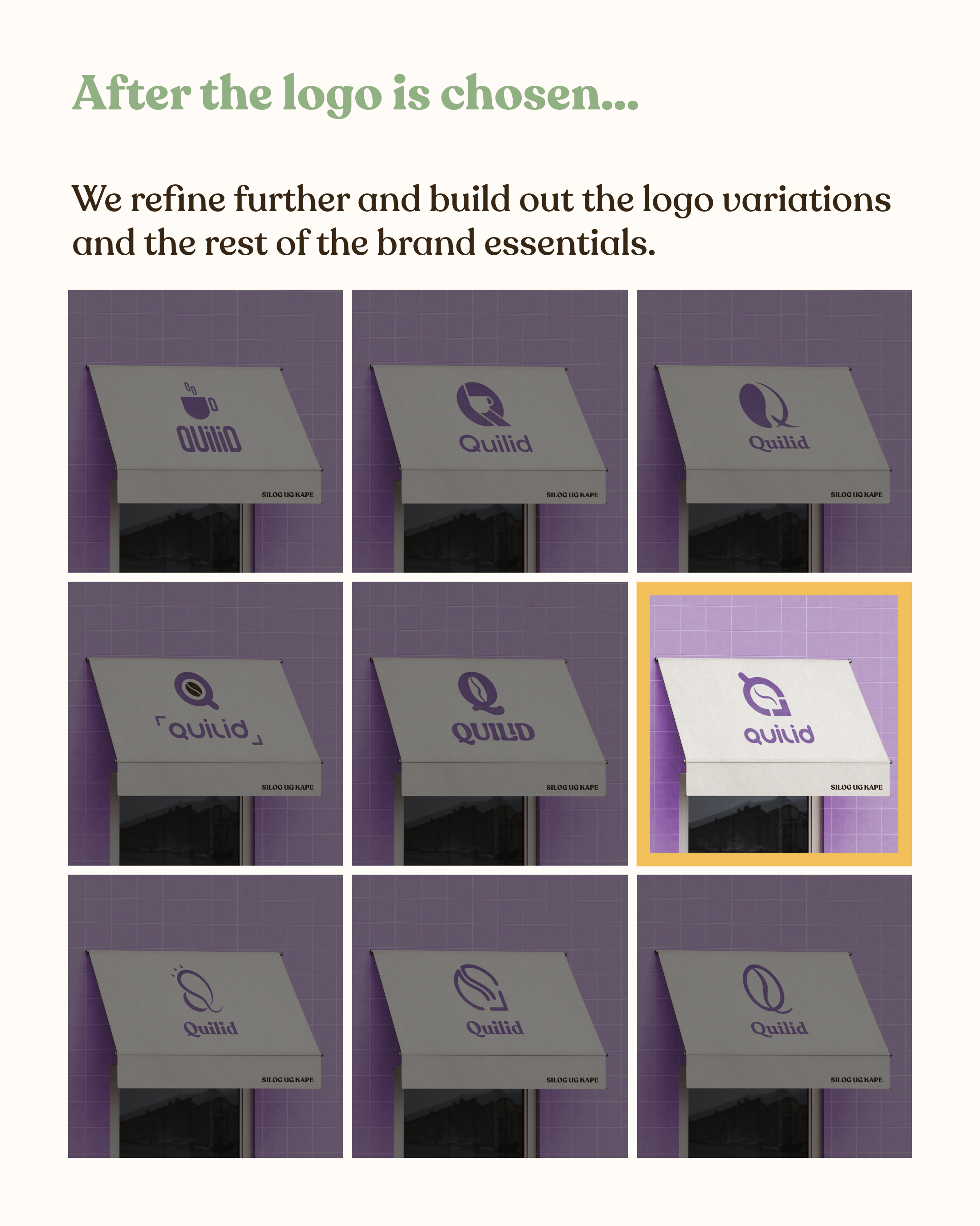
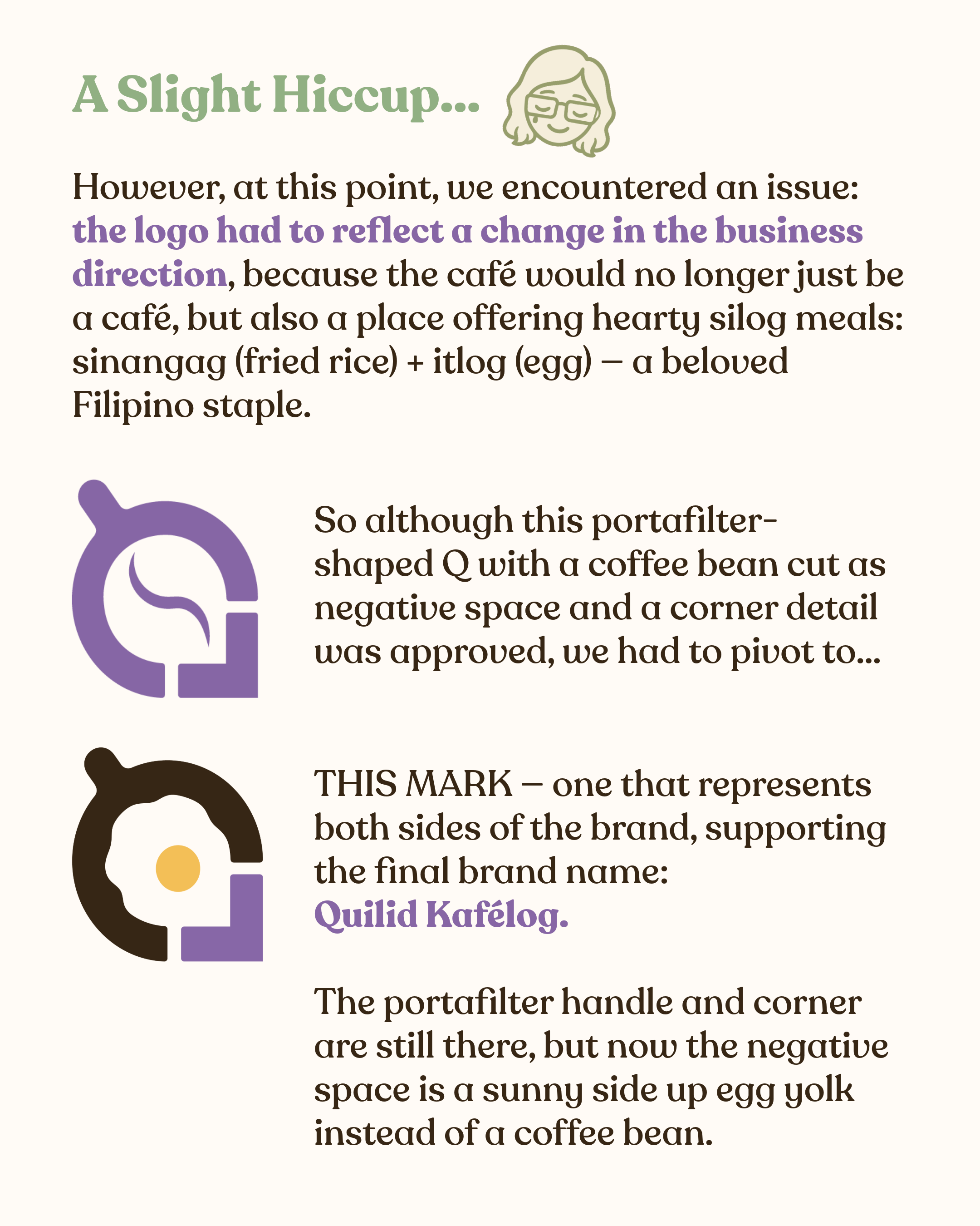
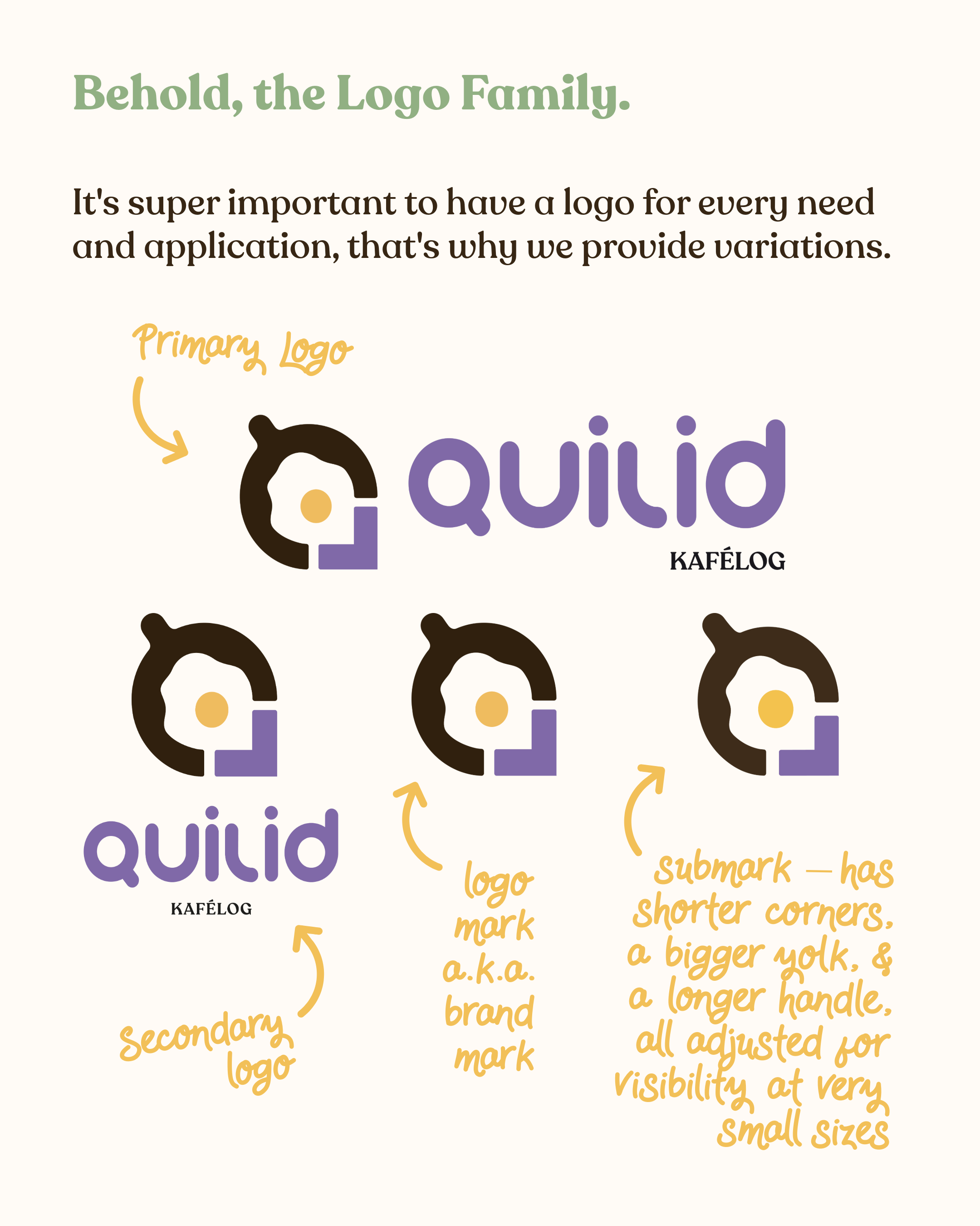
The logo: Bauhaus-inspired, which made sense for a brand built by architects, the logo symbolizes both the café and silog resto side of the brand. More details below!
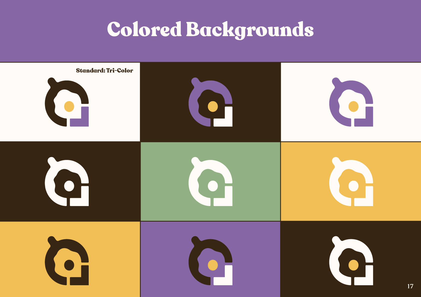
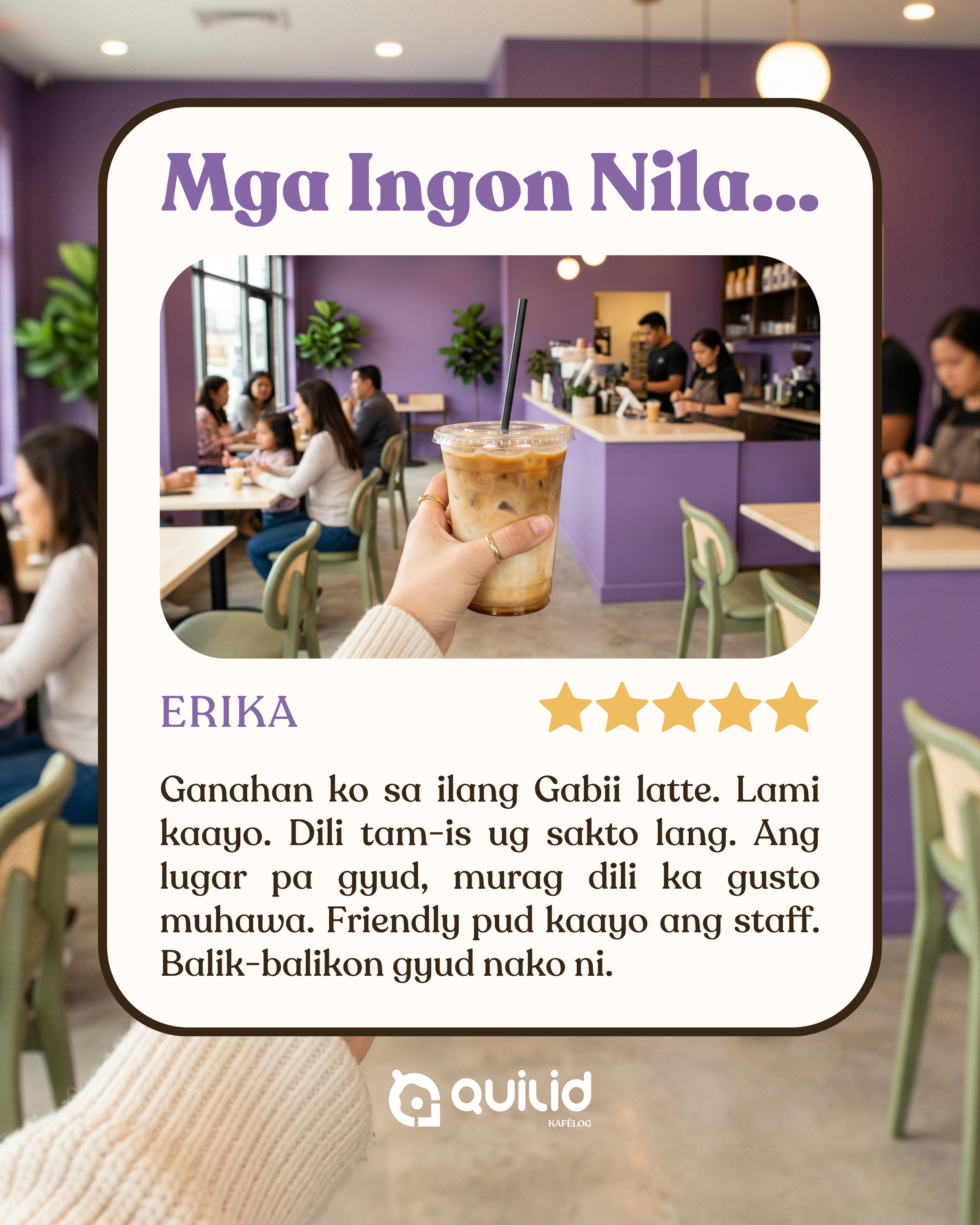
The colors: Purple leads because no other café in General Santos had claimed it. A brand introducing a new concept needed to look like nothing else in the city. The rest of the palette — deep espresso brown, warm alabaster, muted olive, and soft yolk yellow — keeps it grounded and warm.
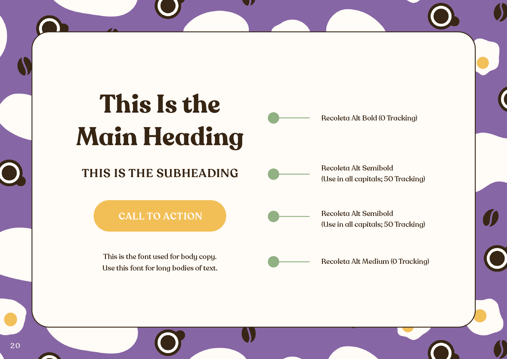
The typography: Warm and rounded, I chose Recoleta Alt (not the "Recoleta") that softened the boldness of the purple without losing the confidence. It also made the brand more approachable, setting the tone and supporting the brand positioning itself. After all, it is the place everyone comes back to.
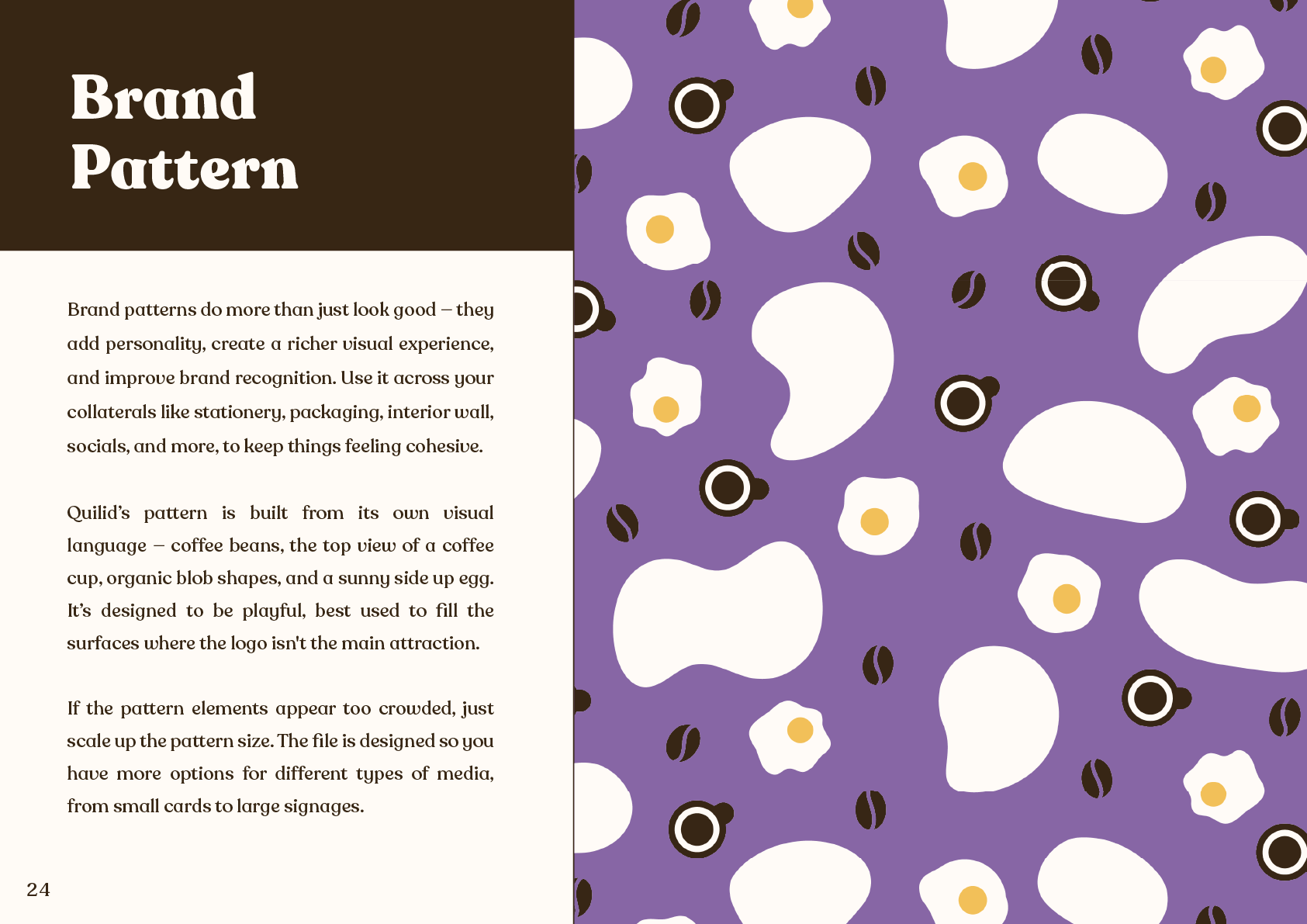
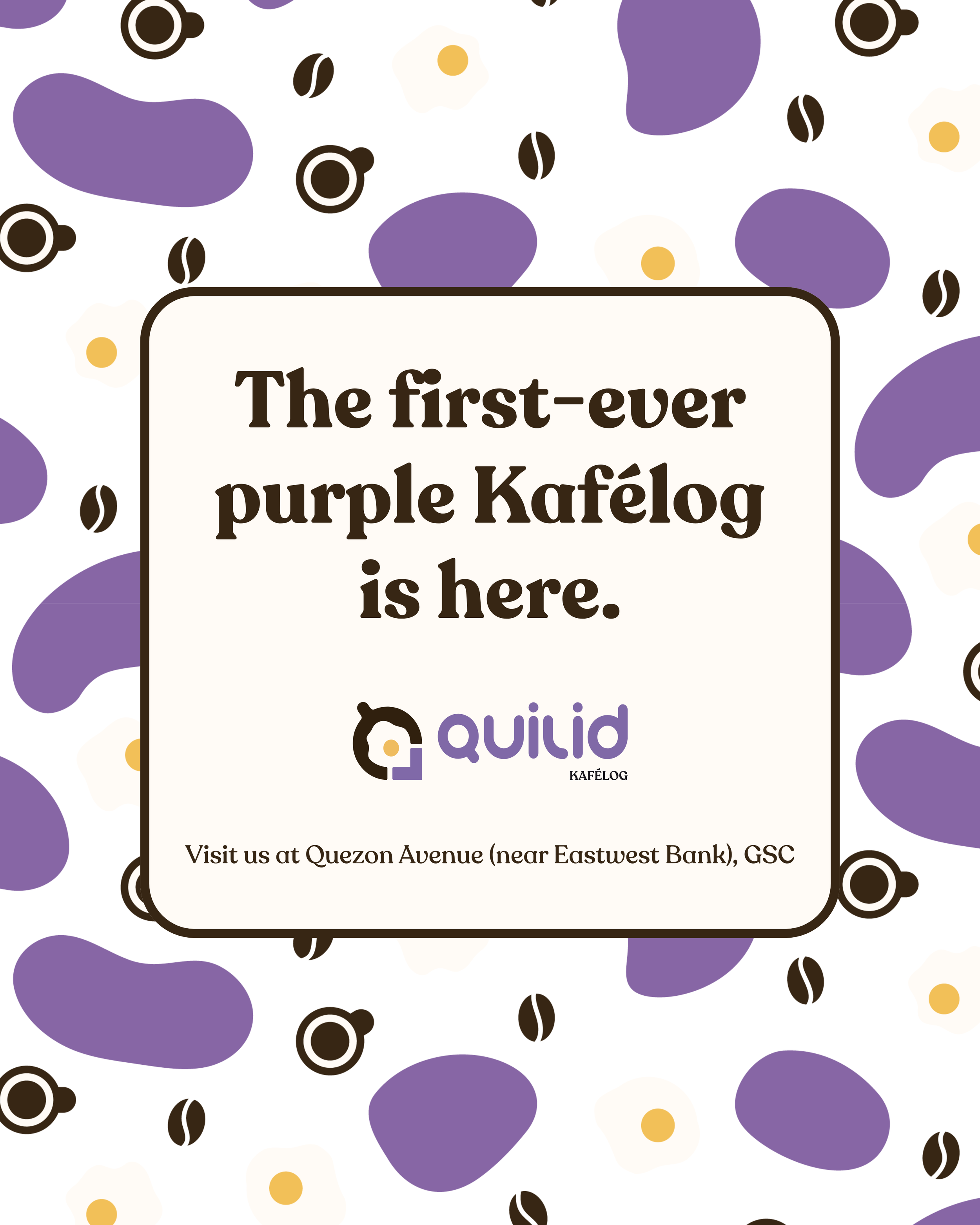
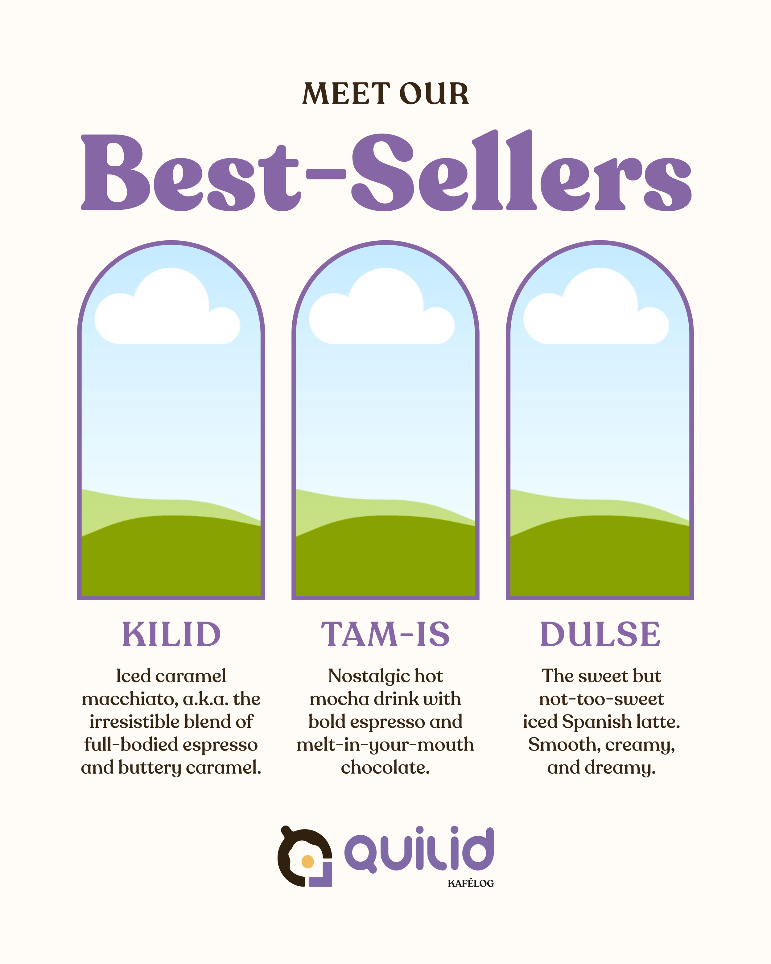
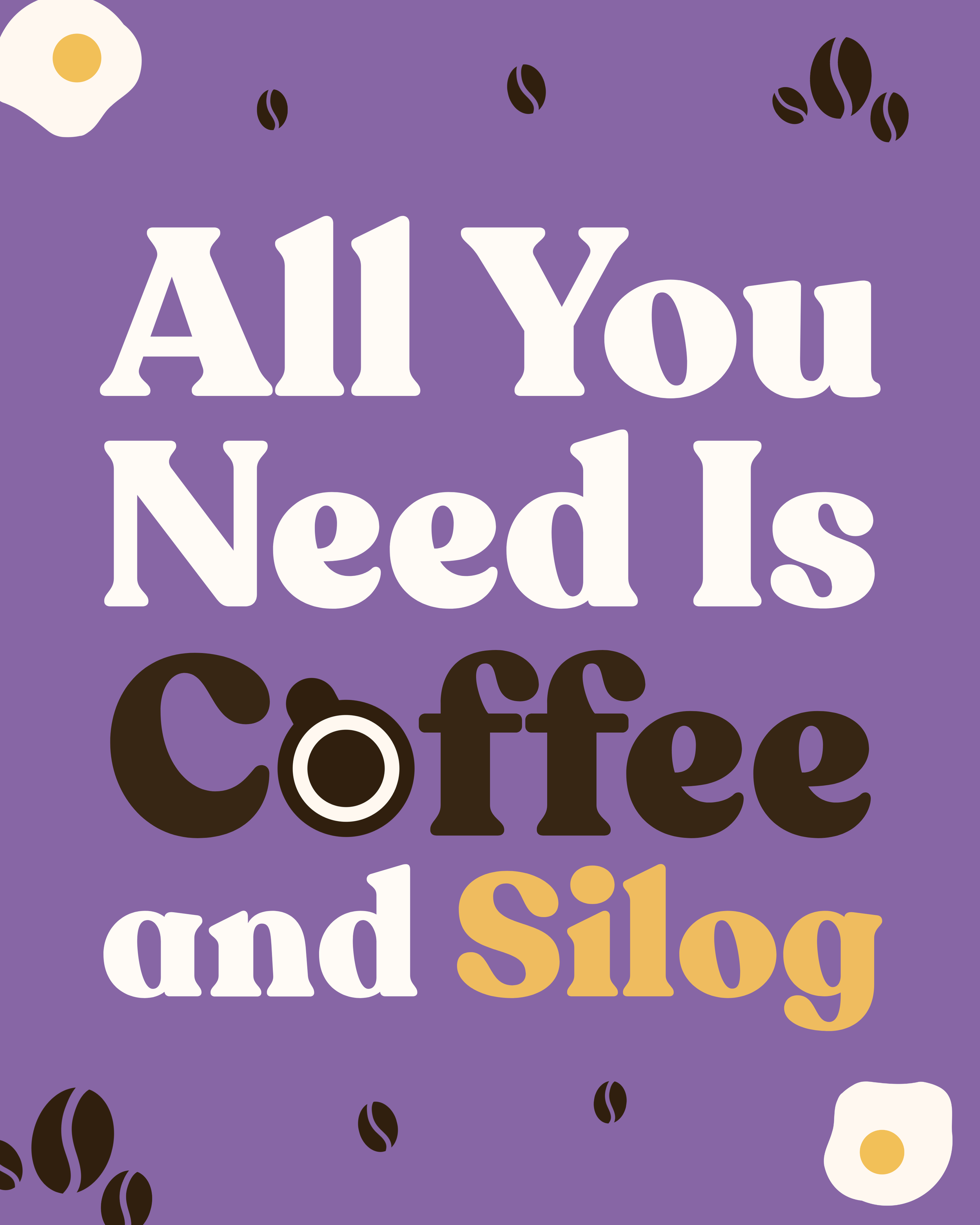
The brand pattern: Comprised of coffee beans, top view coffee cup, blob shapes that symbolize architecture, and a sunny side up egg. It's playful, built to fill surfaces where the logo isn't the main attraction.
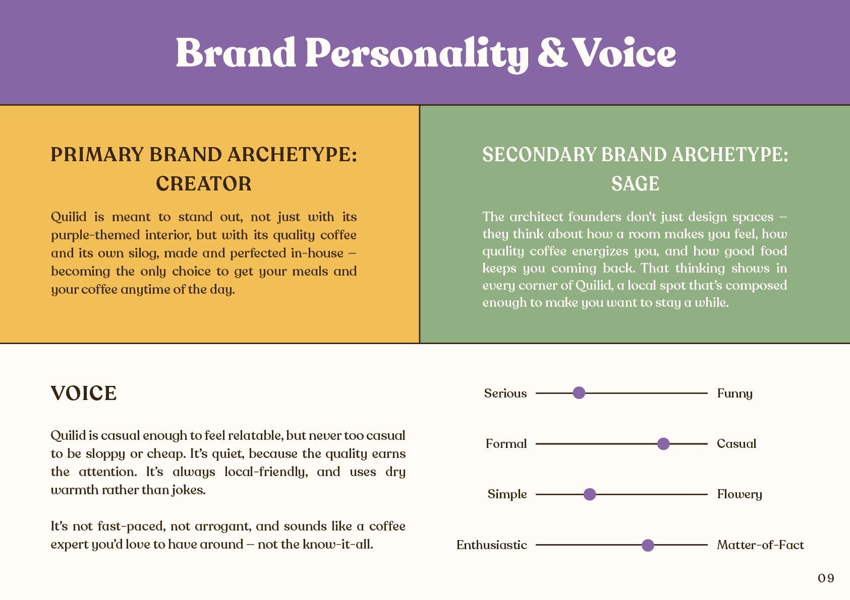
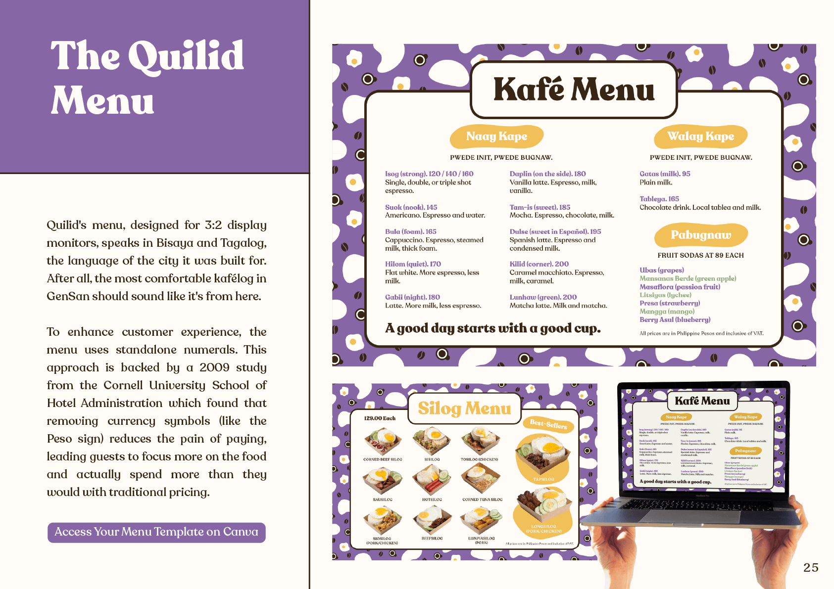
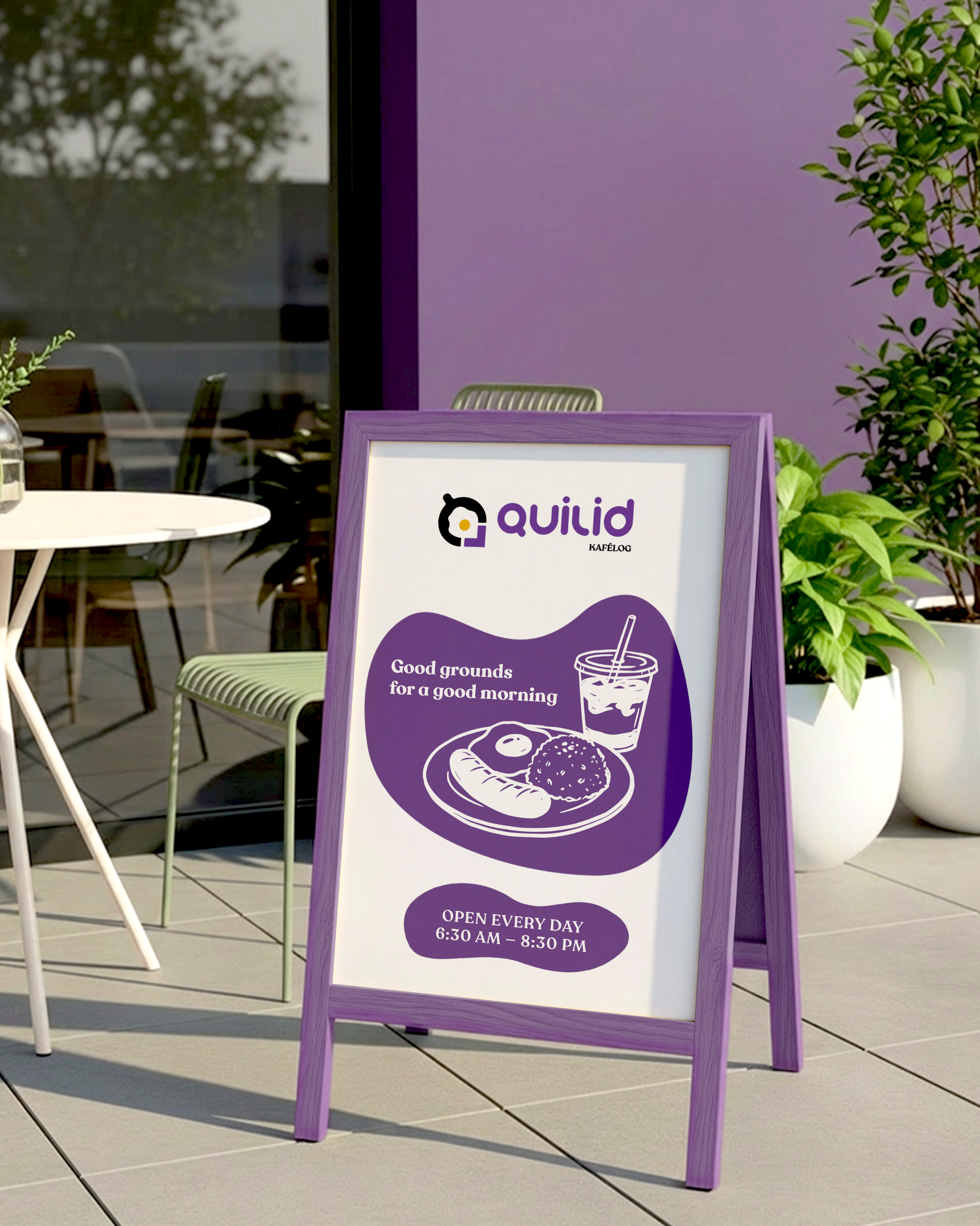
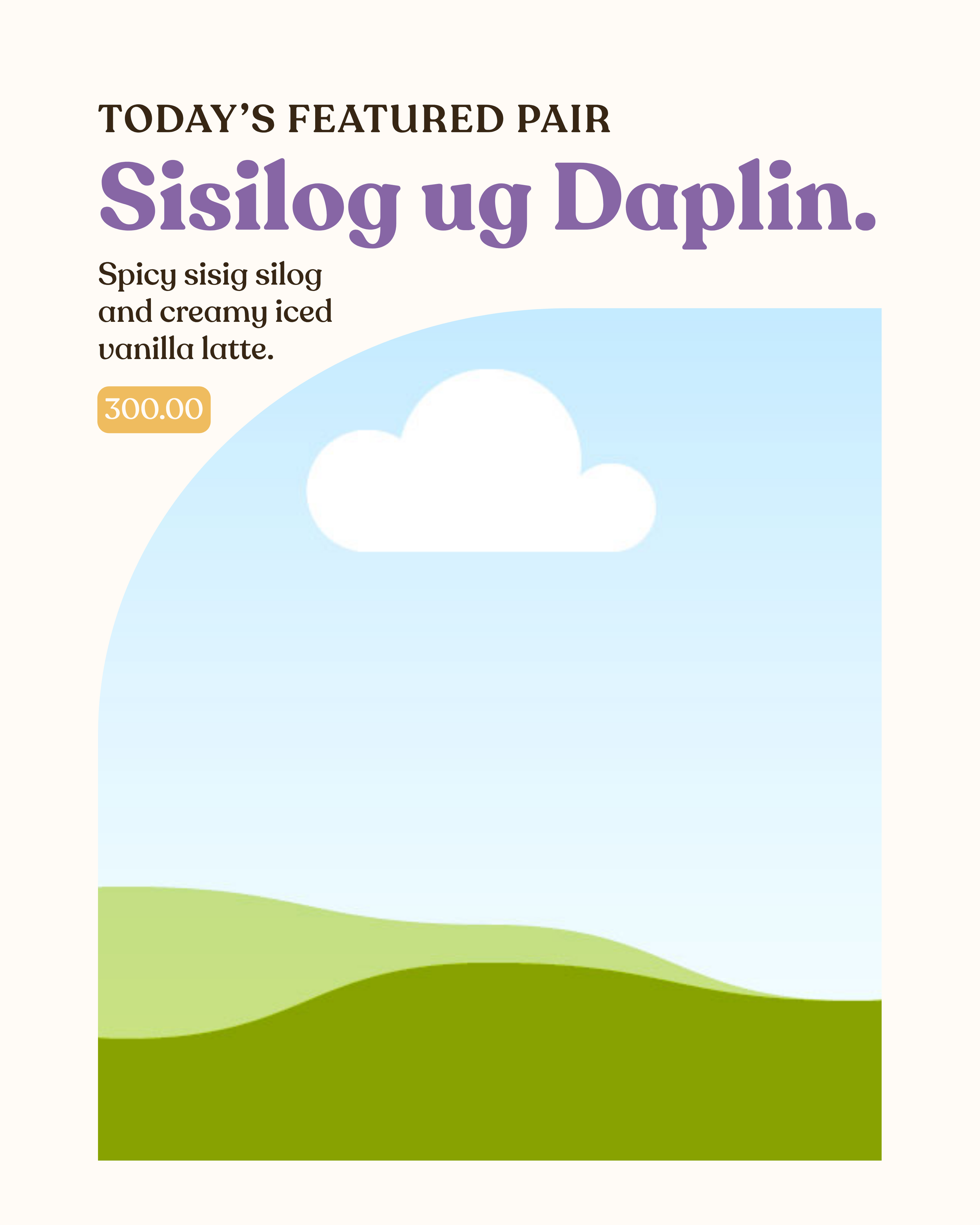
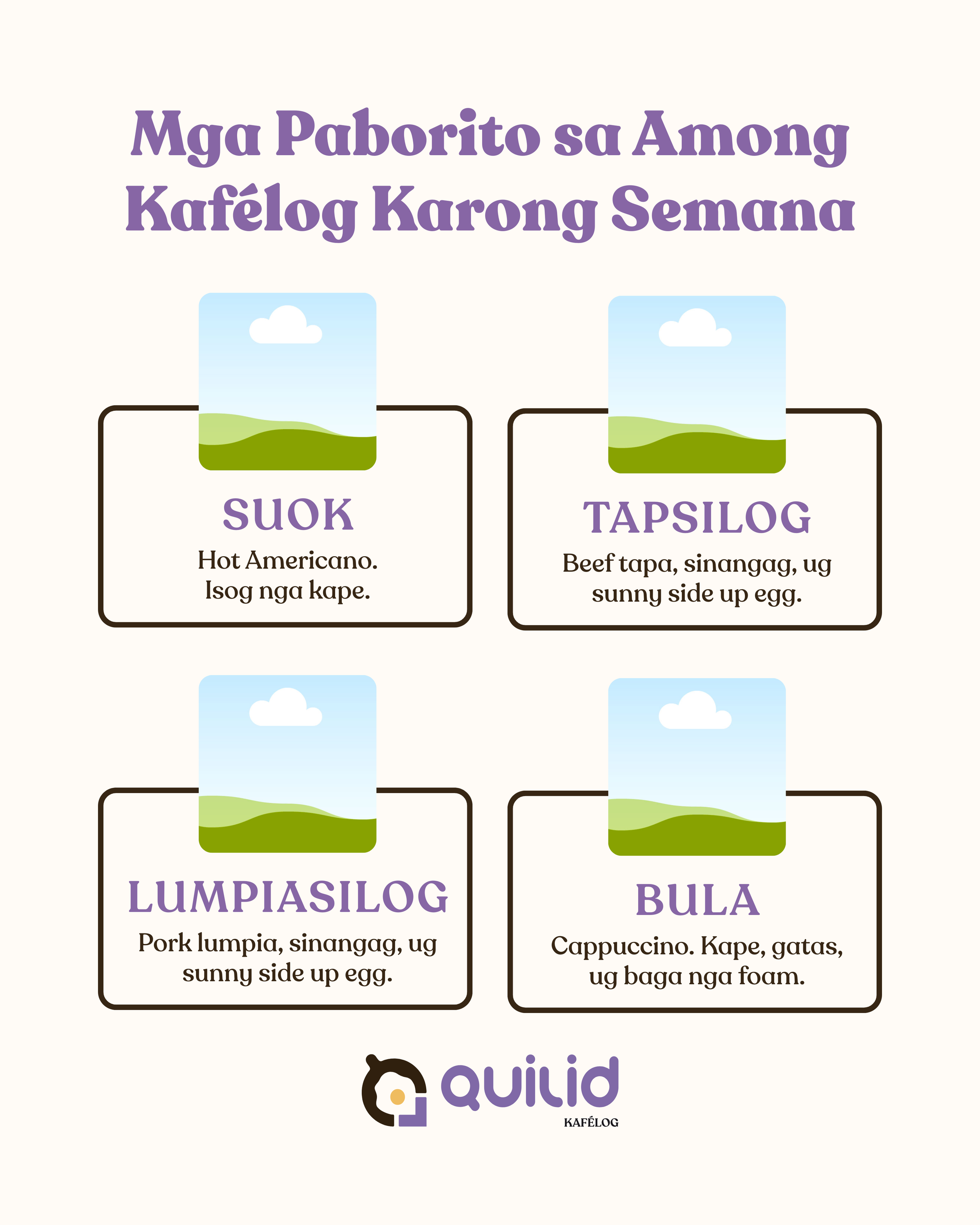
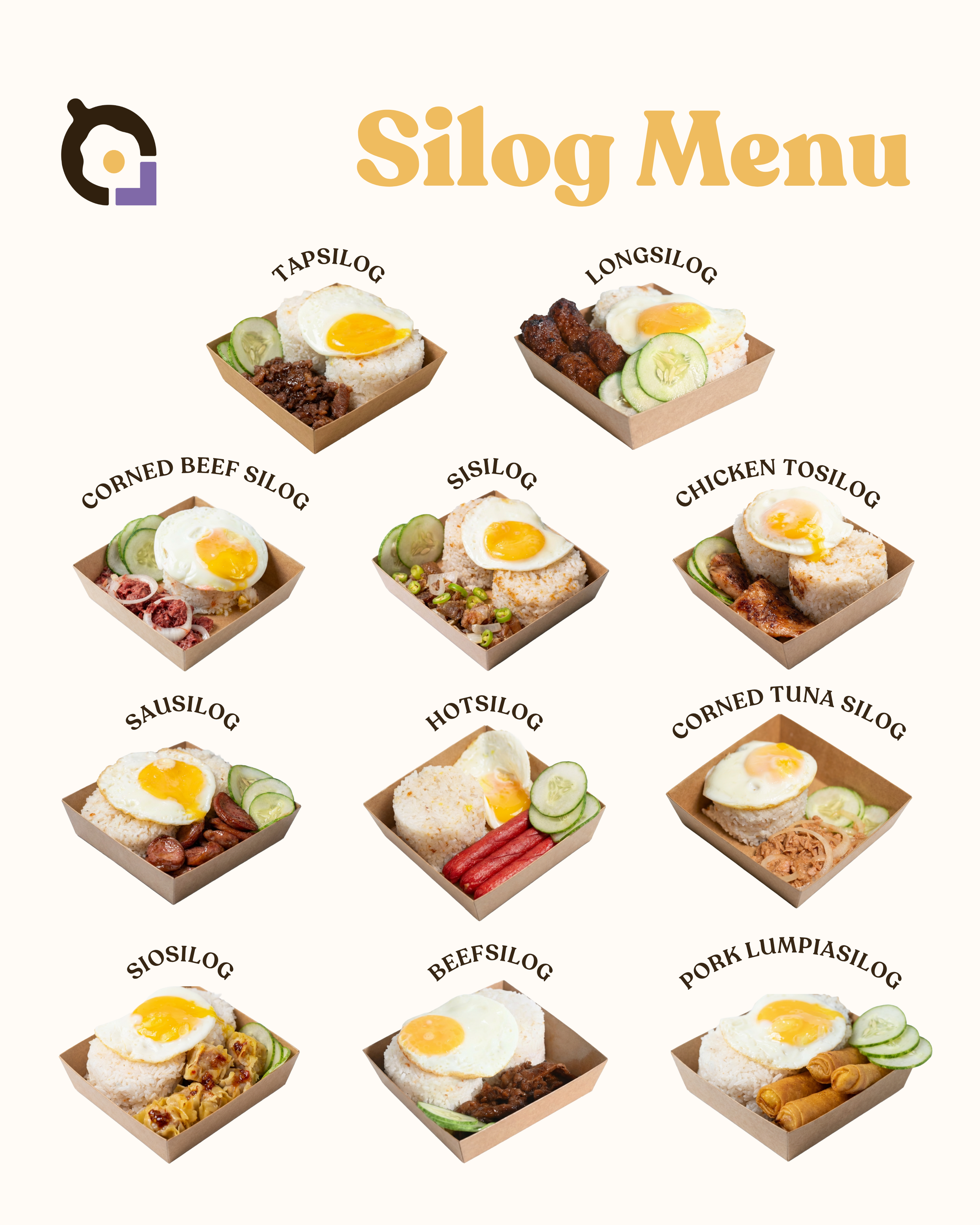
The menu: I figured a kafélog that has its founders living here and eating here in the city should sound like it's from here. Which is why the menu speaks Bisaya and Tagalog. I also decided to drop the peso sign intentionally based on research, shifting the focus to the food rather than the price.
Overall look and feel: Warm, grounded, and just a tad bold.
— Liz
● Logo Design
● Logo Design
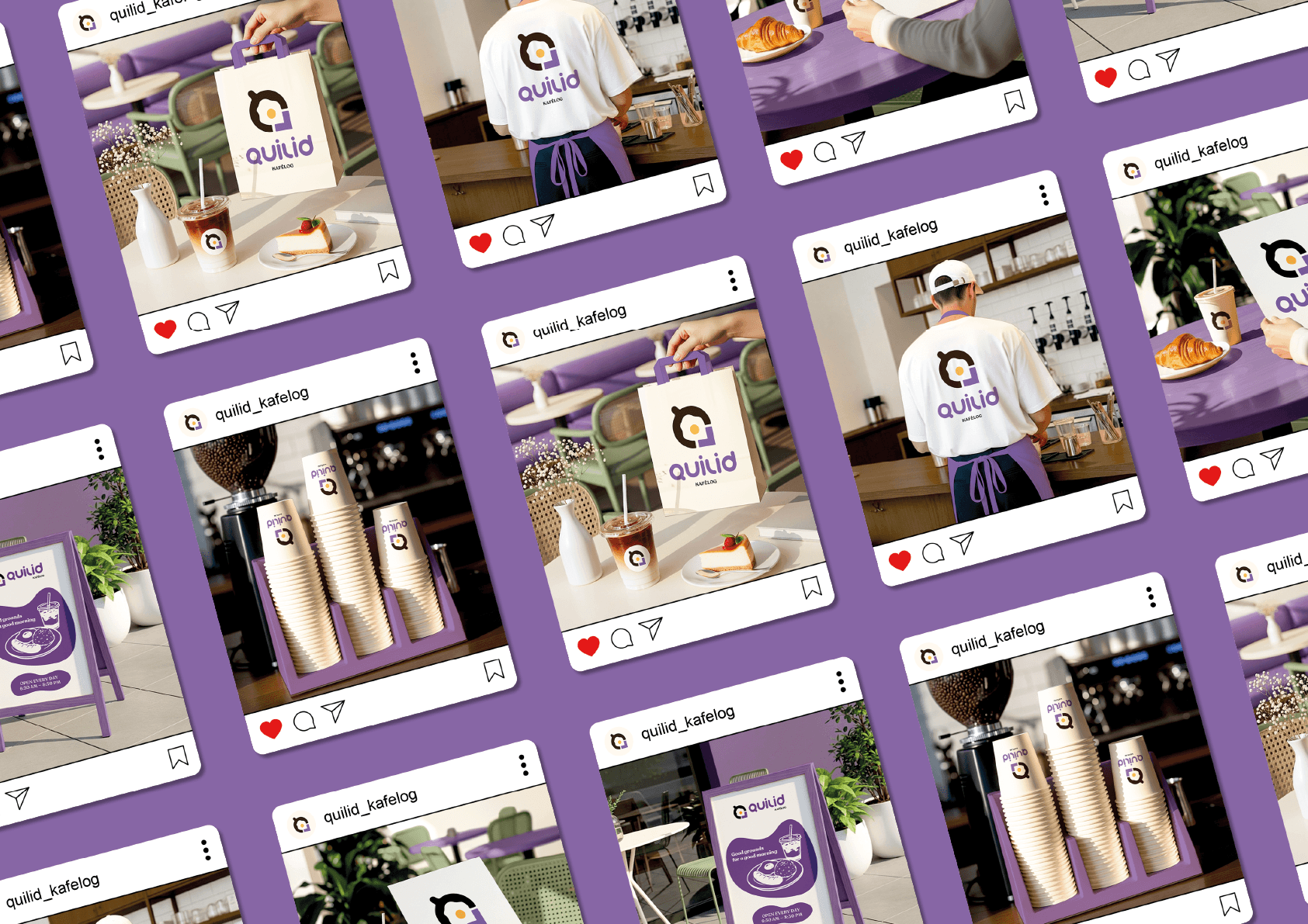
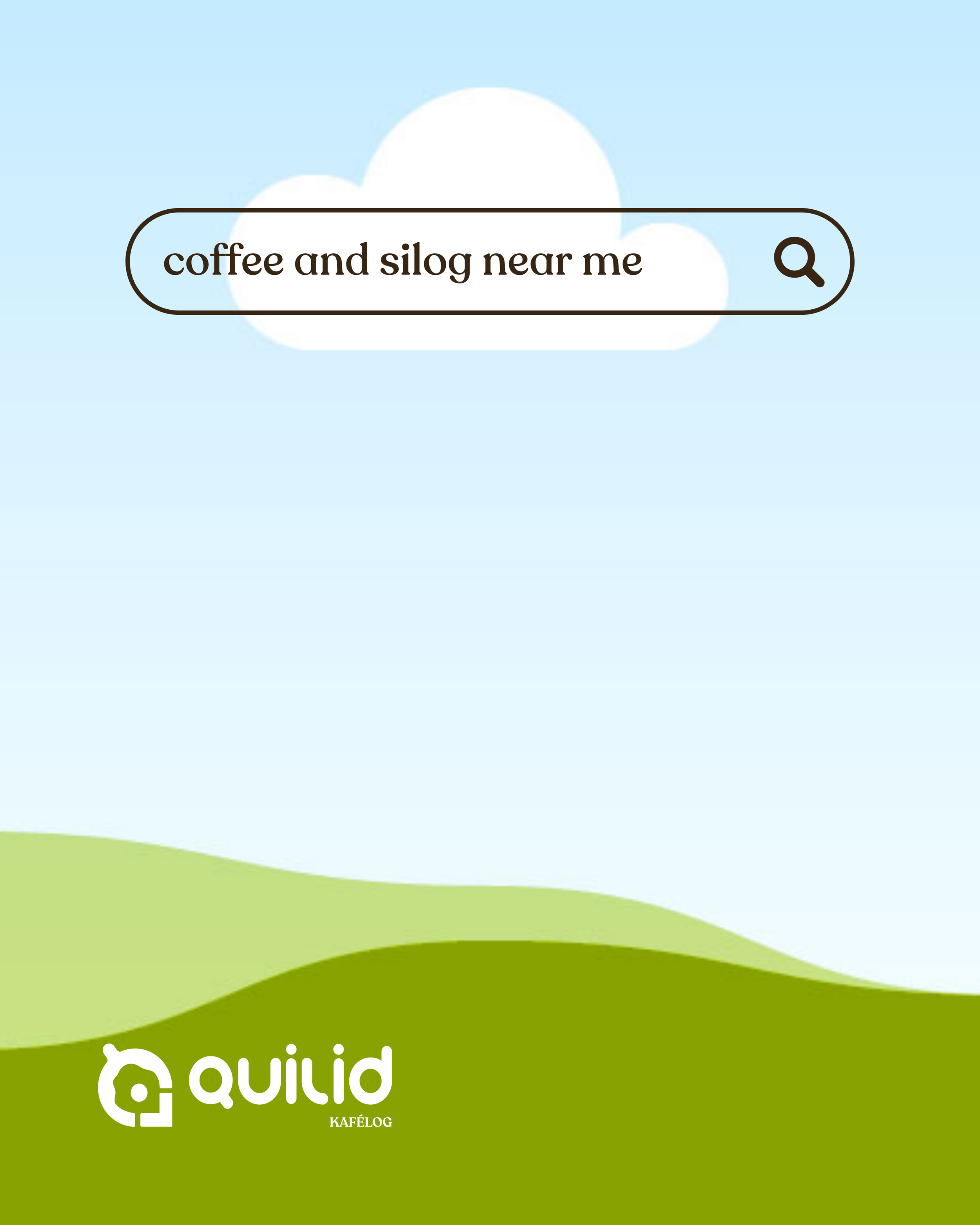
✦ Social Media Templates
✦ Social Media Templates

⛾ Brand Guidelines
⛾ Brand Guidelines