About
Kuwento (Brand Story)
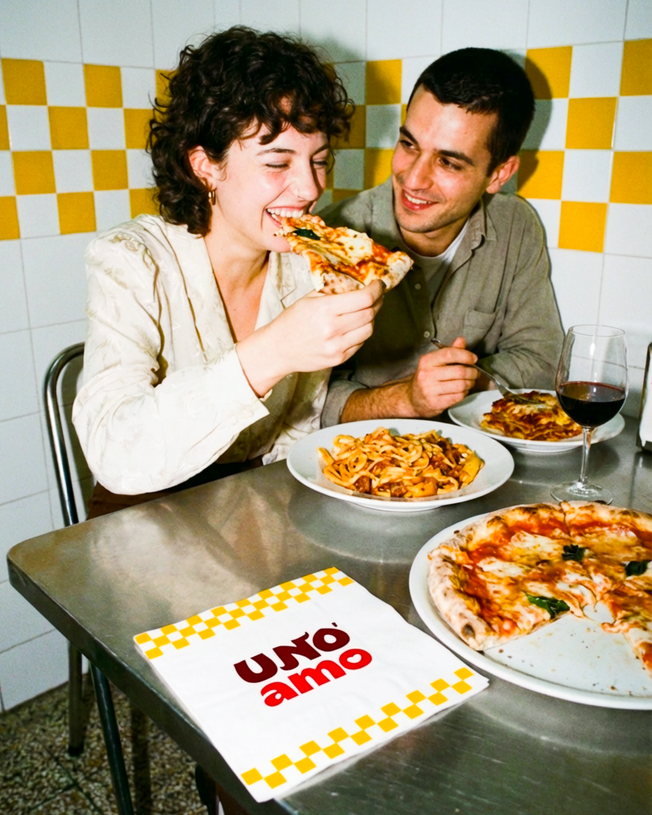
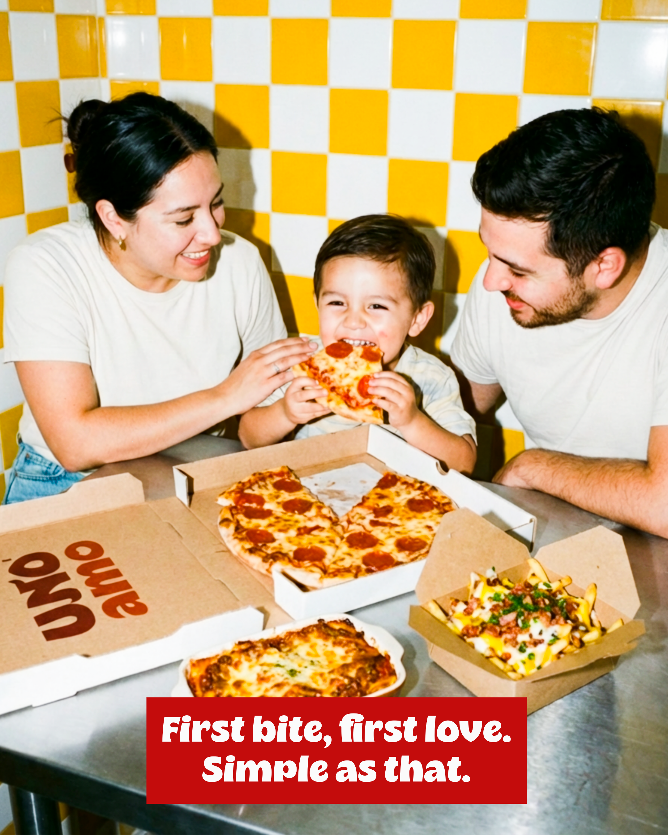
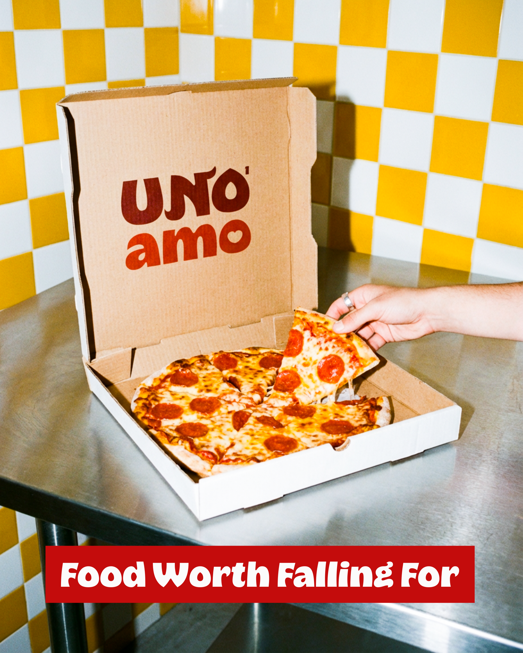
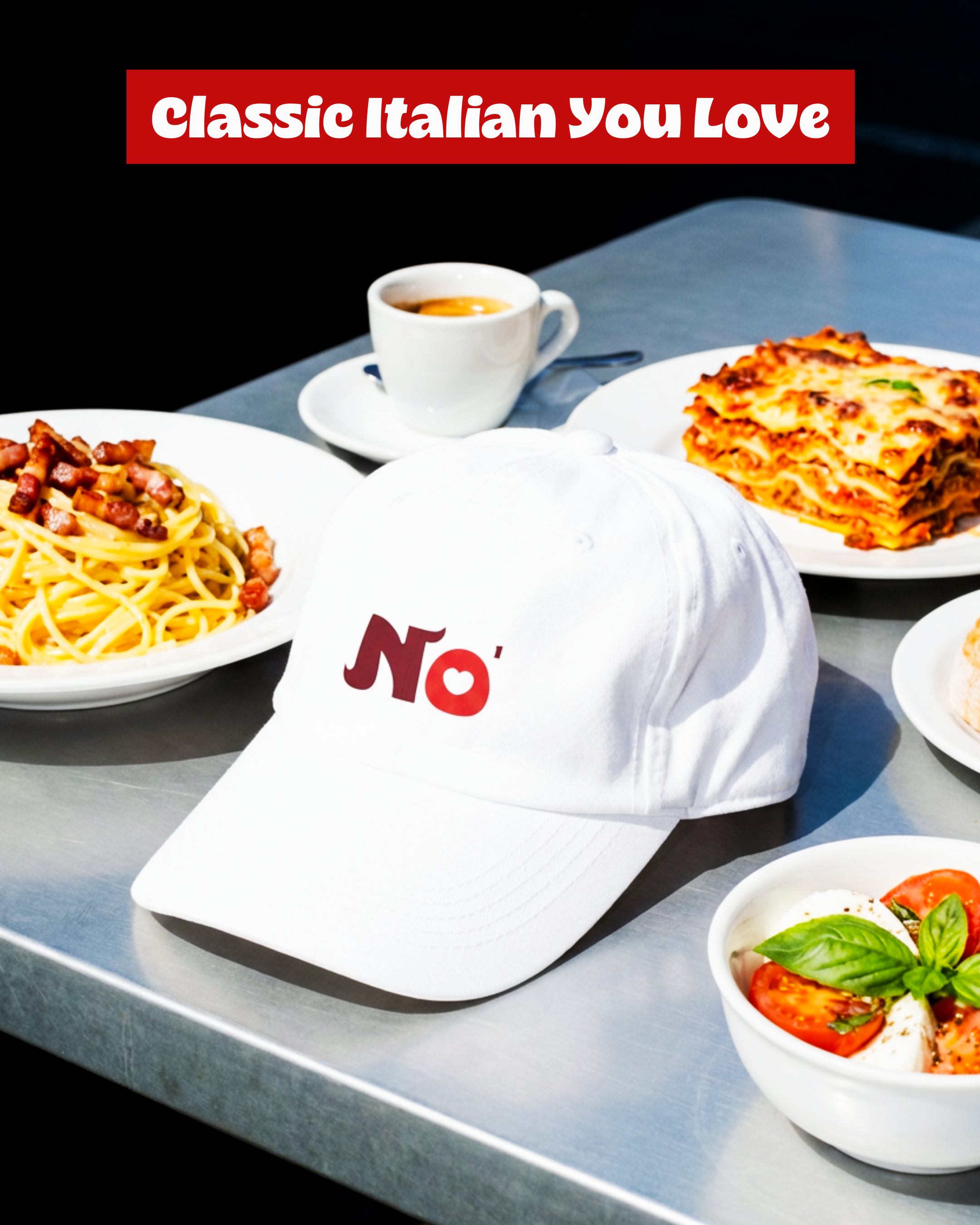
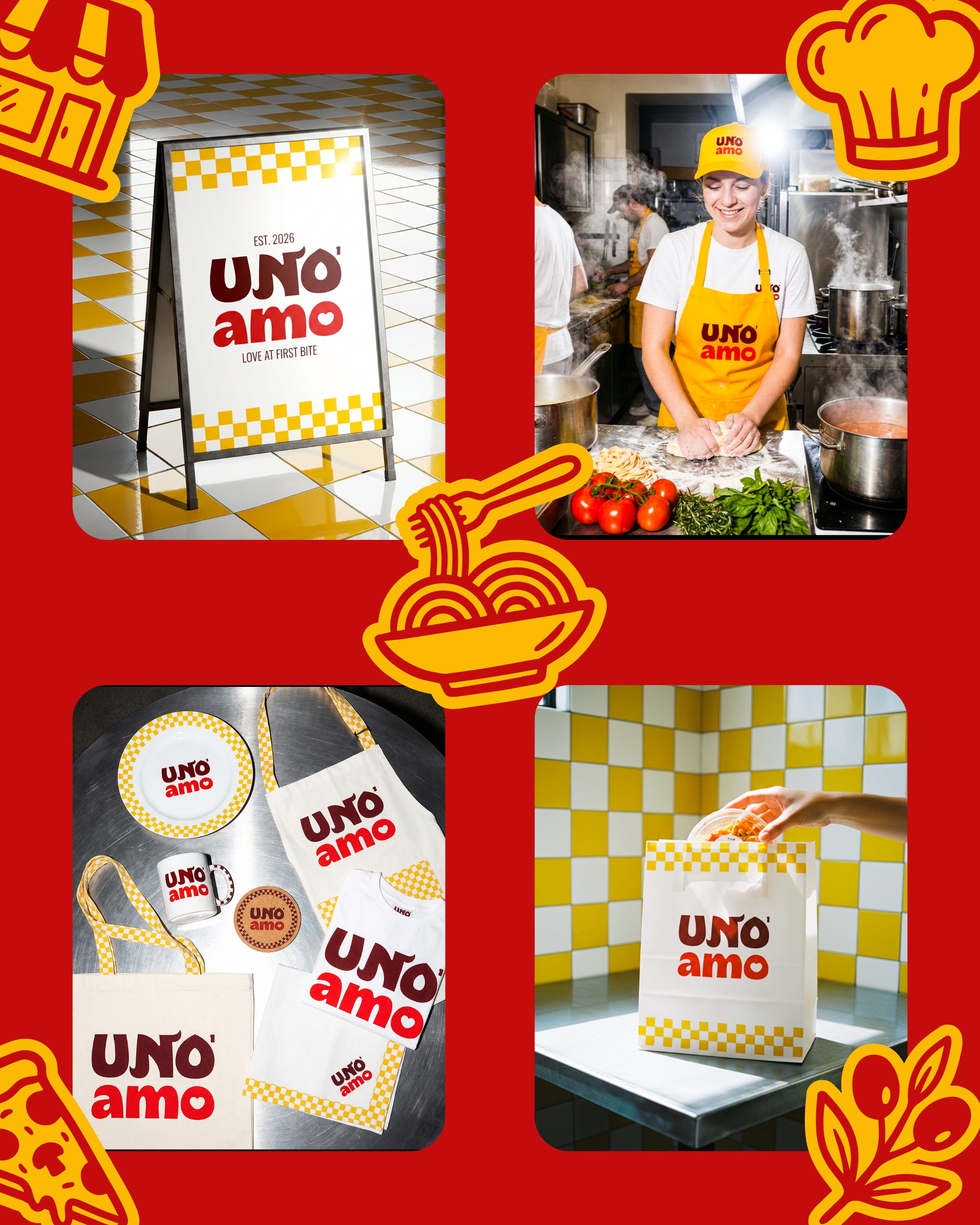
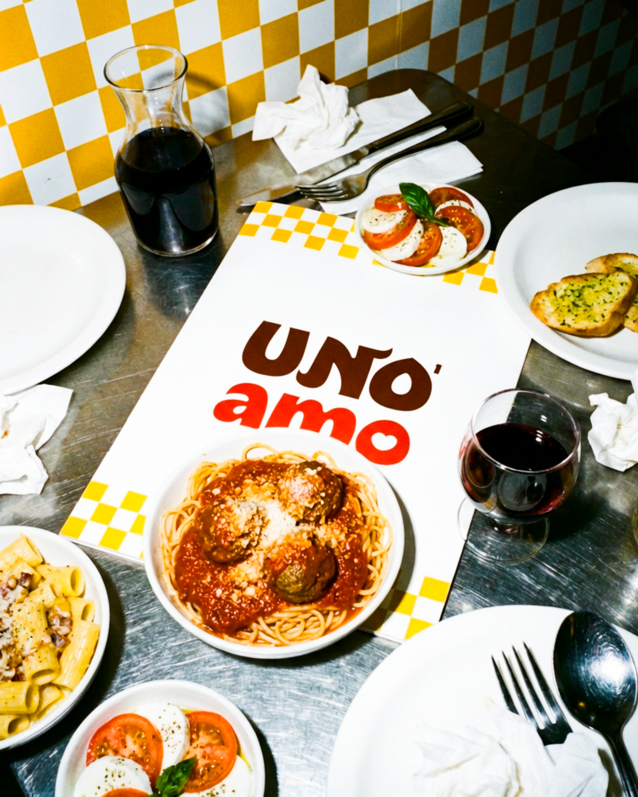
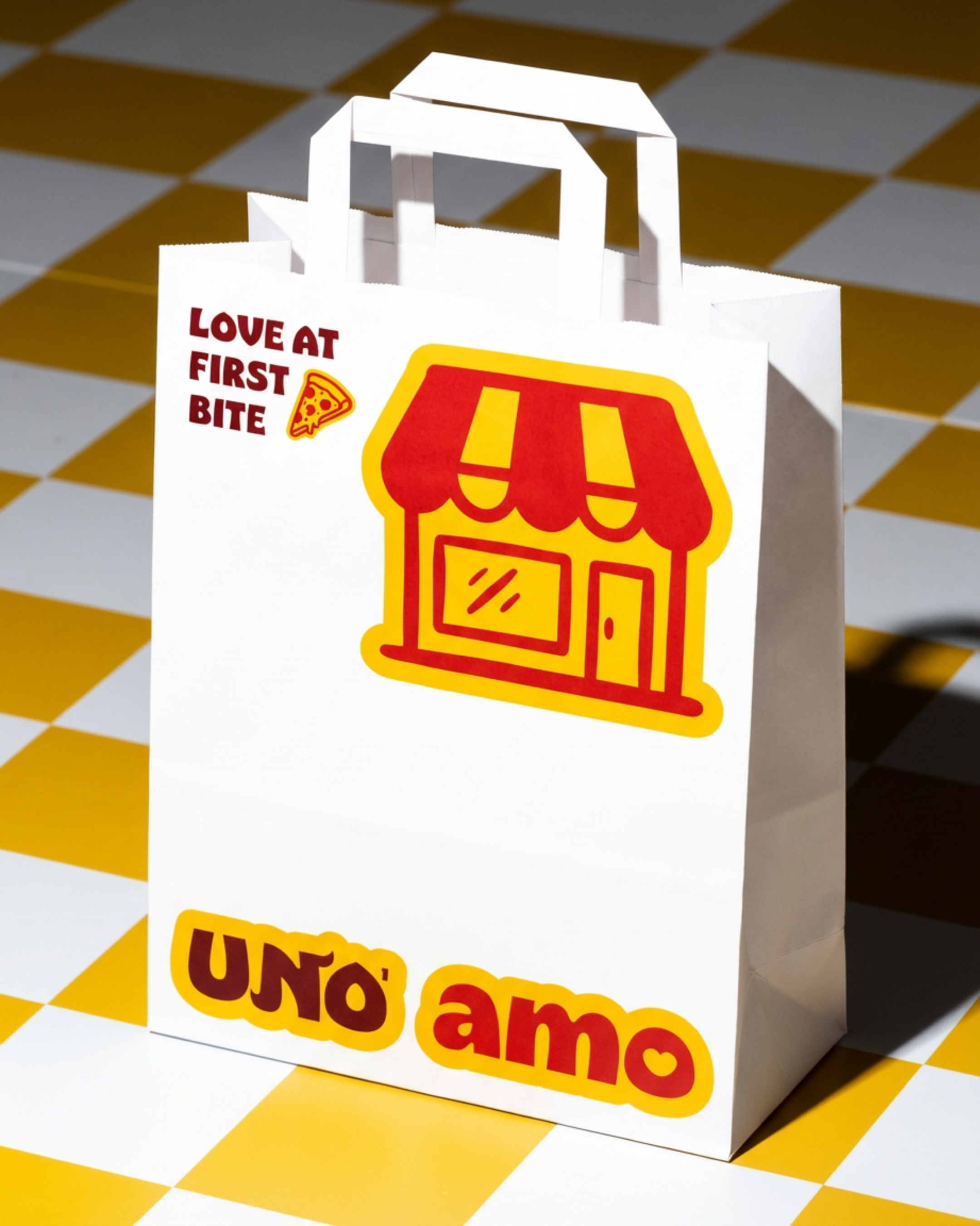
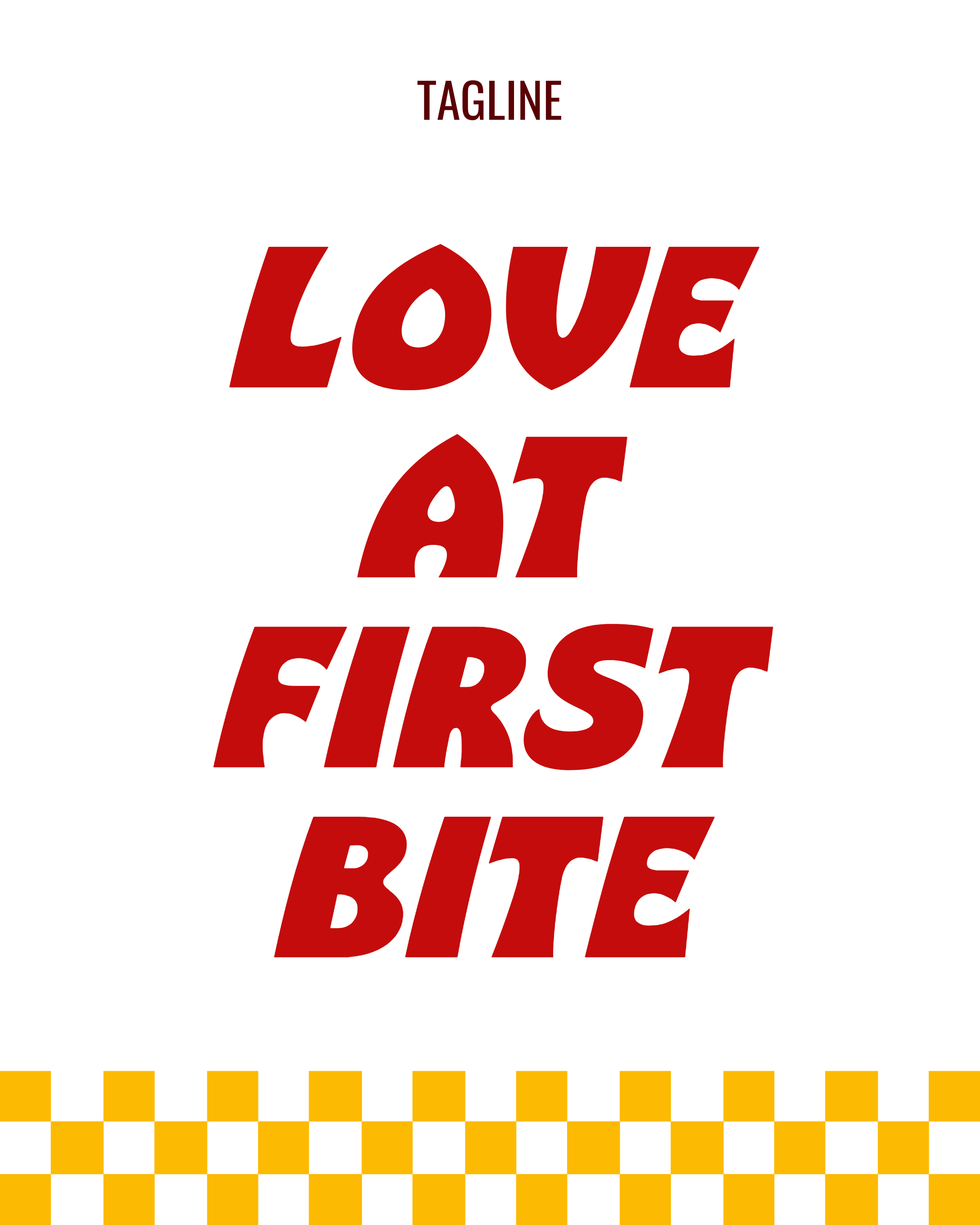
You know that feeling when the food hits and you just know? That’s UNO AMO. It means “the one I love” — intentionally broken Italian, because this isn’t a formal Italian restaurant. It’s relaxed. Cool. And a little romantic.
Cooked with heat, heart, and intention, UNO AMO serves bold, classic flavors in a space that invites you to come hungry, stay longer than planned, and leave in love.
Why Design This Passion Project?
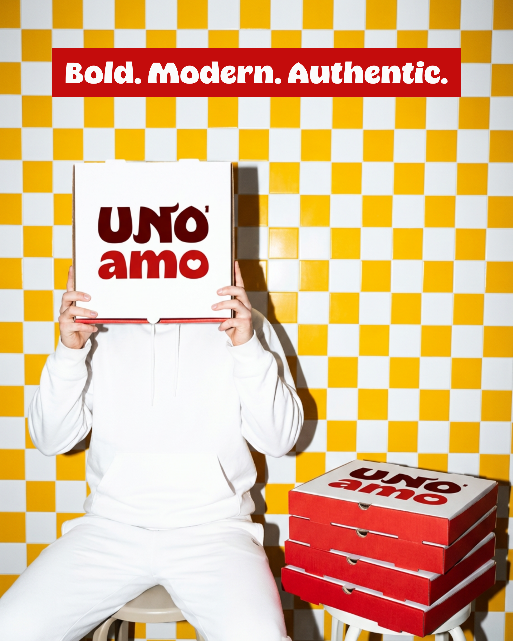
Italian restaurants often lean into the same visual clichés — delicate scripts, tricolor flags, predictable nostalgia. For this project, I wanted to challenge that formula.
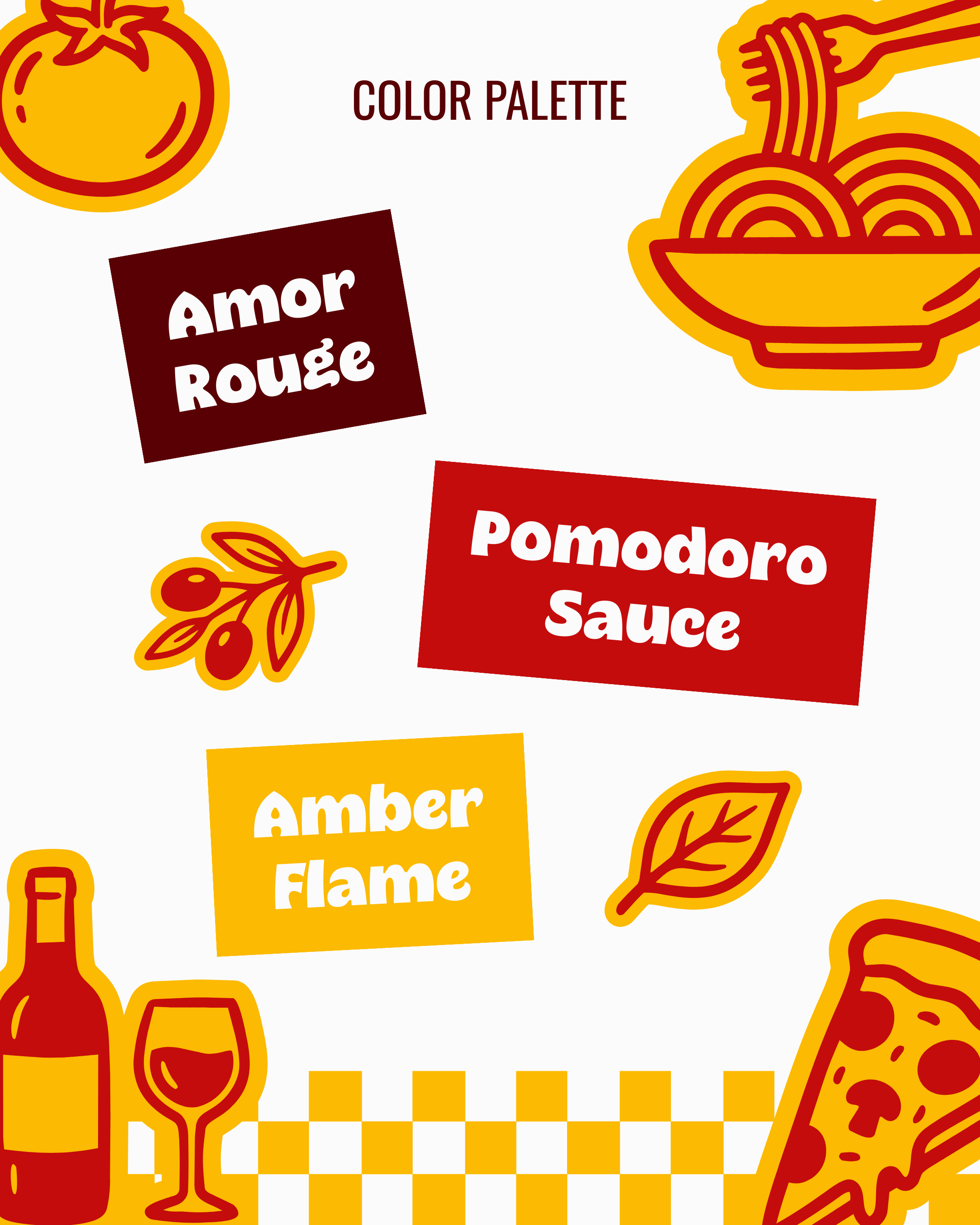
My goal was to balance traditional Italian warmth with a boldly different, modern aesthetic. Heavy, retro-inspired typography replaced thin scripts. I chose playful curves over rigid structures. Everything — from the letterforms to subtle flares and heart details — was crafted to feel confident, passionate, and intentionally romantic.
UNO AMO proves that you can honor Italian roots while breaking the rules — creating something familiar, but refreshingly unexpected.
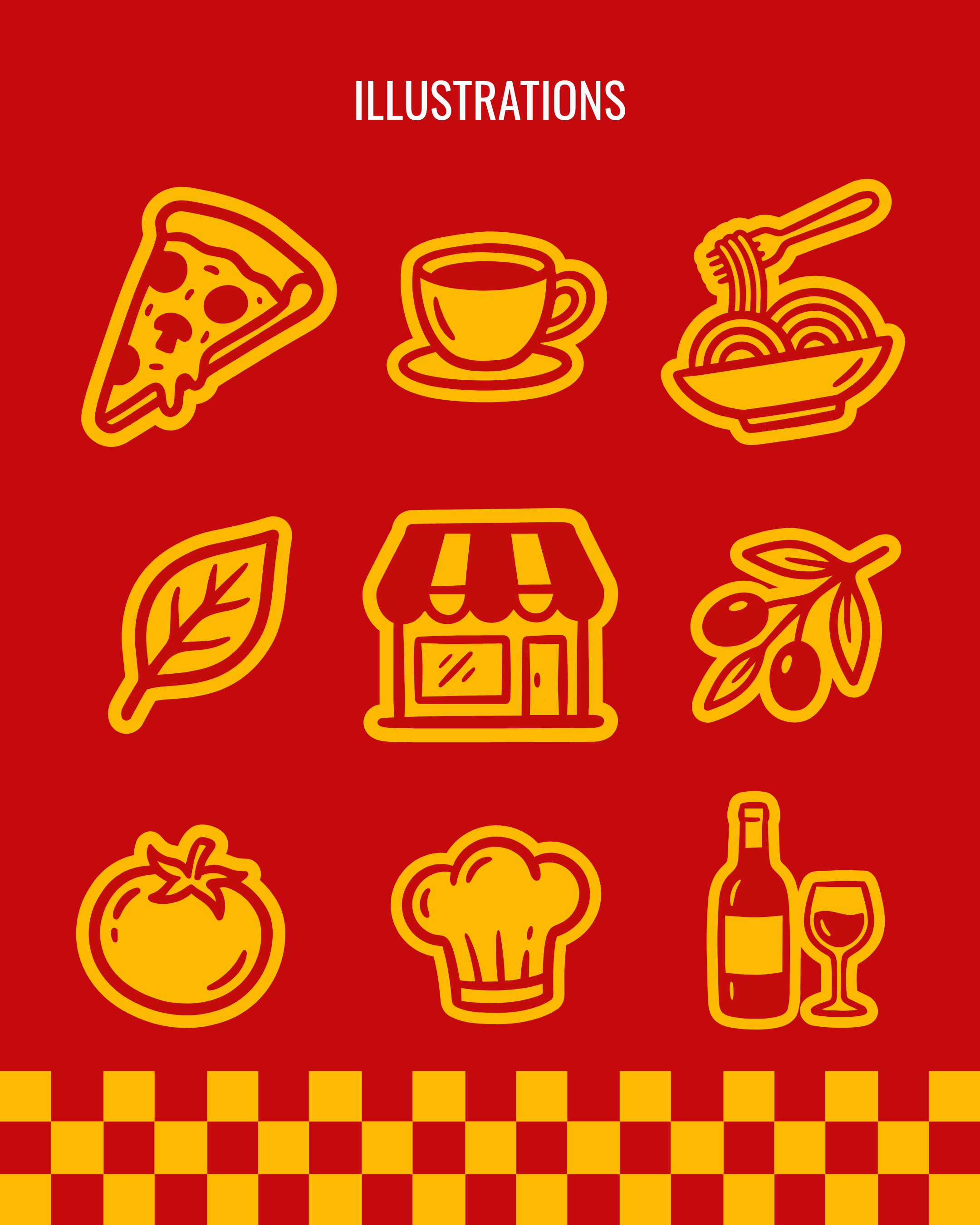
𓌉◯𓇋 Brand Elements
𓌉◯𓇋 Brand Elements
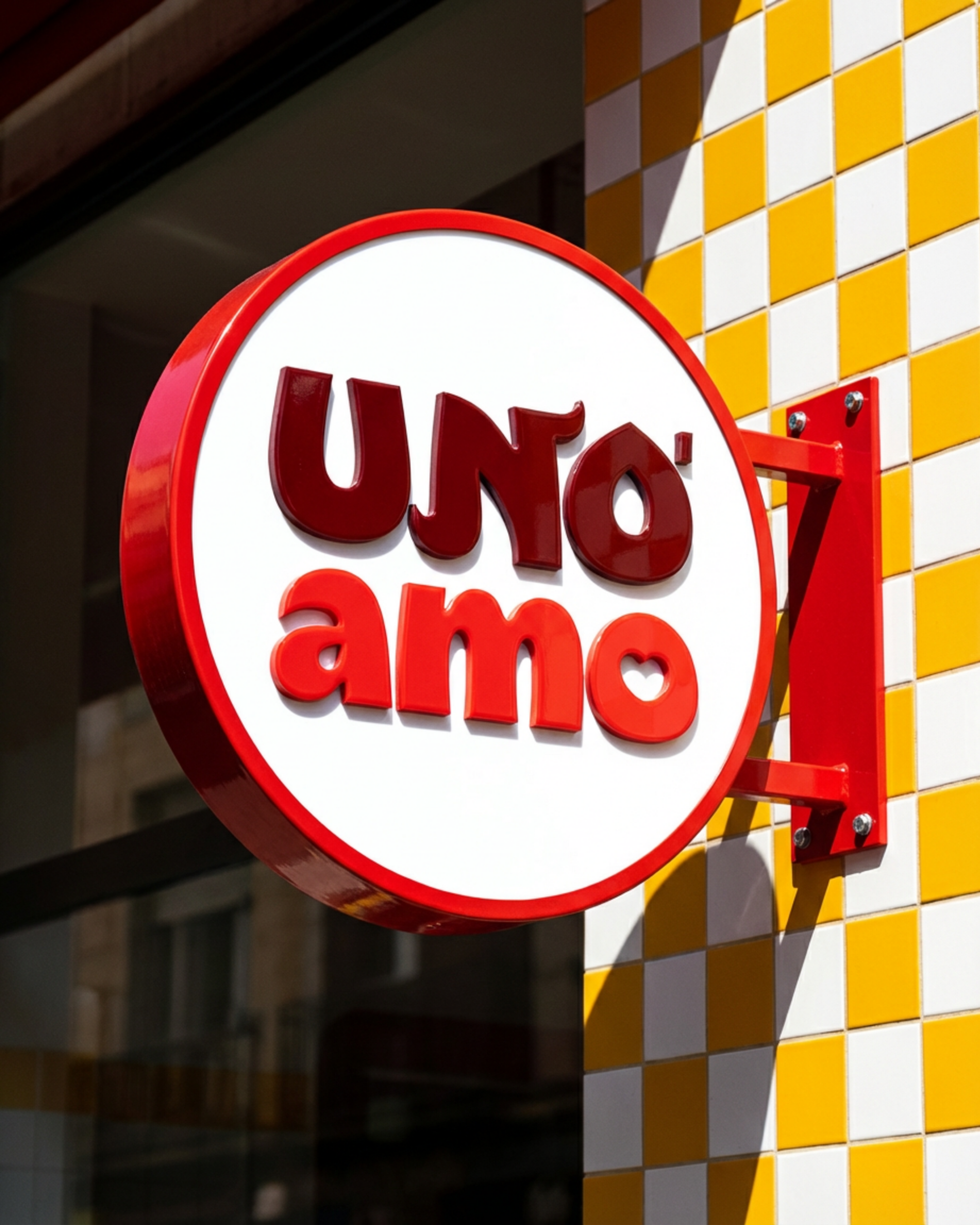
ᢉ𐭩 Logo Design
ᢉ𐭩 Logo Design
Watch my logo design process for UNO AMO, an experimental Italian restaurant.
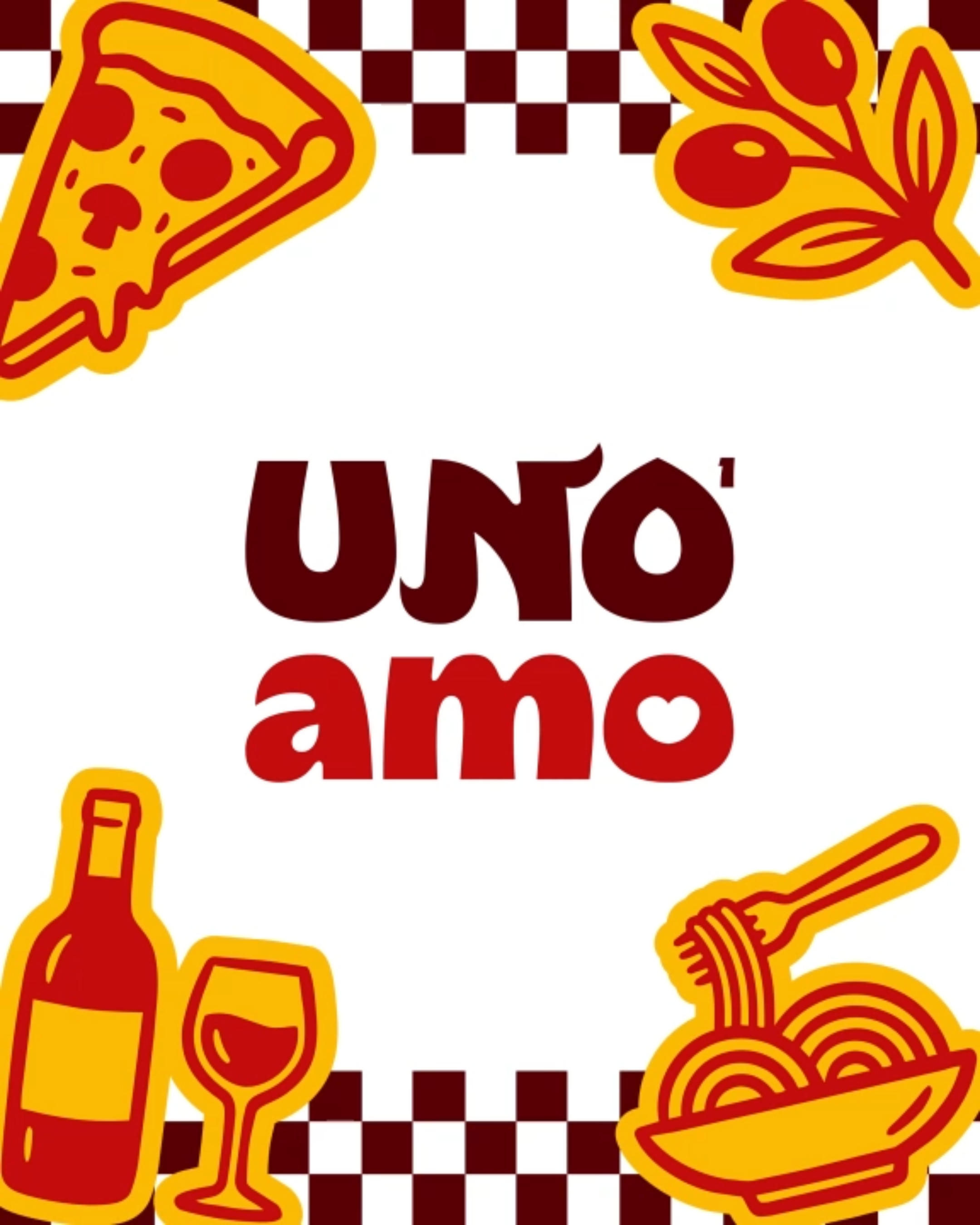
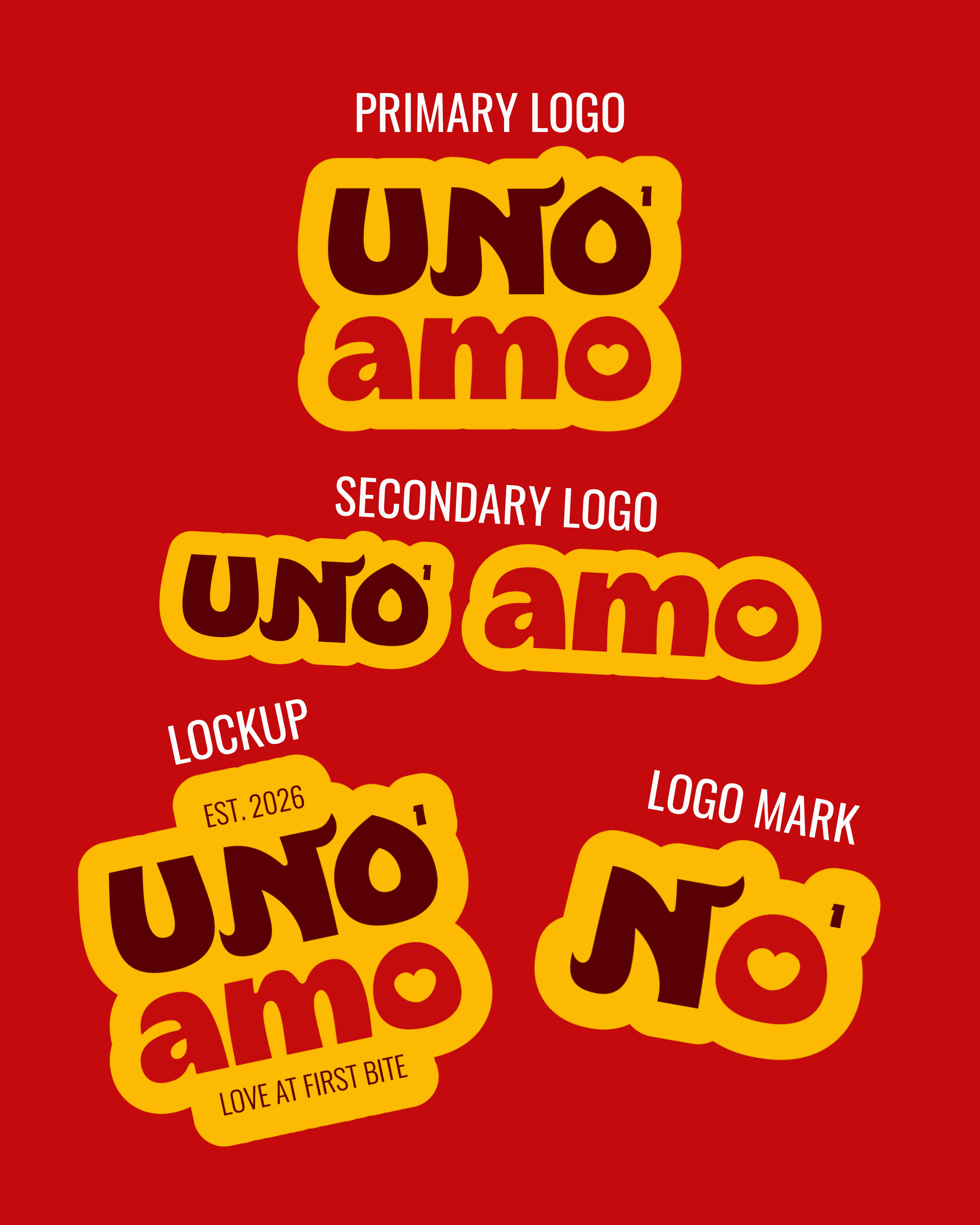
Logo Breakdown:
403 Pambo Typeface: Chosen for its exaggerated curves and eccentric shapes, for that fun, nostalgic, and approachable vibe.
Oswald: Used for the small texts in the lockup, it compliments the main typeface with its clean and versatile style.
N Flares: Flame-like curves that break the rigid structure of standard block lettering, while also suggesting movement, like the twirl of pasta — because this isn't a stiff, fine-dining establishment (tbh, the second flare was added to fill that awkward space between the N and O!).
The Superscript 1: I’ve got 2 reasons why this was added: 1) it’s to say “we’re number 1,” a subtle brag about quality without being loud about it; 2) it’s a counterweight to the right flare of the N, filling the negative space in the upper right corner to keep the overall logo shape contained and intentional — in short, it’s for visual balance too!
The Heart in the O: “Amo” comes from amare (to love). Replacing the standard circle with a heart adds emotional connection, adding warmth to the logo. However, it is chunky, suggesting a passionate kind of love, because the restaurant offers big, bold Italian flavors that come from the heart, rather than a delicate, quiet romance.
⌔ Brand in Action
⌔ Brand in Action
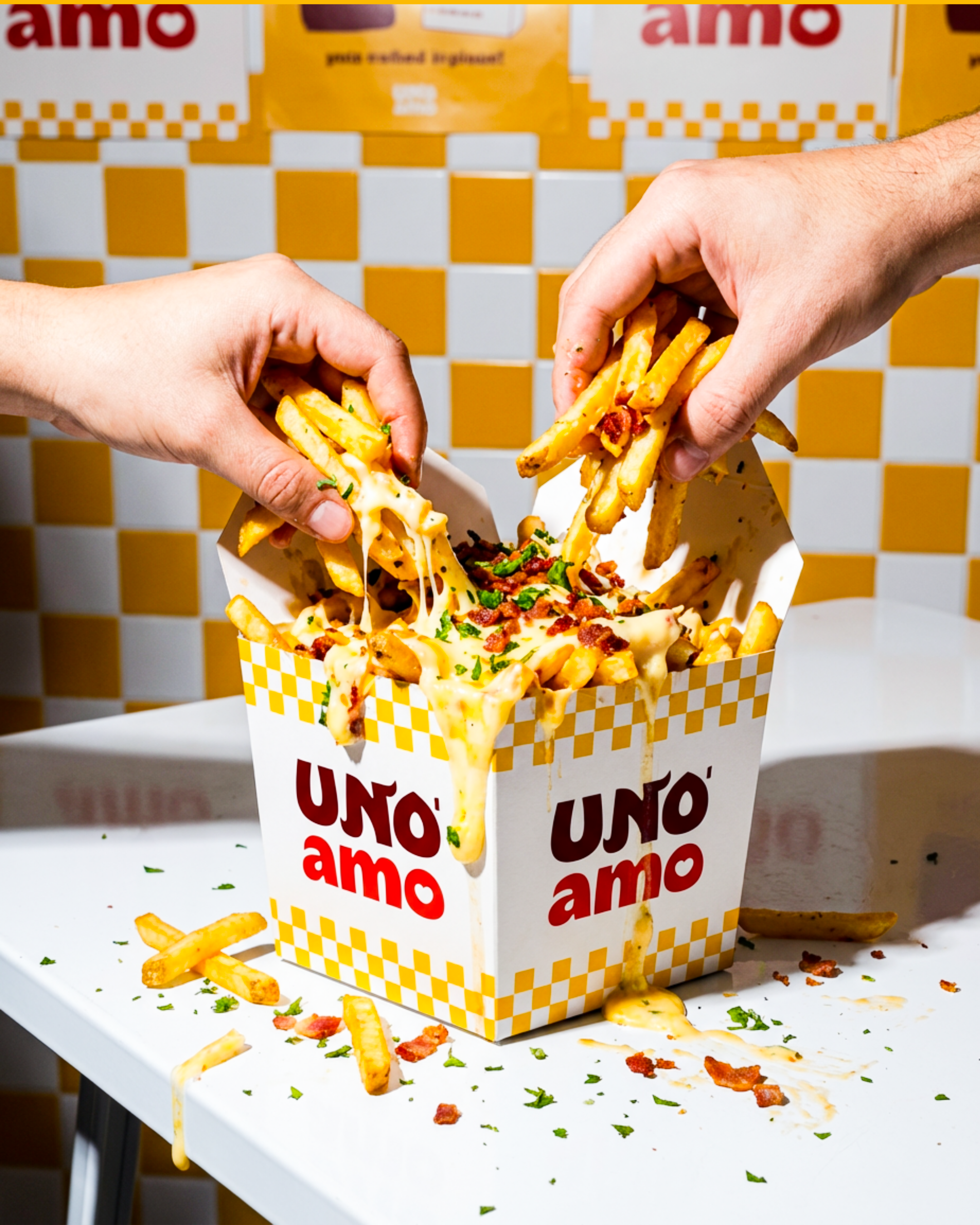
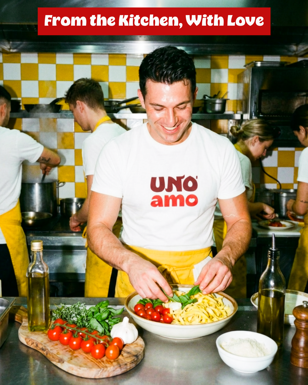
Uno Amo wears its heart on its sleeve, literally and figuratively. Its brand personality is the Lover archetype: warm, passionate, and a little playful, inviting guests to feel at home while indulging in modern Italian delights.
It’s confident without being stiff, stylish without being pretentious, and always heartfelt, serving experiences with care, intention, and a dash of romance.
Think of it as that friend who makes every meal feel special — approachable, expressive, and impossible not to love.